-
Ever wanted an RSS feed of all your favorite gaming news sites? Go check out our new Gaming Headlines feed! Read more about it here.
-
We have made minor adjustments to how the search bar works on ResetEra. You can read about the changes here.
Nintendo almost changed its logo, Reggie reveals.
- Thread starter laziboi
- Start date
You are using an out of date browser. It may not display this or other websites correctly.
You should upgrade or use an alternative browser.
You should upgrade or use an alternative browser.
The N64 logo is still the best designed one of that generation. It's simple and effective. Even 2D flat artwork represents the intended effect of having dimension.
The Playstation logo loses all dimension when made into flat 2D art.
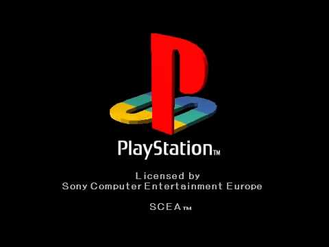
That's how the logo is best represented for 3D. The S is meant to be the shadow of the P to create PS for Playstation.
The Playstation logo loses all dimension when made into flat 2D art.
That's how the logo is best represented for 3D. The S is meant to be the shadow of the P to create PS for Playstation.
Honestly, I don't think changing the logo would've done anything to make the company seem more "grown up" or anything. That said, I don't know how much Nintendo ever really toyed with this idea, but I love how Sega did so much with the Sega splash screens in games.
Just Nintendo in typeface, the same with Xenoblade 2.Splatoon displayed it very prominently with a "Nintendo presents", which is kind of uncommon in Nintendo games, yeah. I feel like Breath of the Wild may have had something similar? Or maybe it was just the game logo and text.
Nintendo stop showing their logo on first party game cover, stop showing on the intro of some game (Astral Chain still have it).
You know that shirt that says you dont have a life, you have many or something like that?
Yeah, the logo itself is nothing special or particularly good in any way. Looking like a fisher price toy is the best part of it, signals its for kids. The real risk is losing brand association. They basically can't change the logo at this point without risking a Pepsi-esque reaction.the logo is iconic but it also looks like something youd see on some fisher price toy tbh
I can't see some hardcore gamers reacting well to it, especially. These forums would be littered with topics about how Nintendo is destroying their childhood, think pieces about how this is everything wrong with the gaming industry etc. Change is terrifying to those really invested, and I guess that's the business perspective on things too.
On the bright side, Nintendo is lucky it's so safe of a logo because at least it doesn't age poorly or get caught in trends.
I don't know what kind of game Nintendo would make with the atmosphere that would make this logo appropriate, but I really, really want to see what it's like now.

I don't know what kind of game Nintendo would make with the atmosphere that would make this logo appropriate, but I really, really want to see what it's like now.
Yeah I remember that. I liked the change (it made sense trying to be more about "everyone" and not "kids") but I also liked it when we got the red back because that meant going back to the Nintendo I grew up with.But they did change their logo.
I like that better than what they have now.
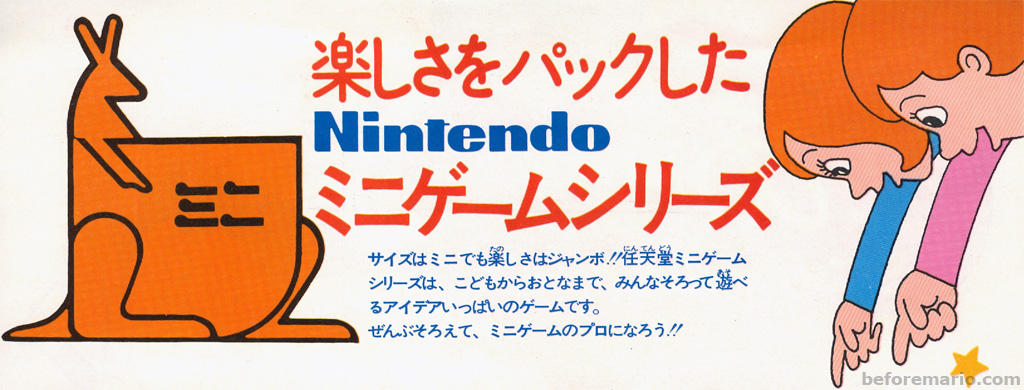
Bring back the kangaroo.
Nintendo's last two revisions, to grey and to white with a red background, were both very effective in what they were trying to accomplish. The almost invisible color scheme of light grey on white mirrored the minimalist approach of the Wii and DS. They simplified input methods and games so that a wider array of people could play. It also likely takes a lot of inspiration from Apple, another company that successfully appeals across age ranges and gender. Nintendo was almost never used in relation with the Wii, though "Nintendo DS" was pretty typical.
Nintendo wanted a hard break from the decade long Wii era, and decided going back to the red, albeit as a striking background this time, really highlights the "game" and "play" aspects of the Switch. It is hardware designed to be played and enjoyed anywhere at any time, it is not a multimedia system or a smart device. It also calls back to their original red race track logo and of course Mario, emphasizing the strengths of their history and IPs. The red also makes for a nice RGB color scheme for the three consoles, although they likely didn't design it with that in mind.
REGGIE'S A GENIUS IS WHAT I'M SAYING DID YOU EAT THE BIGFOOT PIZZA MY GOD IT WAS AMAZING
That wasn't Nintendo's first identity crisis. During the 16-bit console wars they were also tired of being called "kiddie", as Sega had successfully weaponized it against them, so they started the frequently mocked "Play It Loud" marketing campaign.It all stems from Nintendo's identity crisis back in the GameCube days. Where they tried anything and everything to seem "cool", "Hip", and "Edgy" to keep up with Sony and Microsoft, but most of these attempts ended up as pathetic.
Look at all the '90s edge.
As for the logo itself, Nintendo's gone through several over the years.
This one's my favourite oddball:

Its MUCH more iconic than the play station logo. LIKE A LOT.I don't think its even close to as iconic as the Playstation logo so I get why they thought about changing it.
The too kiddy thing I don't get.
The Play Station logo has also changed various times letter wise. The good thing about the Nintendo logo is that its a wordmark logo so you know the company it is EVEN if you are not familiar with industry.
The Play Station logo, in its own, its a monogram logo that goes the fine line of nearly being pictorial (becuase of the way the S could be a shadow and its cut in the middle by the P). A ton of people not fans of videogames wouldnt know what the fuck the PS logo is. When it uses it as mix or its alone being a wordmark logo, it uses the supid Spiderman font from some years now. Changing the wordmark also basically says "yeah, we dont have a distinctive or iconic logo".
Nintendo for its own part, has a distinctive font that for the audience is The Nintendo Font. The oval is just the cherry on top. They used that font since 1967, and even before that, the way they wrote nintendo always had a familiarity with that, in things like the O, that people working on the older versions and the "new" one always found iconic to leave it in all of its revisions, no matter the font that was used.
Wasn't the Tribal Edition GBAsp European exclusive?
That advert is a UK print ad. Nothing to do with NOA.
You're right about it being a UK ad, but to clarify it was a pamphlet included inside of game boxes/cases.Wasn't the Tribal Edition GBAsp European exclusive?
That advert is a UK print ad. Nothing to do with NOA.
A little known fact in the west, but this exact logo is still in use today. It has been printed on the box/case of every Japanese Nintendo release since Nintendo entered the video games industry!I don't know what kind of game Nintendo would make with the atmosphere that would make this logo appropriate, but I really, really want to see what it's like now.
130 years on and only with minor changes, Nintendo still uses it as the corporate logo, usually along with the kanji for "Co., Ltd." (株式会社) in matching typeface.
You're right about it being a UK ad, but to clarify it was a pamphlet included inside of game boxes/cases.
A little known fact in the west, but this exact logo is still in use today. It has been printed on the box/case of every Japanese Nintendo release since Nintendo entered the video games industry!
130 years on and only with minor changes, Nintendo still uses it as the corporate logo, usually along with the kanji for "Co., Ltd." (株式会社) in matching typeface.
Yes they sure do. They also use it on their Tokyo Office signage.
Back of Switch Soft
God, this is probably the '70est logo ever.
In reality they just unified the color scheme worldwide. NoA/NoE had almost always used the classic red, while in Japan they used black and white colors:

That's interesting, didn't know that. But in any case and in any color, that classic logo is classy and better than the current inverted logo imo.
You know that shirt that says you dont have a life, you have many or something like that?
That's what I figured, but what I never understood was how that tied into Nintendo's strategy at the time. Granted, the concept of the GameCube was just "our spin on PlayStation," so them aping Sony's ad campaign from that gen was appropriate.
I didn't know how much I missed that until I read this post.Nintendo should bring back the unique Nintendo logo intros to their games. Then they can have a graffiti style logo for something like Splatoon or a new IP that revolves around urban street style.
Makes you wonder what the marketing department was thinking at the time.
If they felt Nintendo has a kiddy image, it sure wasn't due to the logo.... I'm glad Reggie put a stop to that line of though.
If they felt Nintendo has a kiddy image, it sure wasn't due to the logo.... I'm glad Reggie put a stop to that line of though.
Did they go through a period of selling crackers?