-
Ever wanted an RSS feed of all your favorite gaming news sites? Go check out our new Gaming Headlines feed! Read more about it here.
-
We have made minor adjustments to how the search bar works on ResetEra. You can read about the changes here.
Modern Bowser being in Super Mario 64 DS hurts my brain
- Thread starter AppleKid
- Start date
You are using an out of date browser. It may not display this or other websites correctly.
You should upgrade or use an alternative browser.
You should upgrade or use an alternative browser.
Super Mario All-Stars is a GORGEOUS game.
But I really think they they should have used the NES SMB1 color palette.
But I really think they they should have used the NES SMB1 color palette.
Nah, this one is actually much MUCH better than the original.
It also goes in multiple scenarios unlike the original one that is stuck in a clown car.
I'm more impressed that it had individual fingers. The DS was slightly weaker than the N64, but can produce so much better looking models.
Do fighting game iterations count for this?
Because as great as Street Fighter III 3rd Strike is, I actually prefer 2nd Impact in a lot of aspects, namely some parts of the presentation like a couple of stages, almost the entire soundtrack and the way a couple characters worked (namely Sean who got wrecked in 3S lol.)
Because as great as Street Fighter III 3rd Strike is, I actually prefer 2nd Impact in a lot of aspects, namely some parts of the presentation like a couple of stages, almost the entire soundtrack and the way a couple characters worked (namely Sean who got wrecked in 3S lol.)
Kirby Super Star Ultra is a GORGEOUS game.
But I really think that they shouldn't have used FMV for the cutscenes, but sprite animations.
But I really think that they shouldn't have used FMV for the cutscenes, but sprite animations.
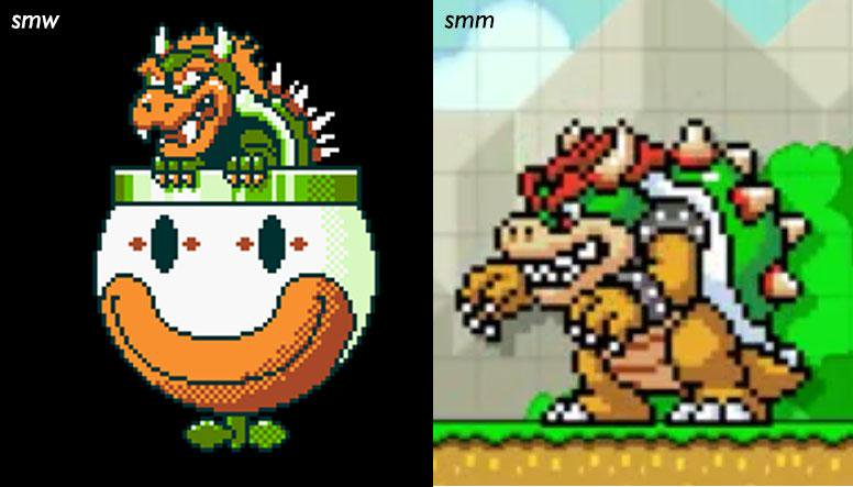
I'll admit, I could never figure out how the original Bowser sprite for SMW actually works. Are his eyes pure yellow? Is that block of orange part of his eyebrows, or is he cross-eyed?
He's looking down there, his eyes are green-ish.I'll admit, I could never figure out how the original Bowser sprite for SMW actually works. Are his eyes pure yellow? Is that block of orange part of his eyebrows, or is he cross-eyed?

What??? His eyes are green and you can't see the left eye because his nose obscures it. The orange part is his eyebrow.I'll admit, I could never figure out how the original Bowser sprite for SMW actually works. Are his eyes pure yellow? Is that block of orange part of his eyebrows, or is he cross-eyed?
The stages in 2nd impact look so much betterDo fighting game iterations count for this?
Because as great as Street Fighter III 3rd Strike is, I actually prefer 2nd Impact in a lot of aspects, namely some parts of the presentation like a couple of stages, almost the entire soundtrack and the way a couple characters worked (namely Sean who got wrecked in 3S lol.)
What??? His eyes are green and you can't see the left eye because his nose obscures it. The orange part is his eyeborow.
You know, until today, both of you had blown my mind with this revelation.
Man, I'm so stupid.
Pokémon FireRed is a GORGEOUS game, but I really think Game Freak should have replaced all GBA speakers with GBC chips instead.
Frog's dialogue in Chrono Trigger DS getting nerfed.
Dampe and his stupid dungeons in Link's Awakening Switch adding unnecessary filler to a great game.
Never played it, but Maverick Hunter X is hideous compared to the classic sprites in MMX.
Dampe and his stupid dungeons in Link's Awakening Switch adding unnecessary filler to a great game.
Never played it, but Maverick Hunter X is hideous compared to the classic sprites in MMX.
OP
OP
Should count, so long as it hurt
Eh, I'd argue that new Mario isn't that much of a departure from the old one. Would have actually been really neat to see a souped up model of the old Bowser go toe-to-toe with new MarioYeah it's a bit weird. Can't have New Mario and Old Bowser though, come on now.
have some nightmare fuel, OP, from one of the in-development mods for Super Mario 64 PC:
lmao Bowser is so Unreal he now suffers from conjunctivitis
But I have to say, my favorite part of that project is that warp pipe at the beginning.
have some nightmare fuel, OP, from one of the in-development mods for Super Mario 64 PC:
It'd be better if his eyes weren't bloodshot.
There's a lot of dialogue choices TPCI made when localizing some of the newer Pokemon games.
I miss the old guy in front of the Celadon City gym..
I miss the old guy in front of the Celadon City gym..
Nah, this one is actually much MUCH better than the original.
It also goes in multiple scenarios unlike the original one that is stuck in a clown car.
all of the SMW character sprites are kinda ugly outside of Mario and Yoshi.
This is why I'm not that crazy about the Gen 1 and 2 Pokemon remakes.
I don't like Pokemon on GBA at all visually honestly.
Heart Gold is pretty good about it honestly, but I loathe what they did to Mt. Silver in terms of atmosphere so even though it's one thing, it's still the pinnacle of the whole game and hurts the whole thing for me. Why is a 13 year old wearing short sleeves standing on top of a snowy mountain with actual hail coming down. Also don't like their battle screens.
This is probably the reason why I like ORAS, because I never got that attached to RSE. I owned Sapphire as a kid and by that point it was just more Pokemon so I played it constantly, but I don't think I really liked that game much.
I mean, it's not hard to see why it bothers OP. Yes, the new model looks better, but it just doesn't really fit in the environment of the original. It's not bad, but I can see why it looks off to some.That's ridiculous, the original model was awful, it didn't even look like the character.
I see nothing wrong in the video you posted.
This thread is like a boomer moment.
It's like throwing Hayden Christiansen into the end of Return of the Jedi.
It better communicates that story point, but ... it definitely looks out of place.
The worst is that they removed the rainbow filter from him during the final fight, just makes it look more boring
wow
Changing the model is... "understandable" But this is unnaceptable.
OP
OP
have some nightmare fuel, OP, from one of the in-development mods for Super Mario 64 PC:
Somehow I find this one is not as jarring as he looks kinda distinct from all other Bowsers + retains that rainbow flair on the final stage. Stage 2 teleport needs work tho lol
Oof yeah, would be a decent amount of that version's dialogue for me. Was Frog's the only part of the script you took issue with?
Old version for context:I guess it's because I grew up with the game, but I don't see what's wrong here.
Modern one looks pretty different and out of place to me due to my familiarity with the older one
We were robbed. All of the new SMW stuff in SMM sucks.
This is why I'm not that crazy about the Gen 1 and 2 Pokemon remakes.
I don't like Pokemon on GBA at all visually honestly.
Heart Gold is pretty good about it honestly, but I loathe what they did to Mt. Silver in terms of atmosphere so even though it's one thing, it's still the pinnacle of the whole game and hurts the whole thing for me. Why is a 13 year old wearing short sleeves standing on top of a snowy mountain with actual hail coming down. Also don't like their battle screens.
This is probably the reason why I like ORAS, because I never got that attached to RSE. I owned Sapphire as a kid and by that point it was just more Pokemon so I played it constantly, but I don't think I really liked that game much.
Why does anything in Pokemon make sense?
OP
OP
Yep, pretty much thisI mean, it's not hard to see why it bothers OP. Yes, the new model looks better, but it just doesn't really fit in the environment of the original. It's not bad, but I can see why it looks off to some.
It's like throwing Hayden Christiansen into the end of Return of the Jedi.
It better communicates that story point, but ... it definitely looks out of place.
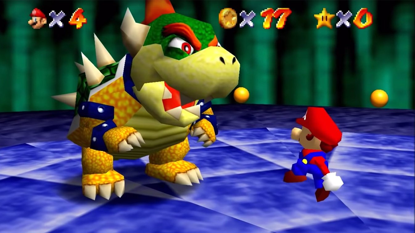
Would love to see this. Most of what makes Modern Bowser feel out of place here is everything else being mostly the same, but those battles were definitely incredibly simplisticHot take: they need to completely revamp the Bowser boss battle in a Super Mario 64 remake.
Hypothermia and freezing to death still exists.
"It's full of" (different voice entirely) "really great trainers"There's a lot of dialogue choices TPCI made when localizing some of the newer Pokemon games.
I miss the old guy in front of the Celadon City gym..
Doesn't he have Charizard?
To be honest Bowser looked awful in SM64, and if you're updating most of the other major models you might as well make Bowser how he should look too.
That said, I voted for So Long Gay Bowser
That said, I voted for So Long Gay Bowser
Twin Snakes is a GORGEOUS game.
But I really think they they should have used the original cutscene direction.
But I really think they they should have used the original cutscene direction.
To be honest Bowser looked awful in SM64, and if you're updating most of the other major models you might as well make Bowser how he should look too.
That said, I voted for So Long Gay Bowser
Yep. Original N64 Bowser looked terrible. I don't have a problem with this.
"It's full of" (different voice entirely) "really great trainers"

I can forgive Bowser looking off in the DS version for making Yoshi and Wario playable.
You know they aren't gonna do that again if the remake for Switch turns out to be true.
You know they aren't gonna do that again if the remake for Switch turns out to be true.
Old version for context:
Modern one looks pretty different and out of place to me due to my familiarity with the older one
I'm familiar with what the older one looks like, but 64 DS is a remake, so pretty much every model is different. The DS Bower looks more in line with Bowser's other appearances so it fits better IMO
Yeah, SM64 Bowser had the fat Pikachu problem: hard to animate him doing anything. He just does a rudimentary step in place and rotate, so it's kind of stiff. Modern Bowser already solves those problems, but does look a bit out of place if you played the 64 game first and familiarized yourself with that.
A lot of the original Super Mario 64 characters were either discontinued or updated quite a bit, if I recall.
A lot of the original Super Mario 64 characters were either discontinued or updated quite a bit, if I recall.
Modern Bowser doesn't convey the weight of the original nor does he look like he can't get off from his back. Looks better, yes. Fits, nah.I'm familiar with what the older one looks like, but 64 DS is a remake, so pretty much every model is different. The DS Bower looks more in line with Bowser's other appearances so it fits better IMO
Uhhhhh, no way lol. SM64 was a great game but it has not aged well in terms of it's visuals, bowser in the original SM64 looks like ass compared to the modern design. Liike, just look at this jumble of polygons. Modern Bowser looks fine, and he was a welcome update for the DS version.
Looked great back when it first came out, but even after a couple of years we were seeing better 3D models in N64 games, like Banjo Kazooie or Pokemon Stadium 2.
Looked great back when it first came out, but even after a couple of years we were seeing better 3D models in N64 games, like Banjo Kazooie or Pokemon Stadium 2.