• Ever wanted an RSS feed of all your favorite gaming news sites? Go check out our new Gaming Headlines feed! Read more about it here.
  • We have made minor adjustments to how the search bar works on ResetEra. You can read about the changes here.

zoukka

Game Developer
Verified
Oct 28, 2017
2,361
Very few games have surpassed what the Prime series went after. I'd love a continuation of that style, restricted areas with lots of geometry and baked lighting to fight the limitations of the hardware. Keep it stylized yet creepy.

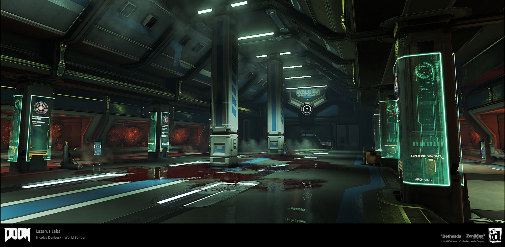
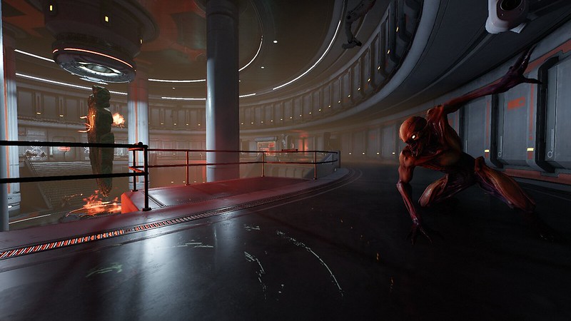
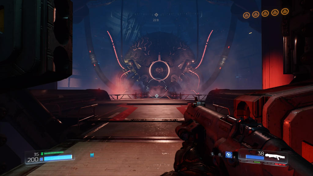
Doom has some really good environment assets in the Mars levels and I'm not surprised why people refer to that game when they think of Metroid.
 

Doskoi Panda

One Winged Slayer
Member
Oct 27, 2017
14,960
Good god no, Metroid should NOT be grimdark.

The Metroid art-style is quite distinct, and honestly better than most of the trash out there. I think Metroid Prime 1–3 should be the reference points, and certainly not gore-driven brownfests such as Doom.
You should play DOOM sometime, it's a bit different from DOOM 3, which I'm pretty sure is the game you're imagining right now.

DOOM 2016 being described as a grimdark gore-driven brownfest... you've gibbed my mind, son. It's a pretty goddamn colorful game.

And at any rate (and as anyone who's, uh, played DOOM might infer), I don't think that Metroid Prime should adopt DOOM's art style and direction wholesale. I'm not suggesting that Metroid become a gory romp through reddish hellscapes - just that aspects of DOOM's presentation would make for a solid model for Prime to follow.

With a few tweaks here and there, and a bit of techno-organic Prime-like stylings, DOOM locales like Lazarus Labs and VEGA's core wouldn't look terribly out of place in a Metroid Prime game.
 
Last edited:

Conor419

Banned
Nov 26, 2017
2,320
London
You should play DOOM sometime, it's a bit different from DOOM 3, which I'm pretty sure is the game you're imagining right now.

DOOM 2016 being described as a grimdark gore-driven brownfest... you've gibbed my mind, son. It's a pretty goddamn colorful game.

And at any rate (and as anyone who's, uh, played DOOM might infer), I don't think that Metroid Prime should adopt DOOM's art style and direction wholesale. I'm not suggesting that Metroid become a gory romp through reddish hellscapes - just that aspects of DOOM's presentation would make for a solid model for Prime to follow.

I feel like there is no way we're gonna get anywhere unless people show me some screenshots proving that DOOM isn't what I've seen from it so far.
 

Doskoi Panda

One Winged Slayer
Member
Oct 27, 2017
14,960
I feel like there is no way we're gonna get anywhere unless people show me some screenshots proving that DOOM isn't what I've seen from it so far.

This is Lazarus Labs, the kind of level I was envisioning as a reference point (and not, say, Kadinger Sanctum, which is literally a grimdark brownfest by design)
maxresdefault.jpg

nicolas-dunbeck-sp-lazaruslabs-2.jpg

33766382244_bfa120261e_c.jpg


This is Vega's core:

emerson-tung-en-polar-core-4.jpg

maxresdefault.jpg

doom_vega_s_core_by_commanderdelta2468-da9s9ec.jpg


of course that's not accounting for outdoor/organic environments. If I desired Metroid Prime 4 to take inspiration from another game's visual design for those details, it'd be Halo 4. But at any rate, it's not like I'd want the game to crib DOOM's art style wholesale.
 

Mcjmetroid

Member
Oct 28, 2017
1,843
Limerick, Ireland
I feel like there is no way we're gonna get anywhere unless people show me some screenshots proving that DOOM isn't what I've seen from it so far.

To be fair it's is a game mostly based in Hell and Mars so I'm not sure what else they could have done. I didn't love the art style in it but I didn't mind it either. The game was too fast for you to even notice.
Metroid however is slower and more exploration based.

Also this being Nintendo:
I think we are far more likely to get a Cel-Shaded "Wind Waker" look than a Gritty Sci Fi FPS look.( I'm not even being funny here)

I want the style style as the Originals but updated.
 

FrostyLemon

Banned
Oct 28, 2017
1,635
I'd really like them to try going down a different route than usual. Ignore the colourful, cel shaded look that infests every other IP they own. Metroid is the one franchise that can provide a different aesthetic and feeling when playing a Nintendo game. Just go full on Doom or Alien Isolation.
 

Conor419

Banned
Nov 26, 2017
2,320
London
This is Lazarus Labs, the kind of level I was envisioning as a reference point (and not, say, Kadinger Sanctum, which is literally a grimdark brownfest by design)
maxresdefault.jpg

nicolas-dunbeck-sp-lazaruslabs-2.jpg

33766382244_bfa120261e_c.jpg


This is Vega's core:

emerson-tung-en-polar-core-4.jpg

maxresdefault.jpg

doom_vega_s_core_by_commanderdelta2468-da9s9ec.jpg


of course that's not accounting for outdoor/organic environments. If I desired Metroid Prime 4 to take inspiration from another game's visual design for those details, it'd be Halo 4. But at any rate, it's not like I'd want the game to crib DOOM's art style wholesale.

Ok this is better than what I thought, still not 100% Metroid-ish but not a terrible foundation.
 

nanskee

Prophet of Truth
Member
Oct 31, 2017
5,071
Halo 4 maybe with a bit more of a stylish/cartoonish but a dark look. I don't think that dread photo looks good to me.

Maybe just an evolution of prime visuals, because prime games still look great
 

Frodo

Avenger
Oct 27, 2017
4,338
I honestly would rather have art styles like BotW that can look amazing with the upside of aging a lot better than realistic styles most AAA games go for.
 

Deleted member 36622

User requested account closure
Banned
Dec 21, 2017
6,639
So BotW, Splatoon, ARMS, etc. are all gorgeous games but they're all also very stylized in a way that the Switch's shortcomings aren't as evident. Do you think MP4 should go in a similar direction for its art style?
I personally don't care if it looks a bit outdated, but I feel like Nintendo wants the core gamer demographic to get hyped about this game and so the visuals are very important. Do you think the same art direction from past Prime games will be enough? Or do you think they should tweak it a bit?

Nintendo explained this very well, they think stylized games are better because 10 years from now will still look great (while a more realistic approach ages quicker).

I don't think MP4 will be as stylized as titles like ARMS but i think what they did with BOTW is the perfect trade-off, that game looks great even in handheld mode and outside Lost Woods it also run consistently at 30 fps.
 

JCal

Member
Oct 27, 2017
8,351
Los Alfheim
Since they decided to call it Metroid Prime 4, I expect the same style. Anything else would be a disappointment.

DOOM, Prey, and Portal feel like good references to me.
 

Nightside

Member
Oct 28, 2017
625
Some years ago there were some concept art from a potential 4th game from retro. It was quite dark. I really can't find them now :(
 

AztecComplex

Banned
Oct 25, 2017
10,371
Since they decided to call it Metroid Prime 4, I expect the same style. Anything else would be a disappointment.

DOOM, Prey, and Portal feel like good references to me.
I think I read somewhere that that's a placeholder title. This is the part where I speculate and I think they'll call it Metroid Prime: Subtitle (no 4).
 

Servbot24

The Fallen
Oct 25, 2017
43,125
Should be weird, dark, alien, organic, icky, natural, surreal.

Prime was a great starting point, though looking back even that had some poor designs that can be improved, and I'd like to see more moody environments and fewer sci-fi corridors. To me Metroid is about connection to the environment. Some sci-fi stuff is inevitable, but naturalism should be the focus.
 

mute

▲ Legend ▲
Member
Oct 25, 2017
25,091
As long as the map and world design is right I'm really up for anything art design wise. Just hope that whatever they go with it performs well both docked and handheld.
 

Wamb0wneD

Banned
Oct 26, 2017
18,735
The artsytle of the original trilogy is perfect and holds up better than pretty much anything else released in that time. I really wonder if we will get the same amount of environmental detail in 4.
 

JoRu

Member
Oct 25, 2017
1,791
Anything but drab. I want lots of contrasting, striking colors so that when the environment becomes truly dark it feels even more so. Metroid generally does this well, so I'm not worried.
 

kizmah

Member
Oct 29, 2017
177
Sweden
Prime already had perfect art direction (including a more mature looking Samus). Just add more graphics! And please, don't undress Samus and put her in a ridiculous zero suit just for the sake of sexualization. Keep that anime bs out of my Metroid.
 
Last edited:

Dark Cloud

Banned
Oct 27, 2017
61,087
I sure as hell don't want to walk through a planet in some cartoon/colorful style or environments. Not with the music and atmosphere of Metroid. It just needs to be HD Metroid Prime.

I'd like something resembling the comic bookish art style from Zero Mission.
mzmbox_jap.jpg

I don't really know how to describe it but it has a way of coloring everything that I liked.
What's so great about this style for Metroid Prime?
 

Gold Arsene

Banned
Oct 27, 2017
30,757
I sure as hell don't want to walk through a planet in some cartoon/colorful style or environments. Not with the music and atmosphere of Metroid. It just needs to be HD Metroid Prime.


What's so great about this style for Metroid Prime?

Because I like it more then the realistic artstyle of the previous Prime games?

I mean I figured we were talking hypothetically here.
 

Lunar15

Member
Oct 25, 2017
4,647
I don't like to be reductive and box a series into anything specific, but the Prime series was it's art style for me. From 1 to 3, there's a specific feel of mosaic style detail with an asymmetrical skew to everything. It works so well for the series.

Moving the prime series into HD and not carrying that over would be a huge blow to the appeal of getting a new Metroid "Prime".
 
Oct 27, 2017
5,618
Spain
I don't see how Zelda or Mario Odyssey are not impressive from a technical standpoint, I'd say Odyssey is a great tech foundation for Metroid Prime 4. It has PBR, good lighting, fairly big environments, pretty particle effects and it runs at a flawless 60 FPS. Using the same technology to build the world of Metroid, with its combination of organic and metallic/plasticky elements, and water, and weather, and lighting, would look glorious. I'm expecting the end result to look kind of like DOOM, but maybe with a different implementation of how textures and assets are loaded that isn't as stressful on the system's CPU, somewhat simpler effects and lighting, and running at 60FPS.
 

Gold Arsene

Banned
Oct 27, 2017
30,757

Deleted member 18161

user requested account closure
Banned
Oct 27, 2017
4,805
Switch can have visually impressive games @1080p/60fps without them being technical showpieces. I don't need Prime 4 to be a technical showpiece in order for it to give me eye candy. That's what good art direction is for.

Which visually impressive Switch games are native 720p when in handheld / native 1080p when docked while running at 60fps? I'm a huge fan of the system and Nintendo but most games are dynamic 900p when docked. I can only think of MK8 (which is a WiiU port) and ARMS (which is a two person fighter in tiny arenas which even then I think drops to dynamic 900p in local mp mode).

There's nothing wrong with 600p / dynamic 720p when handheld and dynamic 900p when docked as Switch is a mobile device at it's heart but people expecting all the nig name games to be native 720p handheld and 1080p docked @60fps are just setting themselves up for disappointment imo especially when the likes of BotW, SMO, Splatoon 2, Pokken, FE Warriors and XBC 2 were all far away from those resolutions and two of those games even had a 30fps target.

A docked Switch is notably more powerful than a 360, indubitably.

Holy shit are people still running with this garbage! The Switch in handheld mode is much more powerful than a 360. Maybe not in paper numbers but certainly in real World performance.
 

Phendrift

Member
Oct 25, 2017
32,300
Graphics wise I guess but I actually really liked the art style they went with.
Especially the Chozo memories.
latest

Favorite armorless Samus design too.
3e0.jpg
Yeah, the Chozo memories and Samus designs in SR was fucking awesome.

That said, I don't want Prime 4 to try and take after anything else artwise besides the original trilogy.
 
Nov 21, 2017
1,772
All I can say is they better make Samus look like a normal human again. I'm talking Metroid Prime 1 vs. the zero suit abominations in the sequels.
 

erikNORML

Member
Oct 30, 2017
1,709
If we get something like how Metroid Prime Trilogy looks on Dolphin, I would be very satisfied.

Damn... its really astounding how well these games hold up with just a resolution boost. Add in modern effects, lighting/shaders and what not and we have another high water mark for game visuals and art style I'd think.
 

Gartooth

Avenger
Oct 25, 2017
8,440
Pretty simple really. I vastly prefer the visual style of Fusion and Zero Mission to the Prime games.

Yeah same here. The colors popped in those games but it didn't come to the expense of the environments and worlds they tried to make. I also loved the simpler and sleeker armor that Samus had.

To me the look of Zero Mission is Metroid. I've always had a stronger affinity for the 2D games though, so maybe this would be a more effective style in Metroid 5.
 
Oct 27, 2017
5,618
Spain
Her arms are fine. And look at those thighs and butt, she looks like an athlete, unlike other forms where she had those massive, impossible boobs and a tiny wasp waist.
 

KITPUNK

Member
Oct 28, 2017
211
Canada
And for the love of God get rid of her high heels! There's no fucking excuse for her to be wearing high heels integrated into her Zero Suit. One of the many shitty things Other M brought to the franchise which inexplicably Samus Returns chose to maintain.

She's a bounty hunter exploring deadly planets on her own, not on a runway.

And while you're at it get rid of the glossy lipstick and eye shadow. There's literally zero reason why she should be wearing makeup. But if I had to choose one toss those heels!

I couldn't agree more. Whats funny, when you compare the Other M Zero Suit Samus:

160


With the original concept from Zero Mission:

91f44318b45126781a6af76b0bf85a5d--metroid-samus-samus-aran.jpg


You can see they already contradict the heel design via the notes in the bottom right.

Also, I really dislike how the 3D Samus has unnaturally yellow hair. Least Smash made it more blonde.
 

Deleted member 3769

User requested account closure
Banned
Oct 25, 2017
677
Graphics wise I guess but I actually really liked the art style they went with.
Especially the Chozo memories.
latest

Favorite armorless Samus design too.
3e0.jpg

I agree with this. I also like the super nes cover art, so something resembling that would look cool.
I also like that Marco Lopez art he did for samus:

marcos-lopez-samus-returns.jpg


Looks like some kind of retro style.
 

Pikachu

Traded his Bone Marrow for Pizza
Banned
Oct 25, 2017
6,402
Color scheme is entirely purple and black, with some minor usage of earth tones.

The only light in many corridors is from the arm cannon when it is being charged up (to sustain the light).

The art is a clean/slick type similar to a Bethesda game.
 

AztecComplex

Banned
Oct 25, 2017
10,371
I couldn't agree more. Whats funny, when you compare the Other M Zero Suit Samus:

160


With the original concept from Zero Mission:

91f44318b45126781a6af76b0bf85a5d--metroid-samus-samus-aran.jpg


You can see they already contradict the heel design via the notes in the bottom right.

Also, I really dislike how the 3D Samus has unnaturally yellow hair. Least Smash made it more blonde.
That's actually hilarious. I'm going to quote that image a lot. Nintendo really fucked up with Other M
 

LordofPwn

Member
Oct 27, 2017
4,402
I think DOOM is a good starting point. Like if you modded it with metroid enemies and the arm cannon i think the UI translates well too. Obviously the DOOM levels are not metroid levels but the feel is there. like if the team just did a case study of doom when making prime 4 and when you played prime 4 you could tell they looked at DOOM i'd be more than happy.
 
Oct 27, 2017
5,618
Spain
Color scheme is entirely purple and black, with some minor usage of earth tones.

The only light in many corridors is from the arm cannon when it is being charged up (to sustain the light).

The art is a clean/slick type similar to a Bethesda game.
I'd like to see a lot of use of colored lighting, of shadows, and of particle effects for the arm cannon. Like the particle effects in Zelda, Mario Odyssey, and DOOM, or even Metroid Prime 3, on the arm cannon.
And have the same HDR color clipping effect Zelda BOTW has on Sheikah objects. That was cool.
 

AztecComplex

Banned
Oct 25, 2017
10,371
Except, as previously noted, they kept the heels in Samus Returns when NIntendo could have easily chosen to nix them from the design.
I know! Thats why Im imploring for Prime 4 to ditch them! If previous Prime games are anything to go by this Samus should be the least sexualized compared to other non Prime games (including Smash). Retro showed class with their Samus, I hope whoever is making Prime 4 follows suit.