• Ever wanted an RSS feed of all your favorite gaming news sites? Go check out our new Gaming Headlines feed! Read more about it here.

MrKlaw

Member
Oct 25, 2017
33,038
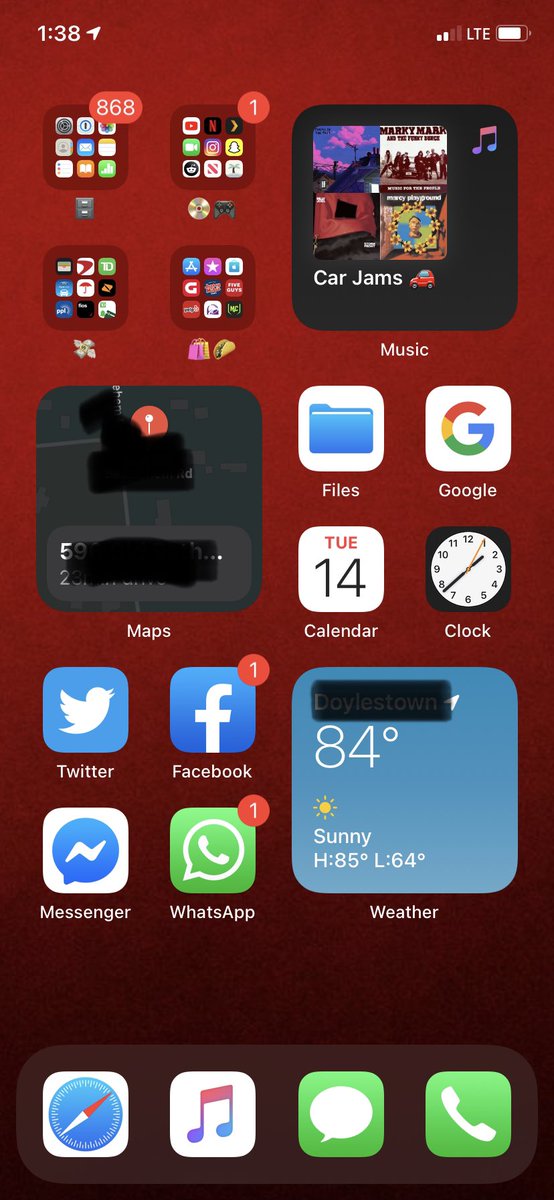
I have every single app on my phone all organized into folders on the first page. Being able to "banish" the apps I use once a year to the app library to clear up space for essential apps+widgets is a dream to me.

Looking at my phone right now, I'll have 12 frequently used apps at the bottom (last two rows and dock) and the top 4x4 filled with widget stacks. I'll use the widgets for glanceable stuff and as a launcher (ie Fantastical, Things, Notes, etc). And then if I need anything not in my widget stacks or the bottom apps I have search.

I don't even personally care about the App Library as a browsable thing, I care about it as a "get 150 of these apps off my home screen" thing.

its a little odd to me still. They don't 'disappear' - they're still in the last page, but now its an automatic list. I kind of had that anyway - a 'dustbin' page with a few folders crammed full of stuff I either never used - like preloaded apps, or only used via search. So I'm still finding it slightly confusing the actual benefit.
 

Humidex

Member
Oct 27, 2017
14,171
Widgets not a thing for me. But something else is; being able to use the volume down button for burst shooting. Thank Christ that came back.
 

thisismadness

Member
Oct 25, 2017
4,445
its a little odd to me still. They don't 'disappear' - they're still in the last page, but now its an automatic list. I kind of had that anyway - a 'dustbin' page with a few folders crammed full of stuff I either never used - like preloaded apps, or only used via search. So I'm still finding it slightly confusing the actual benefit.

Interestingly, its not actually a page. It's a overlay like notification/control center. Would be neat if they provide direct access to it while using other apps, even if its through backtaps or some other accessibility feature.
 

Humidex

Member
Oct 27, 2017
14,171

bry

Member
Oct 27, 2017
1,293
I wish the pinning imessage feature was just the conversations looking as they do with ur preferred ones on top lol.

I don't use contact pictures for my contacts or even have it enabled in messages.
It's a minor thing but i put it as feedback that we should have the option to maintain the regular look with pinning.
 
Oct 27, 2017
1,258
I wish the pinning imessage feature was just the conversations looking as they do with ur preferred ones on top lol.

I don't use contact pictures for my contacts or even have it enabled in messages.
It's a minor thing but i put it as feedback that we should have the option to maintain the regular look with pinning.

Yeah that's how I feel. I find it too hard to notice I have an unread message with a pinned contact.
 

The Real Abed

Member
Oct 25, 2017
7,722
Pennsylvania
Nope. For the people who kept things tidy like we do it's actually a downgrade I'd say.
Well actually I'm one of those people and this update basically made me rethink everything. I had everything on one page with two folders full of remaining apps split into two categories. Media and Tools. When I first installed 14 I had two pages with 6 Widgets and 12 apps per page with more folders. Now I have it back down to one page. 3 small Widgets. Three groups of four icons. 8 of them are my important apps. The other four are folders with one page each except for one that has two pages.

Ec526qBXsAE9vDg


It's so nice not having those dots down there anymore just for the Widget screen. But I feel that empty space is wasted. I wish I could cram one more row in. And I still wish I could have thinner widgets with 1 icon height. Even if it's just a 4x1 option.

Basically I can see almost every app at once on one screen. The only 9 I can't are lesser used but still readily available in the Media/Social folder.

It's a work in progress. I wish there was a Now Playing app instead of just links to playlists. Let me have both in one. I don't even need controls. I just want the song shown. And the Music note should just open Music and not also act as a playlist link.
 

Orb

Banned
Oct 27, 2017
9,465
USA
So far I haven't found home screen widgets to be all that useful. Maybe when third-party devs can create stuff I will have more of a reason to use them. But I really like the move to the App Library concept. For years I have basically been using Spotlight as an app launcher and this allows me to think about app organization and clutter a lot less. I just keep my first home screen with a handful of critical apps that I use a lot, and search for the rest when I need them.
 

Haribokart

Banned
Oct 27, 2017
1,065
Well actually I'm one of those people and this update basically made me rethink everything. I had everything on one page with two folders full of remaining apps split into two categories. Media and Tools. When I first installed 14 I had two pages with 6 Widgets and 12 apps per page with more folders. Now I have it back down to one page. 3 small Widgets. Three groups of four icons. 8 of them are my important apps. The other four are folders with one page each except for one that has two pages.

Ec526qBXsAE9vDg


It's so nice not having those dots down there anymore just for the Widget screen. But I feel that empty space is wasted. I wish I could cram one more row in. And I still wish I could have thinner widgets with 1 icon height. Even if it's just a 4x1 option.

Basically I can see almost every app at once on one screen. The only 9 I can't are lesser used but still readily available in the Media/Social folder.

It's a work in progress. I wish there was a Now Playing app instead of just links to playlists. Let me have both in one. I don't even need controls. I just want the song shown. And the Music note should just open Music and not also act as a playlist link.
Does having the maps widget not cane your poor battery?

I'm not going on until it fully releases, but can you now properly 'hide' apps or am I misinterpreting what I read above?
 

The Real Abed

Member
Oct 25, 2017
7,722
Pennsylvania
Does having the maps widget not cane your poor battery?

I'm not going on until it fully releases, but can you now properly 'hide' apps or am I misinterpreting what I read above?
Not that I've noticed. It doesn't update that often anyway. It only updates when it thinks you have a destination to be at. I could live without it on the Home Screen though so when 14 comes out I'll probably end up replacing it with another widget. But it doesn't really hit my battery at all. According to the Battery section though it has used 10% of my last 24 hours.

Yes you can hide apps. They'll disappear from the Home Screen and only show up in the Library. You can then put them back if you want. Apple basically gave us their interpretation of how Android works. Their own Widget behavior, their own home screen and their own App Drawer. They work differently but they're basically the same in the end. (Well, Widgets will need work of course.)
 

John Caboose

Member
Oct 26, 2017
2,199
Sweden
But even then, is there a difference in the end between customized folders now and customized ones in the app library?

I'm not the one you quoted but afaik the library folders are infinite scroll but the regular old folders are page-based (9 per page). I wish the regular folders would be upgraded to infinite scroll versions too.
 

Aria

Member
Nov 21, 2019
538
Well actually I'm one of those people and this update basically made me rethink everything. I had everything on one page with two folders full of remaining apps split into two categories. Media and Tools. When I first installed 14 I had two pages with 6 Widgets and 12 apps per page with more folders. Now I have it back down to one page. 3 small Widgets. Three groups of four icons. 8 of them are my important apps. The other four are folders with one page each except for one that has two pages.

Ec526qBXsAE9vDg


It's so nice not having those dots down there anymore just for the Widget screen. But I feel that empty space is wasted. I wish I could cram one more row in. And I still wish I could have thinner widgets with 1 icon height. Even if it's just a 4x1 option.

Basically I can see almost every app at once on one screen. The only 9 I can't are lesser used but still readily available in the Media/Social folder.

It's a work in progress. I wish there was a Now Playing app instead of just links to playlists. Let me have both in one. I don't even need controls. I just want the song shown. And the Music note should just open Music and not also act as a playlist link.
For a neat freak how do you deal with all those red notifications!
 
Oct 29, 2017
1,494
Loving the app library. Loving the shift towards more vital info being present at all times with widgets. Hate the Music widget. I don't care about playlists. Just let me tap the play button and resume where I left off. If it's a fresh start maybe it could just launch into a most played/playlist screen
 

dallow_bg

Member
Oct 28, 2017
10,628
texas
This is are my 3 home screens now.

The bigger top widget is Calendar and Weather.
The small square is just a stack of a few items... wish I could edit it a bit more.

2nd page stock widget is just there, to be replaced when some 3rd party stuff starts rolling in.
Actually a lot of this may change depending on what 3rd party apps do.

ftxXaWvl.png


2NZFOKFl.png


Q9G8SIcl.jpg
 

The Real Abed

Member
Oct 25, 2017
7,722
Pennsylvania
For a neat freak how do you deal with all those red notifications!
Quickly. Aside from Mail I always clear them ASAP. I only have them here because it was a Tweet that said "post your home screen as it is right now."

Also Tinder. I rarely open that. I should just delete it. The only notifications I get are useless anyway. I usually only open it to clear the notification or for some reason keep my account active when they tell me I'm about to be hidden. lol

dallow_bg That's a lot of folders. Do you use all those apps? How many pages do those folders have?
 
OP
OP
브라이언

브라이언

Avenger
Oct 27, 2017
3,169
Well actually I'm one of those people and this update basically made me rethink everything. I had everything on one page with two folders full of remaining apps split into two categories. Media and Tools. When I first installed 14 I had two pages with 6 Widgets and 12 apps per page with more folders. Now I have it back down to one page. 3 small Widgets. Three groups of four icons. 8 of them are my important apps. The other four are folders with one page each except for one that has two pages.

Ec526qBXsAE9vDg


It's so nice not having those dots down there anymore just for the Widget screen. But I feel that empty space is wasted. I wish I could cram one more row in. And I still wish I could have thinner widgets with 1 icon height. Even if it's just a 4x1 option.

Basically I can see almost every app at once on one screen. The only 9 I can't are lesser used but still readily available in the Media/Social folder.

It's a work in progress. I wish there was a Now Playing app instead of just links to playlists. Let me have both in one. I don't even need controls. I just want the song shown. And the Music note should just open Music and not also act as a playlist link.
Just letting you know, using the highlight/pen tool in markup does not cover sensitive data, the tool is semi transparent and someone can easily edit it to see what data lies underneath. Use the shape tool instead if you're using markup (shape -> rectangle -> fill in)
 

Deleted member 8166

Account closed at user request
Banned
Oct 26, 2017
4,075
updated my gen 2 Apple Watch to the latest watch os6 update and now iOS14 does not show the battery life of my Apple Watch anymore.

time to write a report.

Reminder: WRITE REPORTS :D

edit: restart of both devices fixed it。
 

FliX

Master of the Reality Stone
Moderator
Oct 25, 2017
9,868
Metro Detroit
I hope the stock tiles get more customization options.
I would love a 2x2 calendar tile with just the left side of the 2x4 tile. Who cares about the full month of days?

8jKz9pL.png
 

MrKlaw

Member
Oct 25, 2017
33,038
I'd like the exact opposite - just the month grid. Have an app on my MacBook Pro just for that - it's useful when planning.

maybe a 2x2 smart widget with the two layered on top of each other so I can toggle?
 
Oct 27, 2017
4,642
I hope the stock tiles get more customization options.
I would love a 2x2 calendar tile with just the left side of the 2x4 tile. Who cares about the full month of days?

8jKz9pL.png
I'd like the exact opposite - just the month grid. Have an app on my MacBook Pro just for that - it's useful when planning.

maybe a 2x2 smart widget with the two layered on top of each other so I can toggle?
seems like this could be solved with a 2x2 with pages and you swipe for which half you want?
 

The Real Abed

Member
Oct 25, 2017
7,722
Pennsylvania
I hope the stock tiles get more customization options.
I would love a 2x2 calendar tile with just the left side of the 2x4 tile. Who cares about the full month of days?

8jKz9pL.png
I want the opposite. I want a 2x2 with the month of days on it.
I'd like the exact opposite - just the month grid. Have an app on my MacBook Pro just for that - it's useful when planning.

maybe a 2x2 smart widget with the two layered on top of each other so I can toggle?
Yeah, they could just make a month view a fourth option and you'd just be able to make your own Smart Widget that includes both. Everybody wins. They've already shown some widgets can have alternate versions of each size like the News widgets that can have top stories or categories if you want. More customization will make Widgets amazing. I'm sure some app dev will have a calendar view within a week or so. THat's why I'm excited for the full release when we can actually see what devs are gonna do with them.
 

leder

Member
Oct 25, 2017
7,111
My iPhone 8 battery has been getting murdered. Going to turn off widgets and see if that helps tomorrow.
 

Halbrand

Member
Oct 27, 2017
19,615
Man I really don't like the alarm clock change. You type in the time you want now instead of scrolling through the time with the haptic feedback.
 

Ashhong

Member
Oct 26, 2017
16,595
I hope the stock tiles get more customization options.
I would love a 2x2 calendar tile with just the left side of the 2x4 tile. Who cares about the full month of days?

8jKz9pL.png
Isn't that pretty much what the 2x2 tile is? Although it also has the current day. I don't actually have any events so I didn't test it out though
 

Cipher Peon

One Winged Slayer
Member
Oct 25, 2017
7,800
Question for those who have iOS14: Does Siri have the ability to convert timezones? Siri atm can't do that and it's the number 1 thing I'd like for it to do.
 

SnakeXs

Member
Oct 28, 2017
3,111
Question for those who have iOS14: Does Siri have the ability to convert timezones? Siri atm can't do that and it's the number 1 thing I'd like for it to do.
I asked her the time in Athens and Moscow and she nailed it, assuming that's what you were looking for.
Also asked her "When it's 6PM here what time will it be in..." and she just said the current time in said place.
 

Cipher Peon

One Winged Slayer
Member
Oct 25, 2017
7,800
I asked her the time in Athens and Moscow and she nailed it, assuming that's what you were looking for.
Also asked her "When it's 6PM here what time will it be in..." and she just said the current time in said place.
More like "What is 3PM PT in EST"

I just asked Siri that and she said "Sorry, I don't know the date in Egilsstaör, Iceland" which ???????
 

ghostcrew

The Shrouded Ghost
Administrator
Oct 27, 2017
30,351
I don't know what happened but my battery has suddenly turned super poor. Is there a new dev beta yet?

Came here to say this. My battery is being slayed these past few days. I'm having to charge my phone during the day. My 11 Pro Max would last two days before.

It gets hot just running Safari at the moment. Something changed?
 

Deleted member 21709

User requested account closure
Banned
Oct 28, 2017
23,310
What's the performance like on a 7 Plus? I'm expecting these widgets will impact battery life/performance in some way.
 

BAD

Member
Oct 25, 2017
9,565
USA
I'm guessing we'll probably get a new beta release this coming week?
2 weeks between builds is somewhat regular, so... maybe?

Gotta say, the way a widgets expand to full screen and shrink back to their widget space is wonderful.
If I remember correctly, they tend to be a little spaced out the beginning with some of them taking two weeks to come, but sometimes become weekly for the last several weeks as they start knocking out bugs for the final release going on new iPhones in September.

But I could be remembering wrong...

We definitely have gotten them weekly at some points in the past.
 

SnakeXs

Member
Oct 28, 2017
3,111
If I remember correctly, they tend to be a little spaced out the beginning with some of them taking two weeks to come, but sometimes become weekly for the last several weeks as they start knocking out bugs for the final release going on new iPhones in September.

But I could be remembering wrong...

We definitely have gotten them weekly at some points in the past.
You're definitely not wrong.
 

dallow_bg

Member
Oct 28, 2017
10,628
texas
dallow_bg That's a lot of folders. Do you use all those apps? How many pages do those folders have?

It's just under 400 apps, haha. Most of the folders are only 2-3 pages, a lot of 1 pagers, and just a few reaching 4.
I've actually started going in to preen and deleted a number of apps now. Should have done this a while ago.

Customize and apple. Name a more unlikely duo :p

I don't know what happened but my battery has suddenly turned super poor. Is there a new dev beta yet?
Ha, I know.

My battery has now gone bad too and the phone is getting very hot all the time...