Note: I'm talking about the labeling itself and not the actual box art. Which is why I didn't list Sega or Playstation examples as they've always kept their labeling rather reserved.
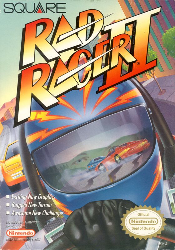
Anyways, I felt these 3 different systems get the point i'm trying to make across. With SNES you had the border with a lot of extra flair that had no rules to how it was used.
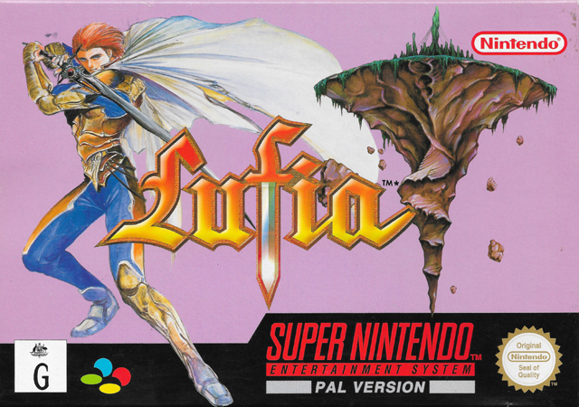
This was the case with a lot of SNES titles for the times and it really added for some unique designs and ideas on how to work around the unqiue aspects of the SNES Standard Box Labeling.
With N64, things got a bit more uniform, but it was still quite the contrast to everuthing else out at the time. A box made so that you could see the game itself, the exclusivity, and what features it offered right on the front was a unique concept perfect for window shopping. Even now I wish this format didn't go completely away, as it would save me from having to pull out my phone to check.
Lastly with the OG Xbox (the last generation I consider to have "rad" labeling), you just have this extreme edge to everything that for me is still pretty iconic. The "Only on Xbox" stamp was always a standout and the "Live - Online Enabled" banner worked well with all the components on just about any box. To this day i'm impressed that MS managed some iconic game labeling out of the gate.
Sadly that seemed to be the last system to pull it off. Everything after OG Xbox on any system seemed to go for a more reserved looked and that trend has been settling more and more as time goes on. With even labeling from the start of the gen transforming to be more "clean", which is understandable from a marketability standpoint and to get titles out of the eyes of being seen as "Just Toys". Thankfully there are folks like Limited Run Games that still manage to have some fun with their Box Labeling from time to time.