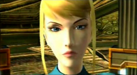
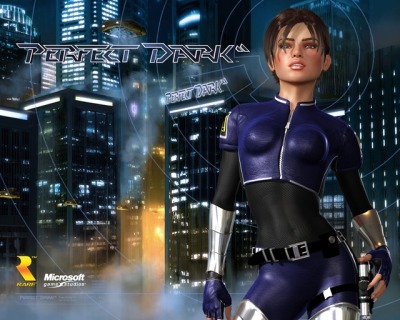
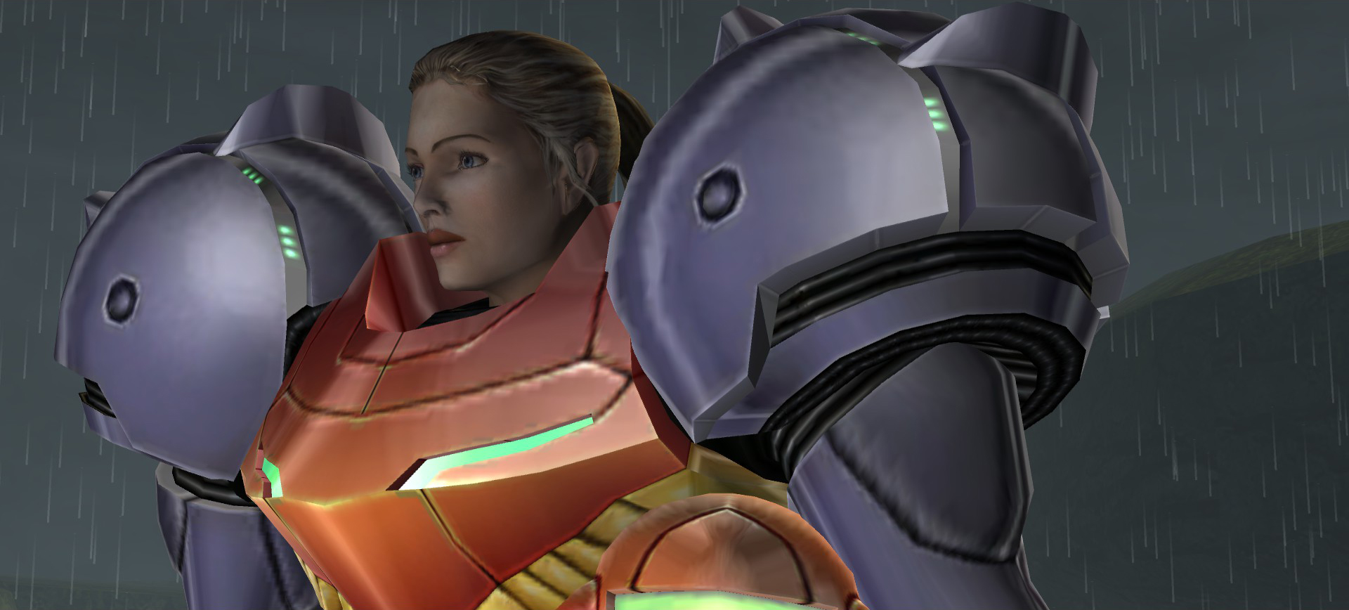
Joanna Dark's N64 design I don't find particularly amazing - It's definitely some late 90's stink, but I think it's servicable enough, and distinct as Joanna Dark
I think what I like the most about her design here is her shorter hair, something that wasn't so common back then, I feel.
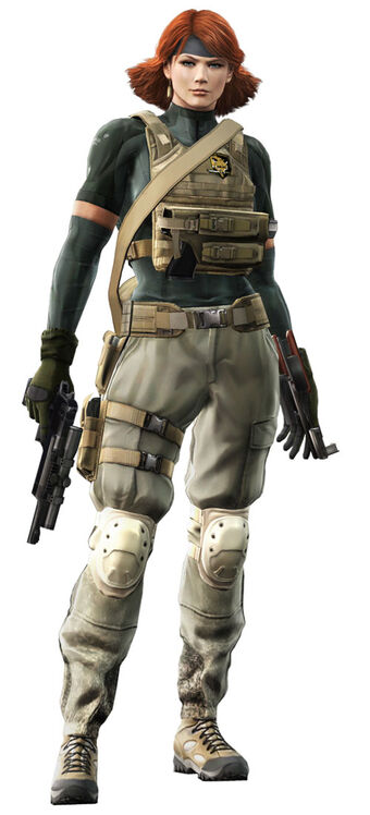
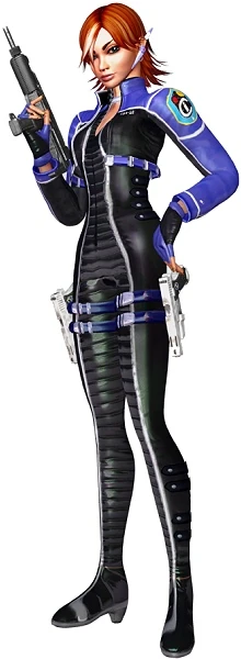
But then Perfect Dark Zero happens.
And, man, outside of being a garbage-to-mediocre video game, I hate hate hate Joanna's design.
Like... What? That's not even the same person. Why does she look like she wants to sell me the latest flavor of Mountain Dew? Why is her hair longer and more cartoonishly red? She looks straight out of Max Steel or Action Man, somehow moreso than the original.
Why is she a shitty Black Widow?
Joanna Dark has pretty much always been a sort of "Sexy Skintight Suit Spy Woman" trope, which is certainly a product of Rare's, and gaming-at-large's sensibility at that time, and yet I still find the Perfect Dark Zero design so much trashier? I abhor it and seriously hope it doesn't erase the original and become the defacto design.
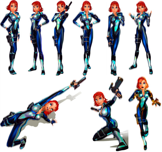
But that's okay, right? In Perfect Dark, Joanna is sort of known to wear different outfits, remember?
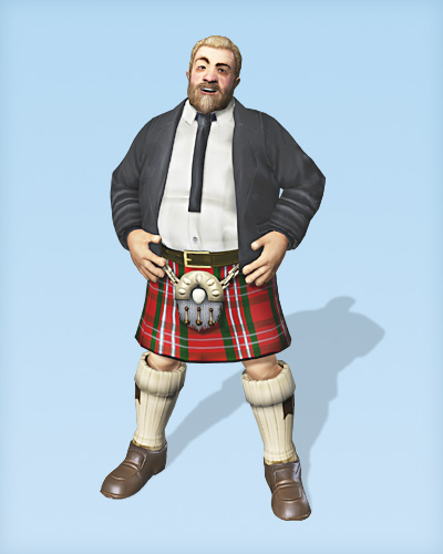
For some reason, I can't find her Chinese dress from the first game online, but it was generally... Alright? Questionable appropriation aside, I guess the idea is that it's a sort of formal dress for her. In PDZ, we get... A Sim With Guns?
I'm a fan of a good chunk of Rare games, but I feel they've never been super known for great art design. But this is
offensively bad.
Maybe with a slight change in art style, a new Joanna Dark with the PDZ design could look alright? But it's so extremely dated in an awful way, to a degree that the original isn't. For me the big thing is the super red, longer hair. I already loathe Scarlett Johannsen and I'd really rather we try not to stick to the idea of bootleg Black Widow.