• Ever wanted an RSS feed of all your favorite gaming news sites? Go check out our new Gaming Headlines feed! Read more about it here.

btags

Member
Oct 26, 2017
2,078
Gaithersburg MD
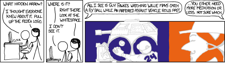
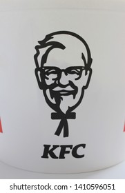
Alright, time for peak logo design. People always think the Fedex logo is cool, well how about some old northwest airlines logo!

The N (black line) and W (grey dashed line) for NorthWest are clearly visible, but I have outlined them for clarity. Then on top of that, the little red triangle that makes up the top left of the W, what direction is it pointing in? THE MOTHFUCKIN' NORTHWEST!!!!

nwlogomarkedv3kq4.png


And the logo by itself:

nwlogounmarkeddskfa.png
 

LordofPwn

Member
Oct 27, 2017
4,402
You lost me there. I don't believe your lies.
please excuse the slopiness, i already had after effects open and i didnt want to spend more time on this than i had to.
0gBWGng.png


obviously the vertical stabilizer is a more retro exaggeration but that's where it's located in the logo design. if they would have used small caps they still would have had the arrow but would not have had the axel and wheels nor the plane vertical stabilizer shapes. also yes the lower rounded parts of the e and the d (the wheels) go below the bottom of the "F" and "Ex" because how else would it travel?
 

fontguy

Avenger
Oct 8, 2018
16,151

Little known fact: the golden ratio is mostly just bullshit us designers use to sell execs on our logos. Rubes love it when you tell them there's magical math stuff that secretly shapes our civilization and the human perception of beauty, but it's not true. In fact, most of the time, perfect math = ugly. Fibonacci ain't shit.

And if you actually look at that picture, literally nothing about that Apple logo conforms to the ratio. The spiral grid overlays are totally arbitrary. The best you can say is that they indeed did use circles in a couple spots.

These meaningless lines are somewhat of a joke among designers.

zjvtMYj_d.jpg


"Just look at all the math that went into this! I'm so smart. Give me money, please."
 

Afrikan

Member
Oct 28, 2017
16,968
That ain't too bad. I never knew/cared how to spell the word "Etcetera".... I have been pronouncing it the wrong way in my head since this forum started. Thought it was some weird new slang and brushed it off.

Then one day I finally watched the movie Split...and had subtitles on. MINDBLOWN! 🤦🏾‍♂️
 

Joe

Member
Oct 25, 2017
8,593
Little known fact: the golden ratio is mostly just bullshit us designers use to sell execs on our logos. Rubes love it when you tell them there's magical math stuff that secretly shapes our civilization and the human perception of beauty, but it's not true. In fact, most of the time, perfect math = ugly. Fibonacci ain't shit.

And if you actually look at that picture, literally nothing about that Apple logo conforms to the ratio. The spiral grid overlays are totally arbitrary. The best you can say is that they indeed did use circles in a couple spots.

These meaningless lines are somewhat of a joke among designers.

zjvtMYj_d.jpg


"Just look at all the math that went into this! I'm so smart. Give me money, please."

Thank you. I was sitting here, looking at the pinkish golden spiral part of the diagram, thinking "but...it's not corresponding to anything in the logo..."
 

Aztechnology

Community Resettler
Avenger
Oct 25, 2017
14,134
I'm sitting here confused. And forgot we did it on Resetera discord before the site was up.