-
Ever wanted an RSS feed of all your favorite gaming news sites? Go check out our new Gaming Headlines feed! Read more about it here.
Holy fuck Resetera's logo is an arrow
- Thread starter Lant_War
- Start date
You are using an out of date browser. It may not display this or other websites correctly.
You should upgrade or use an alternative browser.
You should upgrade or use an alternative browser.
^^^^
That's incredible.
That's incredible.
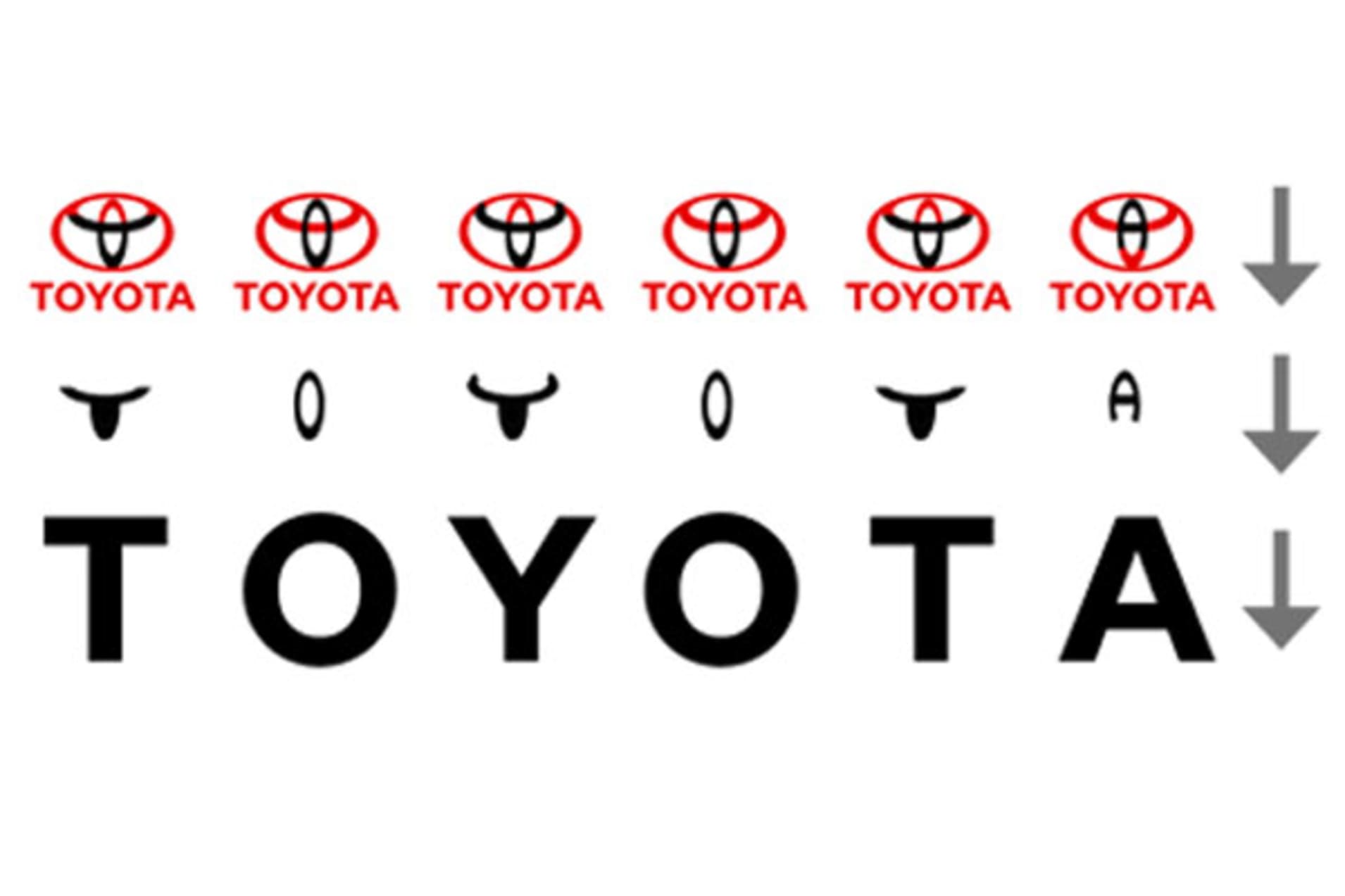
The smile I've always known, but the more obvious "A to Z" that the arrow implies has gone unnoticed by my eyes until now.

It's also an upside down diamond.
Okay this one fucked me up ...wtf
FFFUUUCCCKKKK That's clever! I'm more of a Ford guy myself, but that's damn impressive and I gained some extra respect for them.


Whoa. I always noticed the arrow, but I never noticed the small black R.
I can't tell if you're being serious.the white space between the f and e is a plane's tail. the e and d form wheels where the bar in the e makes an axel connecting them. it's to symbolize they do air and ground shipping to you.
It's more of a smug ass smirk.
i'm being serious. i've learned about it a couple of times across the various design and marketing classes I've taken.
lol first thing I thought of
I mean lets be real, you can only go so left when you're half gaming forum Lolleft but not TOO left
forward but lmao let's not get carried away!
This is the real mind blown realization.
I've always seen the arrow, but don't see the R.
Also, it doesn't make sense, should've been a reset button
Also, it doesn't make sense, should've been a reset button
the white space between the f and e is a plane's tail. the e and d form wheels where the bar in the e makes an axel connecting them. it's to symbolize they do air and ground shipping to you.
Huh, I can actually see the wheels now that you mention it, but I am not seeing the plane tail.
i'm being serious. i've learned about it a couple of times across the various design and marketing classes I've taken.
I still think you're joking around with me. The shapes you describe aren't reasonably inferred from the image at all, haha. about the only thing that the e in the D have in common with wheels is the circular shape. I can't fathom that anyone would get any of that from looking at this logo

Clearly the logo is a reference to crane games, which serves as both a reference to niche videogame as well as the ways in which microtransactions and lootboxes affect the industry today.
In this essay, I will
Goddamnit how was I beaten

You lost me there. I don't believe your lies.the white space between the f and e is a plane's tail. the e and d form wheels where the bar in the e makes an axel connecting them. it's to symbolize they do air and ground shipping to you.
My daughter points it out everytime she sees it.
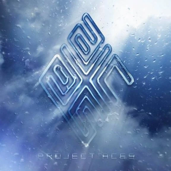
Also, Project Aces' logo actually spells out "aces".
Also, Project Aces' logo actually spells out "aces".
Vertical stabilizer is what i was thinking of.Huh, I can actually see the wheels now that you mention it, but I am not seeing the plane tail.
totally not joking. heard about it in a summer marketing class over a decade ago and then once again in a design class almost a decade ago.I still think you're joking around with me. The shapes you describe aren't reasonably inferred from the image at all, haha. about the only thing that the e in the D have in common with wheels is the circular shape. I can't fathom that anyone would get any of that from looking at this logo
if i get time i can try and highlight them.
I still think you're joking around with me. The shapes you describe aren't reasonably inferred from the image at all, haha. about the only thing that the e in the D have in common with wheels is the circular shape. I can't fathom that anyone would get any of that from looking at this logo
The wheels are easy to see actually.
where do you see the claw?
where do you see the R?
This one is new to me. Very cool.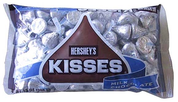
The negative space between the K and the I forms a Hershey's kiss.
Same as the arrow.
I don't know why there's an arrow in the Era logo at all. No disrespect to the designer(s), but it makes no sense and seems to be included for simply for inclusion sake (unless it's something like, "We strive to move the gaming community forward." 🙄)