• Ever wanted an RSS feed of all your favorite gaming news sites? Go check out our new Gaming Headlines feed! Read more about it here.
Status
Not open for further replies.
Oct 20, 2018
1,281
Brazil
Answered everything inside the quote since there was too much stuff to talk about =P

Oohh, that looks pretty, I love it! Red and green are complementary colors so they work really well together.

Thanks, I'll keep improving it as I go.

Sorry, I meant to comment on that but I completely forgot! Yeah, I was thinking of something like option d), which is exactly what Hyrule Warriors does: hearts are character-specific, and in fact, you need to be playing that character to even pick them up (but you can probably relax that restriction in your game).

Oh, no problem! I've posted way too much today already so you were bound to miss something haha. I haven't played Hyrule Warriors yet (I really should get to it one of these days...), but I guess that's one way of doing it. As for restricting the player, instead of just letting anyone open the chest, I could maybe tie it in with puzzles since the general idea is that characters themselves would have abilities similar to Zelda items. So you'd need a specific character to be able to reach its respective heart pieces. We'll see.

I feel like the "scale" you use determines a lot of the "tone" of your game, but that might be a personal thing. Like, in a game like a Mario RPG, enemies doing 1 and 2 points of damage (and you likewise) makes it feel more whimsical and fun than if they did, say, 1487 points of damage. There is some logic behind that, because higher values allow you more granularity and fine-tuning: a "+5% damage" passive skill, for example, doesn't make any sense in a game where you do 1 or 2 points of damage. I personally would try to use values as low as possible that don't paint you into a corner.

I definitely don't want damage to get to a point where you can do thousands of damage, so I want to keep it on the lower side. But 8HP per heart seems a little bit too low actually, so I'll probably go with 16. I'll have to make it so it's easy to change those values and experiment regardless since that'll make balancing the game much easier later on.

That said, you can always change these values afterwards. I originally had 100 HP per heart (25 per quarter), but decided to lower it to 40 (10 per q). If you use a constant for the HP-to-quarter ratio, and define as many HP values as hearts as you can, then you can change this ratio afterwards without much hassle.

What are you going to do with the enemies? Are their healths going to be displayed as hearts or HP?

I was thinking of doing it like most turn-based RPG's where you can't really see how much HP an enemy has but if I'm using hearts maybe it's better to show it? Your way of doing it where enemies use HP and the player uses hearts sounds good to me, but either way I haven't decided whether it's better to show the enemy's health or not.
 
Last edited:

Kalentan

Member
Oct 25, 2017
44,626
Sorry guys but I don't get this. Isn't the whole point of the thread to show our work and get feedback? A more active thread is always better than a slower thread, absolutely don't worry about "cluttering" it or anything like that!

Whenever it comes to forum threads or discord I am constantly worried about: "Spamming it".

Like I'm always thinking (regardless of game dev or my writing): "Oh did I make enough tweaks/improvement/progress to actually make a worthwhile post?"

However at the same time I want feedback on micro changes- but that can add up very quickly. Also a guess a fear of feeling like your too reliant.
 

Weltall Zero

Game Developer
Banned
Oct 26, 2017
19,343
Madrid
Whenever it comes to forum threads or discord I am constantly worried about: "Spamming it".

Like I'm always thinking (regardless of game dev or my writing): "Oh did I make enough tweaks/improvement/progress to actually make a worthwhile post?"

However at the same time I want feedback on micro changes- but that can add up very quickly. Also a guess a fear of feeling like your too reliant.

Nah, screw that :D . We're all hear to learn and talk to each other about our games. The more we post, the more tightly-knit the community becomes. :)

I get (and share) that occasional feeling of being a bit too reliant on others to make some choices, but in the end, we are reliant on them. No one single developer has 360º vision, and we will always see the trees rather than the forest. It helps if we're part of a team, but for solo devs, I feel like constant feedback is usually the way to get the birds-eye view of the game and stay on the right track of what's important and what's self-indulgence (not that you shouldn't self-indulge once in a while!), and there should be no shame in that.

That doesn't mean you have to actually obey that feedback; filtering out the things that are actually insightful and useful, from the things that are a result of not being privy to the current and future details and intrincacies of your game's design, is one of, if not the most important job of a game designer. But learning to listen regularly to feedback is a skill one definitely needs to work a lot on, because we usually don't listen unless we're insecure, which is the worst time to listen. When properly developed, this skill can make your game 10x better by making you see avenues of improvement and development you would have never thought.
 

jarekx

Member
Oct 25, 2017
623
Answered everything inside the quote since there was too much stuff to talk about =P

I prefer showing enemy HP in some form. Gives the player more information when choosing actions. It definitely depends on the game though. Of course, you could tow the the line and have skills or abilities or something that allowed you to see HP at some point.

I do like the hearts as your HP indicator for a turn based game. A lot simpler to read and understand how much damage an action does, how far your remained hp would go, etc. Actually something like that would probably work well for the system i'm working on so i'm sad I didn't think of it myself. lol

FGPTSyC.jpg


I definitely need some more practice. LOL. Shield looks a little too low on the back but i think i could do something with this. I definitely need to settle on a palette. I tried a version with and without the eyes and yup, definitely feels better with that. Just a bit more human.
 

Weltall Zero

Game Developer
Banned
Oct 26, 2017
19,343
Madrid
I definitely need to settle on a palette. I tried a version with and without the eyes and yup, definitely feels better with that. Just a bit more human.

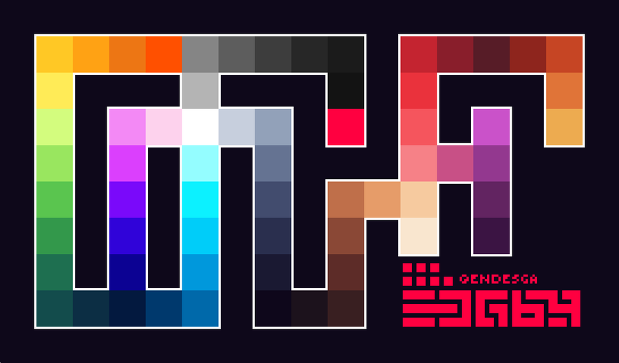
I say this like every other page, hahah, but I can't recommend the Endesga 64 palette enough. It improves the look of pretty much any game using it; all of its colors are vibrant and pleasant, and it's the perfect middle point between "too many colors" and "too few".

DbxFFD8VwAE27fi
 

Deleted member 62221

User requested account closure
Banned
Dec 17, 2019
1,140
I prefer PC strategy games but since I have savings now I think I could invest a few months making a couple of mobile games. I have an idea I want to try:

 
Oct 20, 2018
1,281
Brazil
I say this like every other page, hahah, but I can't recommend the Endesga 64 palette enough. It improves the look of pretty much any game using it; all of its colors are vibrant and pleasant, and it's the perfect middle point between "too many colors" and "too few".

Haven't seen you talk about it before but thanks for that, I was using Aseprite's default palette which kinda sucks so I always wasted a lot of time just picking colors. I didn't even know you could import custom palettes this easily and I've used that program for 100 hours already, oops =P

I prefer showing enemy HP in some form. Gives the player more information when choosing actions. It definitely depends on the game though. Of course, you could tow the the line and have skills or abilities or something that allowed you to see HP at some point.

I do like the hearts as your HP indicator for a turn based game. A lot simpler to read and understand how much damage an action does, how far your remained hp would go, etc. Actually something like that would probably work well for the system i'm working on so i'm sad I didn't think of it myself. lol

FGPTSyC.jpg


I definitely need some more practice. LOL. Shield looks a little too low on the back but i think i could do something with this. I definitely need to settle on a palette. I tried a version with and without the eyes and yup, definitely feels better with that. Just a bit more human.

I don't like showing the enemy HP from the get go but using an ability to reveal it sounds good, so I'll probably go with that and maybe have a specific character have that ability.

@ your sprite, it's simple but I like it! As you said, palette could probably use some work though, but it doesn't look bad at all as is.
 

Weltall Zero

Game Developer
Banned
Oct 26, 2017
19,343
Madrid
Haven't seen you talk about it before but thanks for that, I was using Aseprite's default palette which kinda sucks so I always wasted a lot of time just picking colors.

I have EDG64 set to my default palette on Aseprite. I think Aseprite still doesn't include EDG64 by default, only EDG32? I've uploaded the palette and index files to include it (drop them in Aseprite\data\extensions\endesga-palettes):

I didn't even know you could import custom palettes this easily and I've used that program for 100 hours already, oops =P

Well...
wjkgvDs.png
 

K Monkey

Member
Oct 25, 2017
278
Haven't really posted anything in here in a while since I've really been focused on planning my next VN more than anything. Taking my sweet time and not really rushing anything which feels nice.

OybEcTf.png

6WvTQoh.png

that looks awesome.. you should post more :)

Another weekend arrives.. started to work on the House sections a bit more! I've been neglecting these sections as there were many bugs to iron out in the catacombs but its now in a good place.

 
Oct 26, 2017
3,915
I was using Aseprite's default palette which kinda sucks so I always wasted a lot of time just picking colors.

I feel like I can give some advice here, as this was something that I did too. I'm no artist, and I spent hours upon hours trying to create a pallete that worked. I went through every stage that newbies do. First making everything too similar, then too garish etc. Basically nothing I did ended up right.

I can whole hartedly recommend using someone else's palette right from the start. It saves so much time, and also by working with colours that you "know" are "correct", it helps you learn what works and what doesn't. Then, when you need to make small changes to the pallete (Because in my experience, every now and again you'll need to add an adidtional shade or something) the changes you make won't stray too far from what is decent.

The pallete I used isn't one that was purpose made and presented such as the one Welltal posted, I just found a picture on twitter (Or reddit, can't remember) that I liked the colours of and created one based on what colours that artist used. I don't think pinching colours counts as copyright infringement, haha!
 

jarekx

Member
Oct 25, 2017
623
Wow, Aseprite is great. Downloaded it after looking here and it's really nice. Definitely a step up from the GM sprite editor. Lol. Imported the palette and i'm now good to go. Let's see what I can do now :)
 

Weltall Zero

Game Developer
Banned
Oct 26, 2017
19,343
Madrid
I'm very pleased how the in-game achievements list looks now, especially considering yesterday it was a random assortment of equally randomly colored-background with no rhyme or reason to them.


that looks awesome.. you should post more :)

Another weekend arrives.. started to work on the House sections a bit more! I've been neglecting these sections as there were many bugs to iron out in the catacombs but its now in a good place.


that lightning clap was NOT scripted (its random in the game)... its a sign


Ergastulum is consistently terrifying, amazing job. It's very interesting because first person games with this kind of atmosphere (e.g. Amnesia, etc.) tend not to have combat in order to emphasize the player's helplessness.

I'm now curious if something would have happened if you turned off the light before saying Bloody Mary thrice. :)
 

Mike Armbrust

Member
Oct 25, 2017
528
I'm very pleased how the in-game achievements list looks now, especially considering yesterday it was a random assortment of equally randomly colored-background with no rhyme or reason to them.


Those achievements are looking great. Even as steam achievements and psn trophies have become standardized, I've always appreciated in game achievements more. They feel like they are actually a part of the game's design instead of something just thrown on top.
 

Weltall Zero

Game Developer
Banned
Oct 26, 2017
19,343
Madrid
Those achievements are looking great. Even as steam achievements and psn trophies have become standardized, I've always appreciated in game achievements more. They feel like they are actually a part of the game's design instead of something just thrown on top.

To be fair, the entire reason I'm making them is because I want to release the game on Steam, hahah. But since it's probably going to release on Switch eventually too, plus there's a DRM free Humble version, I wanted everyone to be able to unlock and see them.

I'm also considering making them give some of the currency you use to unlock stuff, which is a very Into the Breach thing to do (currently it mostly drops from bosses, like in Enter the Gungeon).
 
Oct 20, 2018
1,281
Brazil
I feel like I can give some advice here, as this was something that I did too. I'm no artist, and I spent hours upon hours trying to create a pallete that worked. I went through every stage that newbies do. First making everything too similar, then too garish etc. Basically nothing I did ended up right. I can whole hartedly recommend using someone else's palette right from the start. It saves so much time, and also by working with colours that you "know" are "correct", it helps you learn what works and what doesn't. Then, when you need to make small changes to the pallete (Because in my experience, every now and again you'll need to add an adidtional shade or something) the changes you make won't stray too far from what is decent.

Yeah, having a good palette goes a long way, as you can see below with my first test using the new palette Weltall provided us here.

I'm very pleased how the in-game achievements list looks now, especially considering yesterday it was a random assortment of equally randomly colored-background with no rhyme or reason to them.


That's looking great, congrats!


Welp, looks like I have a long way to go still haha. Oh, big thanks for the palette, I played around with it today and it's already making a big difference on how my game looks (plus I've decided that 16x16 is too small for tiles so I'm redoing them in 24x24 size.

I actually have some new screenshots to show everyone now, here:
I2zPs0I.png

Ro5rz1P.png

2hEDiM7.png

And here's a zoomed out overview of how the island's layout is shaping up. HandsomeCharles I think it's spaced out a bit better now, still working on it though:
4EhgqEZ.png
 

jarekx

Member
Oct 25, 2017
623
I'm very pleased how the in-game achievements list looks now, especially considering yesterday it was a random assortment of equally randomly colored-background with no rhyme or reason to them.


Love me some achievements and especially love them when they unlock stuff! Looking good!


nV8GIjw.png
jNpvLnc.png


Hmmm, I was just messing around trying to get a feel and created the first guy. Kind of like that style. Would be simpler for me to make. I don't know. The second definitely looks better now with a stronger palette. It would definitely take more work for me to keep that style going, even if it is rather simple..i'm not much of an artist lol.
Edit: disregard the random white pixel between his legs in the second picture *facepalm*
 

Weltall Zero

Game Developer
Banned
Oct 26, 2017
19,343
Madrid
Love me some achievements and especially love them when they unlock stuff! Looking good!

nV8GIjw.png
jNpvLnc.png


Hmmm, I was just messing around trying to get a feel and created the first guy. Kind of like that style. Would be simpler for me to make. I don't know. The second definitely looks better now with a stronger palette. It would definitely take more work for me to keep that style going, even if it is rather simple..i'm not much of an artist lol.

I think the second one strikes a good size balance. Sometimes making sprites very small ends up actually being more work because it's hard to make anything readable at that size.

Edit: disregard the random white pixel between his legs in the second picture *facepalm*

I read is as being his belt buckle and that he had a very tall chest and tiny little legs, but I'm now assuming the space between his legs is hidden by his purple tabard and he is actually normal-sized.

If you're going to make very small sprites like this one, also consider making them slightly chibi-sized so that his expressions can be read better (e.g. you typically want to have his eyes be large enough that they can "close" when he's hurt).
 

Dineren

The Fallen
Oct 25, 2017
3,482
Does anyone in here stream any of their work? I've recently started playing around with Unity and I've gotten hooked on watching game dev streams and seeing all the different ways everyone approaches development.
 

Weltall Zero

Game Developer
Banned
Oct 26, 2017
19,343
Madrid
Yeah, having a good palette goes a long way, as you can see below with my first test using the new palette Weltall provided us here.

That's looking great, congrats!

Welp, looks like I have a long way to go still haha. Oh, big thanks for the palette, I played around with it today and it's already making a big difference on how my game looks (plus I've decided that 16x16 is too small for tiles so I'm redoing them in 24x24 size.

I actually have some new screenshots to show everyone now, here:
I2zPs0I.png

Ro5rz1P.png

2hEDiM7.png

And here's a zoomed out overview of how the island's layout is shaping up. HandsomeCharles I think it's spaced out a bit better now, still working on it though:
4EhgqEZ.png

Looking good! The roofs' green clashes a bit with the grass, but I'm assuming the latter is temporary as the city ground was brownish in your concept art?

You're welcome on the palette; I've changed palettes twice in my game and it's a massive pain in the ass (100% worth it, though), so I'm doing what I can to spare everyone else of that by having them spend five minutes in adopting a solid palette early.
 
Oct 20, 2018
1,281
Brazil
Looking good! The roofs' green clashes a bit with the grass, but I'm assuming the latter is temporary as the city ground was brownish in your concept art?

You're welcome on the palette; I've changed palettes twice in my game and it's a massive pain in the ass (100% worth it, though), so I'm doing what I can to spare everyone else of that by having them spend five minutes in adopting a solid palette early.

Yeah, the green roofs are starting to bother me already, too much green with the grass. I'm either changing the roofs again or ditching the grass, but it depends on how good I can make a floor tile look first haha. I'll look up some patterns later and test what looks best.
 

Weltall Zero

Game Developer
Banned
Oct 26, 2017
19,343
Madrid
Yeah, the green roofs are starting to bother me already, to much green with the grass. I'm either changing the roofs again or ditching the grass, but it depends on how good I can make a floor tile look first haha. I'll look up some patterns later and test what looks best.

I find that convincing tile / rock patterns are MUCH easier to make than grass. In general by far the hardest things I find to make is random, organic stuff like vegetation, grass, etc. Ironically, making things that look random and non-patterned require the most careful effort to manually remove all apparent patterns. :D It would also make a lot more sense for a city, all that walking would kill the grass in days.

(protip: you can often make convincing dirt out of grass simply by palette-swapping it, especially if the grass isn't very detailed).
 

TrashHeap64

Member
Dec 7, 2017
1,675
Austin, TX


I'm working on an inventory system where you can use one object on another to get an output. In this example the mouse turns into a coin that you can put into the drink machine.

I don't have a UI yet for the inventory, but I'm planning on doing this for keys/tapes/etc
 

jarekx

Member
Oct 25, 2017
623
8vCYFcc.png


Went a bit more chibi, changed the design a bit and it's feeling like progress. I think i'm pretty happy with these proportions for head, body, and legs. Maaaaybe i'll make the body slightly larger.
 

Rolento

Member
Oct 25, 2017
2,522
I would definitely use Spine. Clean, non-distracting interface and good workflow (in my opinion anyway), good runtime support (UE4 with C for example, also Monogame).

Here's a small demo of how Game Freak used it for Giga Wrecker (2017): http://esotericsoftware.com/showcase/gamefreak/video01.mp4

Also, while in a slightly different category, I would recommend you check out Marmoset's Hexels as well: https://marmoset.co/hexels/?page=overview

If anything for some inspiration.

Here's a GDC talk by the Broken Age guys about 2D animation systems, if that helps any. Not a specific tech, but definitely some thoughts on systemic approaches.
www.youtube.com

Animation Style and Process for Broken Age

In this 2015 session, Double Fine's Raymond Crook presents detailed walkthrough of creating what Double Fine terms "2.5D animation" for Broken Age and the an...

Awesome thanks for the input! I'll check all of it out. Weighing my options to see how I want to approach my next project ^_^
 

Biestmann

Member
Oct 25, 2017
7,412
Hoo, boy. Being messaged by an 'investor' that offers to pay your Steam listing fee in exchange for a % cut. First, my game isn't even worth charging much, and second, that fee is a drop in the bucket at this point.

tenor.gif


8vCYFcc.png


Went a bit more chibi, changed the design a bit and it's feeling like progress. I think i'm pretty happy with these proportions for head, body, and legs. Maaaaybe i'll make the body slightly larger.

That looks great! And really cute if I may add. Love the color scheme.
 

Weltall Zero

Game Developer
Banned
Oct 26, 2017
19,343
Madrid
Hoo, boy. Being messaged by an 'investor' that offers to pay your Steam listing fee in exchange for a % cut. First, my game isn't even worth charging much, and second, that fee is a drop in the bucket at this point.

tenor.gif


That looks great! And really cute if I may add. Love the color scheme.

I'm guessing that deal is vaguely attractive to people that either live in countries where the $100 is a very big deal, or people whose games are low effort asset flips. I very much doubt he's making that offer to the latter, though. :P

If you don't mind telling, what was the %?
 

Biestmann

Member
Oct 25, 2017
7,412
I'm guessing that deal is vaguely attractive to people that either live in countries where the $100 is a very big deal, or people whose games are low effort asset flips. I very much doubt he's making that offer to the latter, though. :P

If you don't mind telling, what was the %?

The exact cut wasn't specified, which is a red flag in its own right. The offer if you can even call it that was low-effort and doesn't instill any confidence. This below is the whole message, I don't even know what publisher name this party goes by. It's impossible to take seriously.
Hi Biestmann,

Nice to see that you are owrking on your game that long already!
Now I am willing to help maybe, depends how far you will go!

What if I will be your "investor". I want to publish your game on Steam. So we can sell the game there. The only thing I ask is a % of the income. I will pay Steam to get the game on their platform.

Furthermore perhaps we can do more?

No, thanks.
 

Weltall Zero

Game Developer
Banned
Oct 26, 2017
19,343
Madrid
The exact cut wasn't specified, which is a red flag in its own right. The offer if you can even call it that was low-effort and doesn't instill any confidence. This below is the whole message, I don't even know what publisher name this party goes by. It's impossible to take seriously.

No, thanks.

Yeah, sounds like a Nigerian prince scam. I'm guessing if you had agreed, he would have "published" your game himself and kept 100% of the income.
 

SaberVS7

Member
Oct 25, 2017
5,237
The exact cut wasn't specified, which is a red flag in its own right. The offer if you can even call it that was low-effort and doesn't instill any confidence. This below is the whole message, I don't even know what publisher name this party goes by. It's impossible to take seriously.


No, thanks.

Now that is some beautiful grammar, it's just like I'm watching an AtomicShrimp scambaiting video. All we need is Mr. Barrister John Barosa and a multi-millionaire Reverend who died in a plane crash in Iraq and we're good to go.

...Anyway, as a matter of morbid curiosity: What do people here think of "Save Token"-based save systems like classic-RE's Ink Ribbons? Are they mechanically too antiquated, too inaccessible/hardcore by modern design standards? How about paired-up with free Suspend Saves that self-delete when loaded? Or, of course, disabled or otherwise tuned-down with lower difficulty options - I know the newer REs do the inverse and turn on Ink Ribbons at the highest difficulty.
 

Jintor

Saw the truth behind the copied door
Member
Oct 25, 2017
32,405
probably depends how masochist your audience is. Think about XCOM's iron man mode for instance, which is widely accepted as part of that game but not completely integral to the experience

of course, if you're going to restrict saving, you better make sure your backup saving is up to snuff in case of crashes etc
 
Oct 26, 2017
3,915
Yeah, having a good palette goes a long way, as you can see below with my first test using the new palette Weltall provided us here.


That's looking great, congrats!


Welp, looks like I have a long way to go still haha. Oh, big thanks for the palette, I played around with it today and it's already making a big difference on how my game looks (plus I've decided that 16x16 is too small for tiles so I'm redoing them in 24x24 size.

I actually have some new screenshots to show everyone now, here:
I2zPs0I.png

Ro5rz1P.png

2hEDiM7.png

And here's a zoomed out overview of how the island's layout is shaping up. HandsomeCharles I think it's spaced out a bit better now, still working on it though:
4EhgqEZ.png

The improvements are coming along already! :D

Don't worry about iterating on previous work, I changed and redid things so many times until I arrived at something I was "happy with"!

Also I'd recommend going for 32x tiles, I've found that's happy medium between getting a nice amount of details in and also the tiles not being so huge that it takes ages to draw them haha!
 
Oct 20, 2018
1,281
Brazil
The improvements are coming along already! :D

Don't worry about iterating on previous work, I changed and redid things so many times until I arrived at something I was "happy with"!

Also I'd recommend going for 32x tiles, I've found that's happy medium between getting a nice amount of details in and also the tiles not being so huge that it takes ages to draw them haha!

Hmm, not sure if I should be trying 32x tiles yet, I don't think I can make them look that good with my current skillset haha. I'd also be afraid of losing a bit of the "chunkiness" that comes with EarthBound-inspired artstyles.

While we're talking pixel art sizes though, what does everyone here think would be a 'good' size for character sprites, considering either 24x or 32x for map tiles? Of course it depends on the type of game you're making, but for a top-down RPG/Zelda-like what sounds okay?

I'm currently using a 32x48 canvas for my characters but I'm not sure if that's enough or not, and in the case of the last character there, this canvas size is starting to feel a little constrained. Any tips or best practices for this kind of stuff would be much appreciated. I take ages to make character sprites so I want to do them the "right way" from the start so I don't have to redo them constantly =P

pbemGbQ.png
F64k7w7.png
NbygiW7.png
 
Oct 29, 2017
598
I'm currently using a 32x48 canvas for my characters but I'm not sure if that's enough or not, and in the case of the last character there, this canvas size is starting to feel a little constrained. Any tips or best practices for this kind of stuff would be much appreciated. I take ages to make character sprites so I want to do them the "right way" from the start so I don't have to redo them constantly =P
There really isn't a wrong or right in terms of sprite sizes or ratios. If you want to make things easy for yourself stick with an even ratio, and something that represents one tile of your game world (i.e. 32x32 pixels). That makes it fairly easy when you do hit detection, physics, and especially a building a world thats traversable by your player and npc/enemies.
 

jarekx

Member
Oct 25, 2017
623
NMILoDh.gif
FbDXUYP.gif
yWYDQT0.gif


Just trying to get a handle on animation today. Still not properly decided on what style I want. It's gotta be simple as thats about as much 'art' as I can do. I'm thinking i'll have an idle animation for each weapon / magic type..and possibly several different attack animations for each type to keep it looking the same each time you use a skill.

Still thinking on a way to simplify the player calculating damage. It's not like they are doing hard math..but i'd rather it be something they could look at in half a second and see it. I may just keep it the same. Not really hard to look at an attack of 37 and a defense of 15 and see that's gonna do 22 damage if it hits before the enemies next skill.
 
Oct 26, 2017
3,915
Hmm, not sure if I should be trying 32x tiles yet, I don't think I can make them look that good with my current skillset haha. I'd also be afraid of losing a bit of the "chunkiness" that comes with EarthBound-inspired artstyles.

While we're talking pixel art sizes though, what does everyone here think would be a 'good' size for character sprites, considering either 24x or 32x for map tiles? Of course it depends on the type of game you're making, but for a top-down RPG/Zelda-like what sounds okay?

I'm currently using a 32x48 canvas for my characters but I'm not sure if that's enough or not, and in the case of the last character there, this canvas size is starting to feel a little constrained. Any tips or best practices for this kind of stuff would be much appreciated. I take ages to make character sprites so I want to do them the "right way" from the start so I don't have to redo them constantly =P

pbemGbQ.png
F64k7w7.png
NbygiW7.png

One of the advantages of 32x is that you can double up some lines to get the chunkiness, but still use single lines for finer details. Up to you though, play around and experiement, find out what fits you best!

As for your characters, Id say you might be better going for a larger canvas overall, depending on what you want your characters to do. For example, in the case of your Tiger character there isn't much room for him to move his arms e.g Above his head, or out to the side in a T-Pose.

For example, if you made then 64 wide, but still had him centered it gives you plenty of room to move in future animations.

Does anyone in here stream any of their work? I've recently started playing around with Unity and I've gotten hooked on watching game dev streams and seeing all the different ways everyone approaches development.

Yep! I stream quite often to an audience of zero haha! It's fine though, streaming keeps me focused on the task because if I feel someone might be watching, I'm less likely to procrastinate! (twitch.tv/charlie_nc)
 

Sean Noonan

Lead Level Designer at Splash Damage
Verified
Oct 26, 2017
384
UK
So I've started writing a post mortem for The Super 1-1 Challenge. Are there any areas people would like me to cover specifically? Maybe features that you'd like to have knowledge on, etc?


Let me know - will be working on it throughout the week.

Also, Gears Tactics reviews are going up today - https://www.resetera.com/threads/gears-tactics-ot-83-gears-17-xcom.191742/ Anxious! Can't wait to play it tomorrow with the rest of the world :)
 

Jintor

Saw the truth behind the copied door
Member
Oct 25, 2017
32,405
figured out two things today

a) it's literally faster for me to remote into my desktop from across the room and use gamemaker studio there than to try and use it on this underpowered laptop

b) i managed to figure out the basic concepts for a lane-based brawler, I think, so I just need to... sit down and actually do the proper planning for it now

yay
 

Weltall Zero

Game Developer
Banned
Oct 26, 2017
19,343
Madrid
So I've started writing a post mortem for The Super 1-1 Challenge. Are there any areas people would like me to cover specifically? Maybe features that you'd like to have knowledge on, etc?


Let me know - will be working on it throughout the week.

Also, Gears Tactics reviews are going up today - https://www.resetera.com/threads/gears-tactics-ot-83-gears-17-xcom.191742/ Anxious! Can't wait to play it tomorrow with the rest of the world :)


I'm not nearly knowledgeable enough about 3D development to have any specific questions, hahah. What I'm most in awe of is how well you nailed the Nintendo look. Like, that goomba looks 100% official! Is there any interesting anecdote or technique about how you studied Nintendo and Mario games to replicate the look?
 

Deleted member 2620

User requested account closure
Banned
Oct 25, 2017
4,491
So I've started writing a post mortem for The Super 1-1 Challenge. Are there any areas people would like me to cover specifically? Maybe features that you'd like to have knowledge on, etc?


Let me know - will be working on it throughout the week.

Also, Gears Tactics reviews are going up today - https://www.resetera.com/threads/gears-tactics-ot-83-gears-17-xcom.191742/ Anxious! Can't wait to play it tomorrow with the rest of the world :)


I finally tried this out. I could tell from the videos over time but man, it's so polished! Awesome work.

I thought the effects were particularly nice-looking. Were the little cloud puffs from the goomba movement sprite-based like they are in Mario games? I assume the cloud shadows are light functions.
 

iHeartGameDev

Member
Feb 22, 2019
1,114
Hey all! About a month ago I participated in a game jam for the second time. I decided to record the experience and make a video out of it! I learned a good amount during the 48 hours, and making the video really helped solidify some of the new concepts. There's still a lot that I need to learn -- some of the code I wrote s probably bad practice and all -- but it's all a learning experience and everyone has to start somewhere.

If you have 10 minutes to kill and want to watch, here's the video. It's supposed to be a combination of NoClip's documentary style of video and some of the other youtube developers who go in-depth/hands-on with their code/unity.


I'd also love some feedback. I want to do this more, and feedback will only help me get better at this!
 

Sean Noonan

Lead Level Designer at Splash Damage
Verified
Oct 26, 2017
384
UK
What I'm most in awe of is how well you nailed the Nintendo look. Like, that goomba looks 100% official! Is there any interesting anecdote or technique about how you studied Nintendo and Mario games to replicate the look?
So getting the "Nintendo look" is thew first part of my write up - so looks like I'm doing something useful :)


I thought the effects were particularly nice-looking. Were the little cloud puffs from the goomba movement sprite-based like they are in Mario games? I assume the cloud shadows are light functions.
People do like the clouds! Just a simple cloud model that I squash and stretch when needed. You're on the monet with the light function. Just a basic thing I dump on a directional light.
 

_Rob_

Member
Oct 26, 2017
606
I'm definitely in "personal crunch" now, trying to get everything done in time for release. One of the things I was dreading a little was Unitaur's labyrinth, which for whatever foolish reason I had always imagined being able to completely flip the maze over in real-time. I'm going for a mish-mash of Greek myths for the whole world of 'Ancient Greece Trap', and in Unitaur's case it's The Minotaur, The Cyclops and a dash of Medusa (hence the "mirroring". I was very pleased yesterday to have finally pulled it off, and it turned out even more disorientating than I thought possible!


jarekx

Member
Oct 25, 2017
623
ELJpJC1.gif
EuVqBAx.gif


Trying to figure out animations still. Getting the juice on attacks is so important to me. Especially since it is turn based I feel i have to get that right.
 

Rolento

Member
Oct 25, 2017
2,522
ELJpJC1.gif
EuVqBAx.gif


Trying to figure out animations still. Getting the juice on attacks is so important to me. Especially since it is turn based I feel i have to get that right.

Loving the green dude <3

Man... I am looking forward to no longer working on a mobile specific project in UE4. My current and last project were mobile and I am tired of all the (understandable) material limitations and exporting test builds -_- (though UE4 does a superb job with Mobile btw...)

I'm worried designing for desktop again will give me whiplash >_<

/dev-problems (or personal problems lol)
 
Status
Not open for further replies.