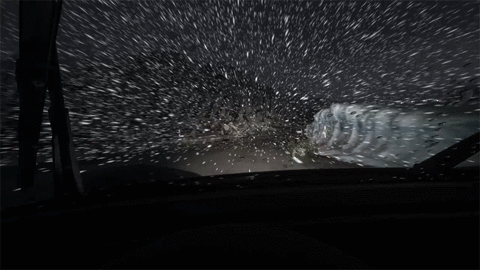
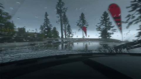
I think there's elements of Driveclub that haven't been topped yet, as most people have said, in weather effects and lighting (I would put some of the fog effects and stuff like that under here too). The cars look (close to) just as good as the cars in games that came out years later, though I imagine there are less cars in Driveclub vs. somehing like Forza Horizon. DC suffers mostly in image quality, the aliasing looks pretty bad in spots for sure, and of course it runs in 30 FPS.
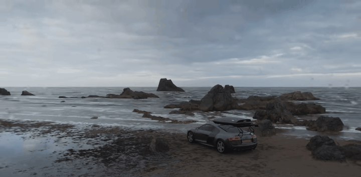
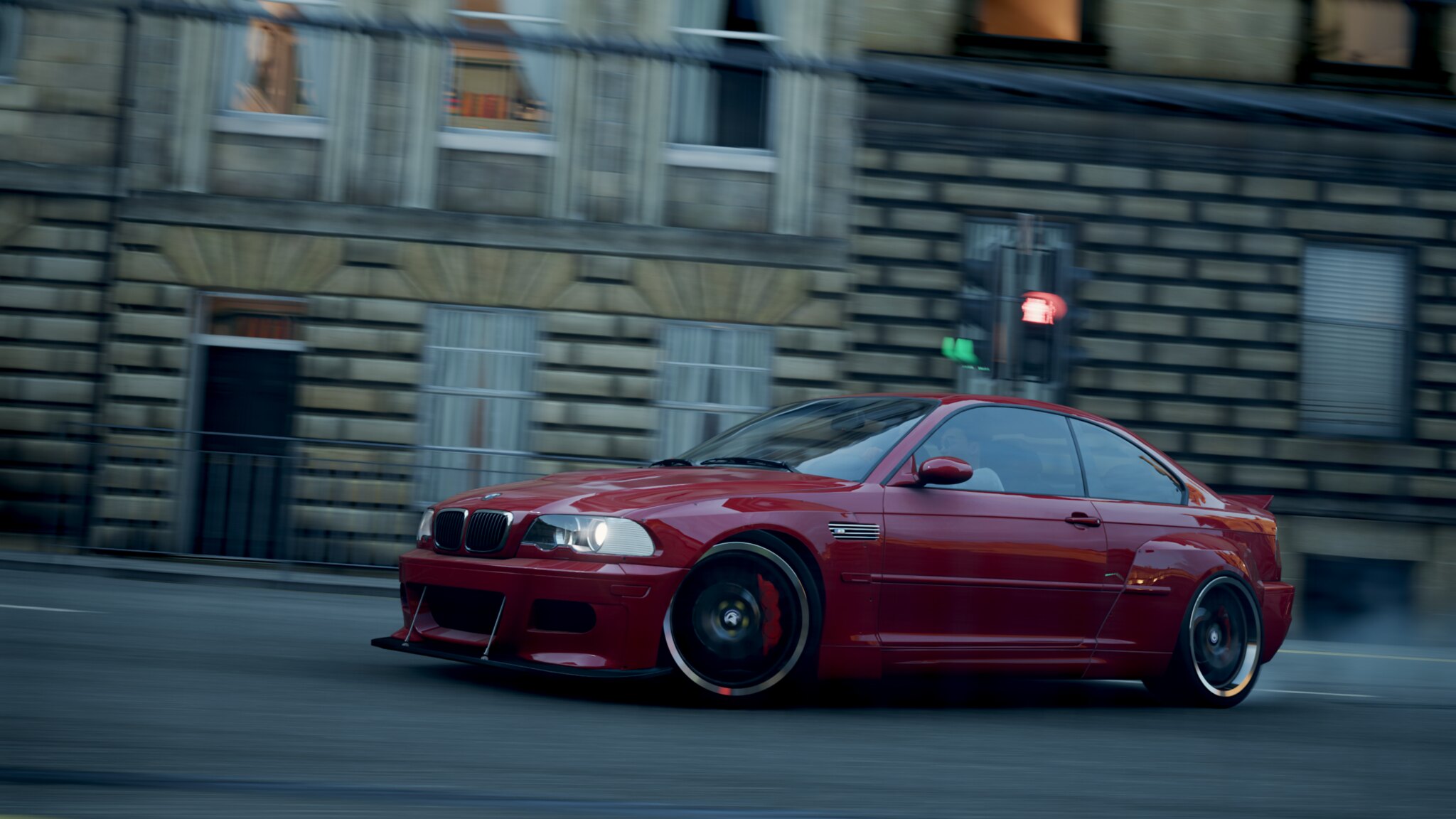
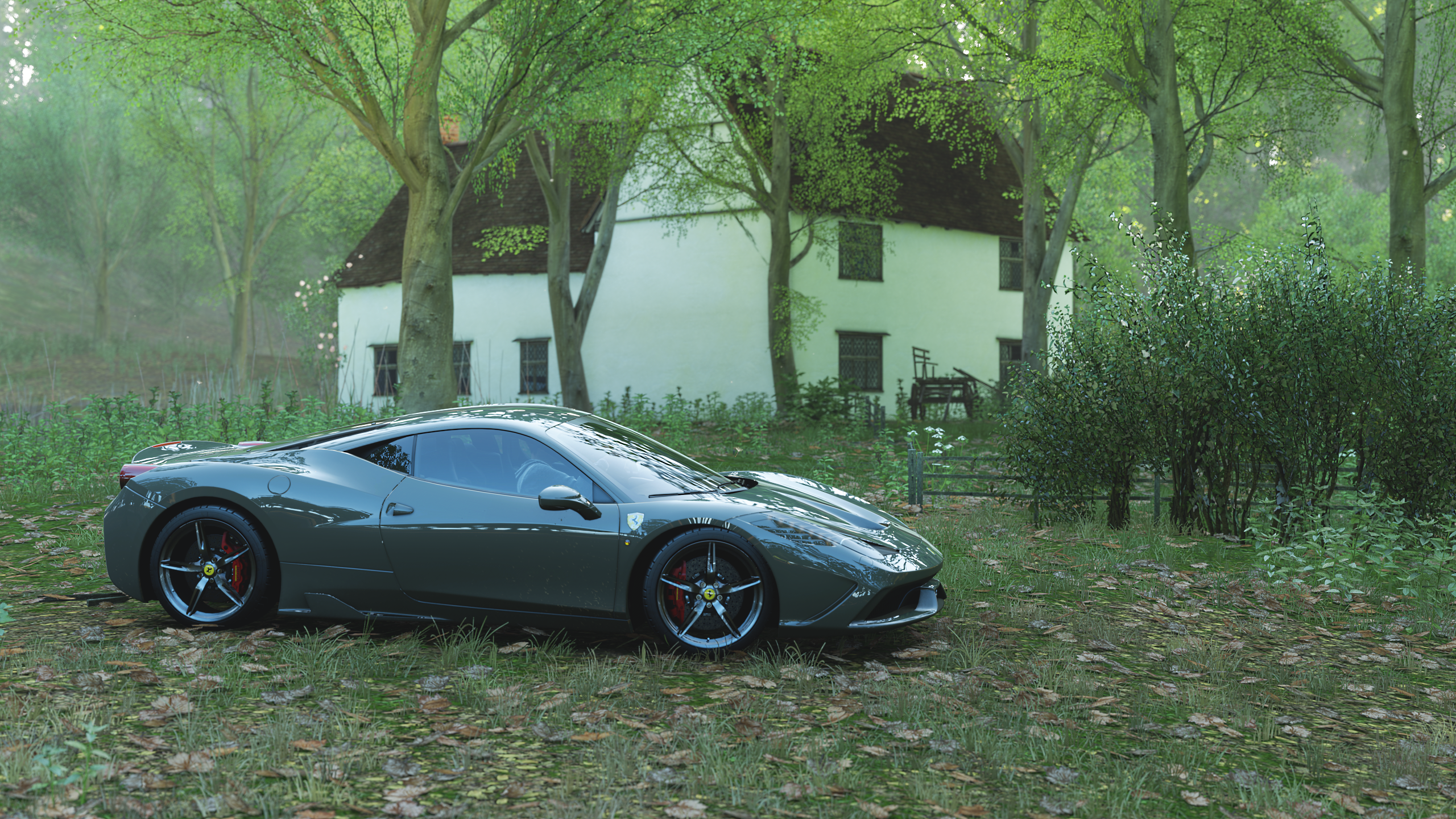
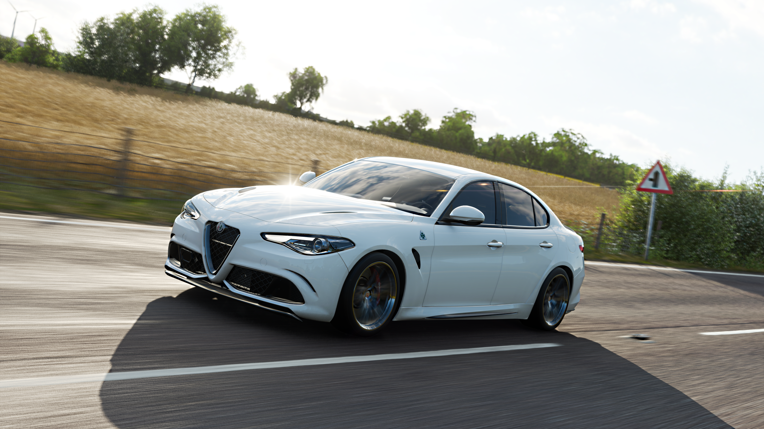
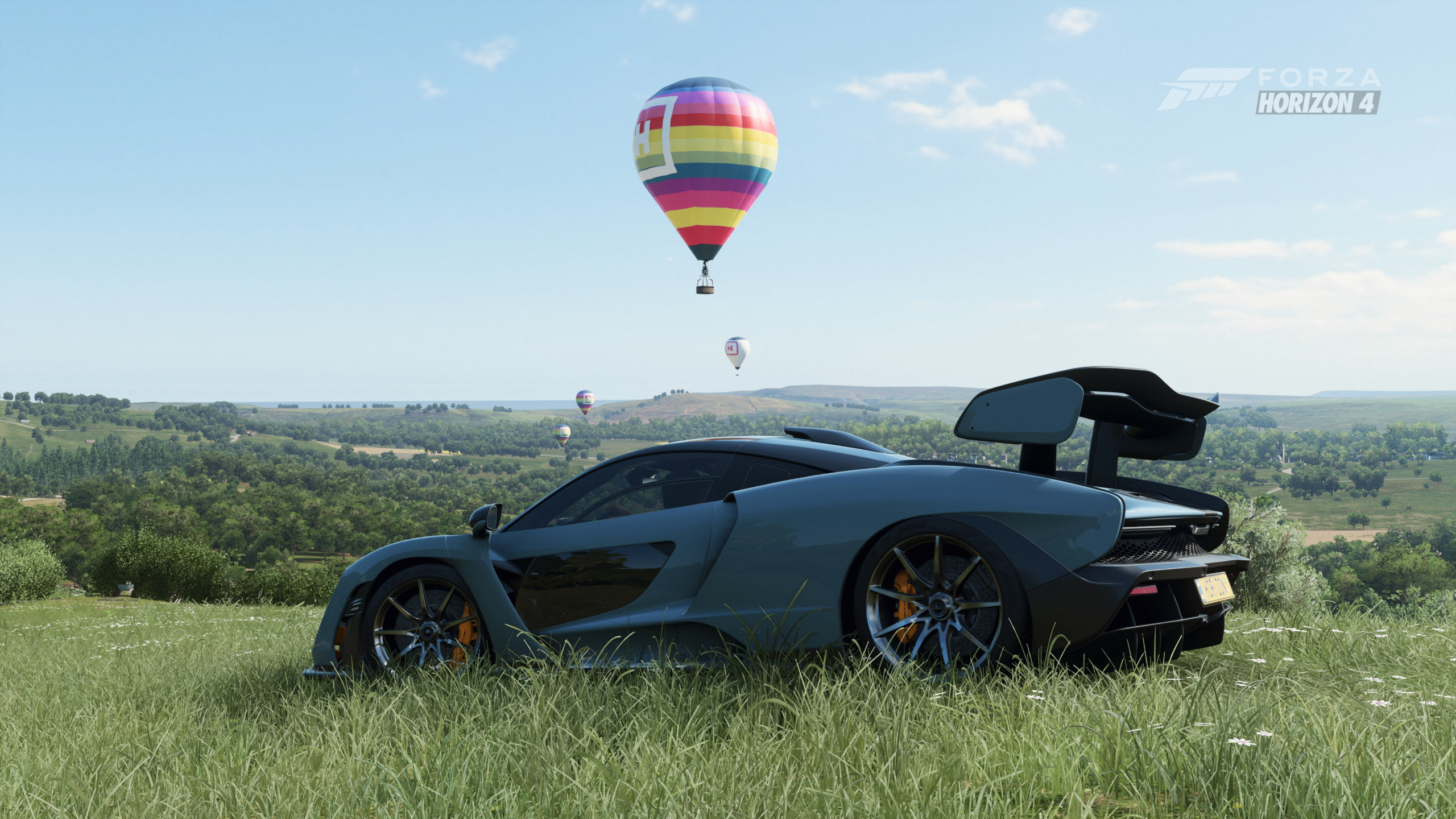
Obviously the gifs and screenshots being used are pretty worthless for comparison, and the games even have pretty different visual styles so I find the "I think this looks better!" comparisons pretty pointless because you're not really having a discussion about anything, you're just looking at poor metrics for determining visuals and claiming which you prefer without backing it up with any clear reasoning. I think a lot of the background stuff in both Forza and GT looks pretty bad compared to what they did in Driveclub, but in Forza Horizons case it is obviously because it is open world, which makes a big difference. They are also 60FPS, so they probably compromised on that front.
In short, if you really want to compare I'm sure there's Digital Foundry stuff you can pull up and discuss, but the bottom line is that these games had different priorities, especially when you compare open world and traditional racers. What I think is the most interesting to discuss is what Driveclub did right to create certain visual aesthetics that still excites people to this day, despite its shortcomings in other visual areas and despite being from 2014 and never getting a "Pro" upgrade. It's a shame they dissolved the studio, would've loved to see their visual proficiency in different games.