Cyberpunk is a genre that's about human creativity, about the underdog, about what are and what we could be -- the untapped potential of humanity, if only so many of us weren't held down by oppressors. It's about imagining, and changing. It's about, god, fucking color and shedding the drab forms often expected in the name of "professionalism" or bland commercial appeal.
So why the fuck does the art look more generic than, like, a fake video game invented for one of those crime procedurals where they invent a new nootropic-off-the-dark-web every episode?
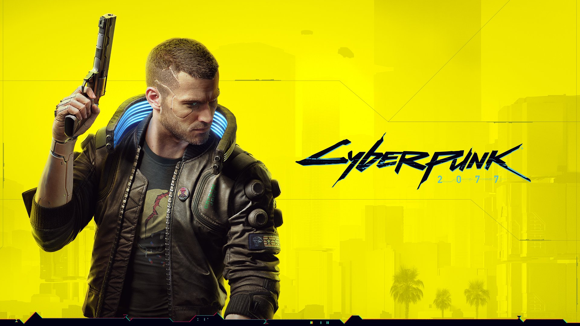
So why the fuck does the art look more generic than, like, a fake video game invented for one of those crime procedurals where they invent a new nootropic-off-the-dark-web every episode?