-
Ever wanted an RSS feed of all your favorite gaming news sites? Go check out our new Gaming Headlines feed! Read more about it here.
-
We have made minor adjustments to how the search bar works on ResetEra. You can read about the changes here.
Guitar Center seemingly changes their logo
- Thread starter Psyborg
- Start date
You are using an out of date browser. It may not display this or other websites correctly.
You should upgrade or use an alternative browser.
You should upgrade or use an alternative browser.


Oh that's funny I guess I never clocked their logo didn't have the G in it.
The guitar was the G
Guitar starts with a G, and the guitar is already shaped like a G if you look closely. It was so much better before.
Right, that's what I meant
Old one doesn't look like a penis at all to me. Looks like a fucking guitar.
But then again I have a ukulele downstairs so what do I know about guitars.
Oh nm misread second post. Still leaving my ukelele joke.
But then again I have a ukulele downstairs so what do I know about guitars.
Oh nm misread second post. Still leaving my ukelele joke.
great now all i see is an erect penis...

For those un-initiated, they have been getting lightly roasted lately in the typography/graphic design worlds for "getting away" with having a guitar as the G. This, joke or real, is possibly a response to it.
For example:
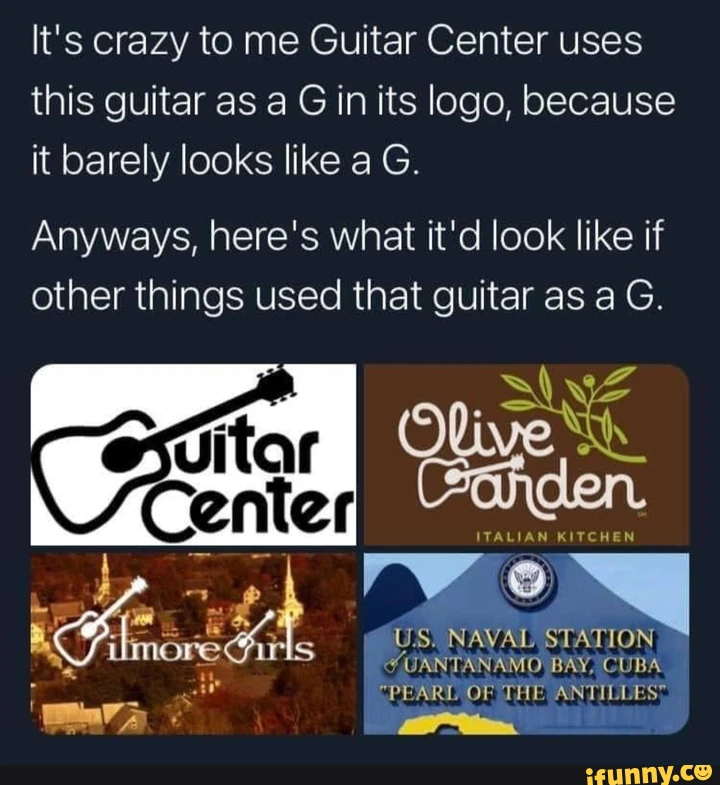
Gilmore Girls could have used more guitars, in that someone should have been hitting Rory with one like they're El Kabong.
OP
OP
Embrace the 🍆enis
Last edited:
New one looks way better, not just the guitar but the font as well. I don't like the weird ass kerning on the first one at all.
One time where I think the new one is just as good if not better.
Cleaner guitar and the guitar of the old one doesn't look much like a "G".
Cleaner guitar and the guitar of the old one doesn't look much like a "G".
New logo is better.
I prefer the old branding. Though I'm surprised they didn't move away from "Guitar Center" entirely given how little of their floor space is given to guitars these days compared to the early 2000s.
It's bullshit innit.
I like the first one better. The guitar screams G to me. But then again, I'm somebody who thought the roof in the Pizza Hut logo was a hat for almost 30 years...
That big C is violating that little e. t also joining in.
Pizza HatI like the first one better. The guitar screams G to me. But then again, I'm somebody who thought the roof in the Pizza Hut logo was a hat for almost 30 years...
Sorry y'all. New one is better. The typography is way better and that...G for Guitar is a inelegant streeeetch (I get why it's iconic though).
I like the clean lines of newer logos.
Last edited:
The new Guitar Center logo is really reminding me of Staples Canada or Bureau en Gros in French:

