• Ever wanted an RSS feed of all your favorite gaming news sites? Go check out our new Gaming Headlines feed! Read more about it here.
  • We have made minor adjustments to how the search bar works on ResetEra. You can read about the changes here.

Which icons?

  • G Suite had better icons

    Votes: 340 87.2%
  • Google Workspace has better icons

    Votes: 50 12.8%

  • Total voters
    390

BAD

Member
Oct 25, 2017
9,565
USA
google_workspace_icons_1.jpg


This illegible, indistinguishable ass mess of icons all using all colors all the time... G Suite sweetie I am so sorry.
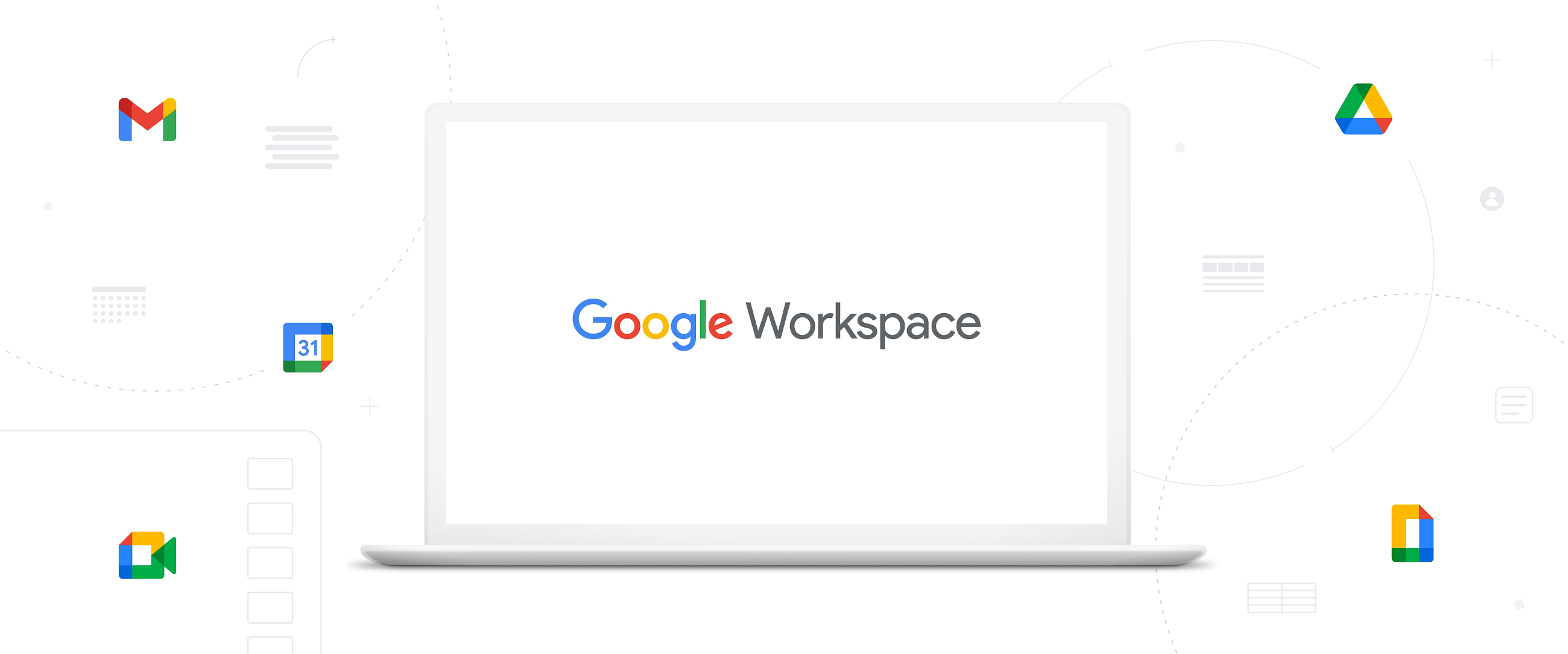
cloud.google.com

Announcing Google Workspace, everything you need to get it done, in one location | Google Workspace Blog

Google Workspace includes the productivity apps you know and love—Gmail, Drive, Docs, Meet, and many more—in one location, so you can create, communicate, and collaborate.

they really thought they came up with somethin here
Google-Workspace-Icons-bad.png


chaobreaker

One Winged Slayer
Member
Oct 27, 2017
5,543
I already confuse the maps and photo app icons on my homescreen. Can't wait to add fucking Gmail to the mix.
 

Skittles

Member
Oct 25, 2017
8,272
Logo designs are just gonna be a mosaic of the same brand colors at this rate, jfc
 

Fliesen

Member
Oct 25, 2017
10,254
The GMAIL one's okay, but the desperate attempt to unify the icon design is definitely detrimental to each app's immediate recognizability.

Especially Hangouts (Meet? Cameratalkingstuff?) and Docs look horrible.
 

davepoobond

Member
Oct 25, 2017
14,607
www.squackle.com
What the fuck is a G suite. Sounds like somewhere you get hookers. Or like the gangster suite at a motel

google workspace sounds better. And the icons are fine, just pay attention to the shapes instead of the stupid colors
 

Sybil

Avenger
Oct 27, 2017
1,642
The Gmail and Drive icons are already pretty common knowledge, whyyy would you undo that
 

chrominance

Sky Van Gogh
Member
Oct 25, 2017
13,634
To be fair, if you go to the pricing page there's a different set of icons for each of the individual suite apps (Docs, Sheets, etc.) that are a single colour. It seems like it's just Gmail, Drive, Calendar and Meet that might be primarily using the mosaic icons?
 

John Caboose

Member
Oct 26, 2017
2,200
Sweden
Oh wow. That's bad.

EDIT: the gifs in the article don't show the new ones except gmail as far as I can see? The actual documents are still using the old icons?
 
Nov 1, 2017
3,068
Looks like I'll have to use custom icons from here on in.

Edit: Okay, who on earth picked Google Workstation in the Poll?
 

Rodney McKay

Member
Oct 26, 2017
12,205
I can tell what each of them are pretty easily.

I like them.
I can see how some people might be confused by the shared colors (definitely not the best idea), but I like the shape unification.

I'd make Docs colors mostly blue and Duo's mostly green, I think that little change would fix the visibility issue.

Was never a fan of Google's icons in general. Maps sucks now, and I don't really even get what Photos is supposed to be.
 

Deleted member 37151

Account closed at user request
Banned
Jan 1, 2018
2,038
Google has no sense of style.

I use Google Docs at work and it's.... shite. Like it works well. But it always feels a bit hacked together and unpredictable and actions that should be easy are hard to discover. Like trying to work out what folder the document you have open is in.
 

Cipherr

Member
Oct 26, 2017
13,436
I can tell what all of those are easily at first glance.


But my company has been using Google products for years. But yeah, that wasn't as problematic as the thread title indicated for me, lol.
 

louie

Member
Oct 29, 2017
559
The heights and colours aren't consistent and Meet looks more like a duck than a camera. Great.
 

artsi

Member
Oct 26, 2017
2,686
Finland
Is the "Google Apps" gang still grandfathered in?

I'm getting like most G Suite enterprise features for free because I signed up early.
 

Deleted member 69573

User requested account closure
Banned
May 17, 2020
1,320
Melbourne, Australia
New ones are way better.

The old ones have a weird grey hue to them, looks like they're covered in a thin layer of dust. The only one I think needs an improvement is the mail icon, but even then I think its better and feels more modern.
 

jdmc13

Member
Mar 14, 2019
2,893
IIRC the crappy icon redesigns are specifically to make the icon byte size smaller to save on bandwidth.
 

Imperfected

Member
Nov 9, 2017
11,737
Most of them only make sense as a direct reference to the icons they're replacing, which is terrible icon design.

Basically if you already use Google enough to know all the icons, of course you don't want them changed to something you're less likely to recognize, and if you don't use Google apps often enough for that to be true these icons are hot garbage that makes zero fucking sense as iconography.

They're literally for no one but bored UI/UX designers.
 

gerg

Member
Oct 25, 2017
2,346
I think the logos aren't bad, and make sense. Google has been moving towards "owning" its particular set of colours for a while, so it's understandable that they want to replace their ultimately quite generic logos (with the possible exception of Gmail) with something more on-brand.

I do think the areas of overlap make the logos unnecessarily busy, however.
 

Weegian

Member
Oct 27, 2017
3,732
Imagine trying to distinguish between these logos if you have a vision impairment. Terrible change.
 

finalflame

Product Management
Banned
Oct 27, 2017
8,538
User Banned (2 Weeks): Dismissing Concerns Around Accessibility
BIG COMPANY CHANGE THING I NO LIKE DIFFERENT THING. CHANGE BAD. DAE AGREE?

Here we go again. Every time. Personally I find the new icons easily distinguishable and dig them.
Imagine trying to distinguish between these logos if you have a vision impairment. Terrible change.
Have you or someone you know had difficulties with distinguishing these icons in context or are you just assuming a company as big as Google didn't do the appropriate a11y research/work when doing this redesign?
 
Last edited:

Weegian

Member
Oct 27, 2017
3,732
BIG COMPANY CHANGE THING I NO LIKE DIFFERENT THING. CHANGE BAD. DAE AGREE?

Here we go again. Every time. Personally I find the new icons easily distinguishable and dig them.

Have you or someone you know had difficulties with distinguishing these icons in context or are you just assuming a company as big as Google didn't do the appropriate a11y research/work when doing this redesign?
I hope I'm wrong.
 

Stalker

The Fallen
Oct 25, 2017
6,733

As someone else said these only really work in reference to their old Icons otherwise it's

Google M? - No reference to it being an envelope or mail at all unless you draw imaginary lines between basic shapes to make them something else
31 in a Square - Absolutely zero indication it's a calendar.
Google Drive - The icon has never been amazing but this is just the same as the last one essentially. If you are an iOS user or have never touched the G-Drive then it's far from obvious.
Google Rectangle - You could maybe understand this was a paper at a stretch
Google Camera - The furthest thing from a messaging app I can imagine, it's clearly the icon for a camera
 

Spish!

Member
Oct 27, 2017
571
These icons aren't really identifiable anymore. Except for drive, which was always abstract nonsense.

Hate to say it but even Microsoft could have done better. And they suck.
 

Scheris

Member
Oct 27, 2017
1,383
Have you or someone you know had difficulties with distinguishing these icons in context or are you just assuming a company as big as Google didn't do the appropriate a11y research/work when doing this redesign?

Considering YouTube Music's complete lack of accessibility testing (forced dark mode makes it unusable for anyone with the type of astigmatism that causes halos with dark UIs), I'd be shocked if they actually spent the time testing these icons for accessibility honestly.
 

Sir Hound

Member
Oct 28, 2017
2,203
I think the "31" says it all really. Concentrate on that in the context of both sets. This is super-poor design.