Dead Space is a masterful example of how to display information elegantly and unobtrusively. Such a fantastic UI.
Still one of the best UI of all time.
Dead Space is a masterful example of how to display information elegantly and unobtrusively. Such a fantastic UI.
Yoooo I didn't even think about checking to see if there was hud options. I give that a whirl. Part of the fun of the game is the immersion for me.while Death Stranding by default has a fairly minimal HUD:

playing without a HUD feels really cool:

as long as you know how to move through the world, the animations and noises are all you need to manage Sam as he's carrying a metric fuck ton of packages on his back
Oh yeah. Dead Space has the best HUD of all time.Here's one of the best UI in my opinion:

The suit = health meter is brilliant really.
MMOs tend to have so much clutter it's awful.
Bethesda games (Skyrim, Fallout) are also pretty bad.
With the exception of BOTW anytime I've turned off the HUD I suddenly am completely lost because they build large empty environments and place tiny objectives in huge open worlds without so much as flavor text explaining it's near the base of the mountain.
Xenoblade 2 is interesting because, yes, it can look like this during combat
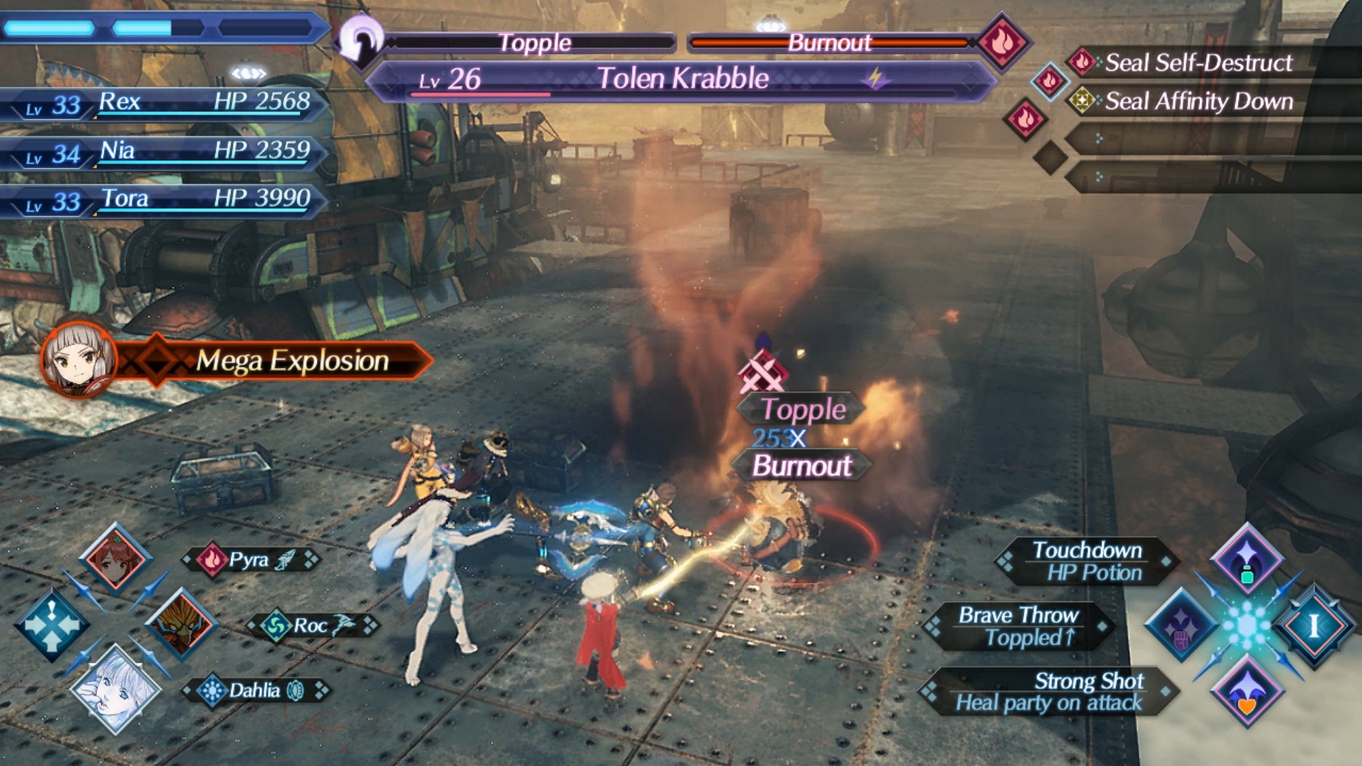

Xenoblade 2 is interesting because, yes, it can look like this during combat
but none of it is extraneous. I wouldn't say it is distracting from the game itself because, most of the time during combat, your main focus is on the HUD.
Outside of combat, it is one of the better examples of HUD.

It really was a much better experience. And whenever I got lost, I could always trigger the Witcher sense to get a rough direction for my objective instead of a marker on a minimap.If you play Witcher 3 on PC get Friendly HUD. It hides stuff when you don't need it, and it shows it when you do. Or you can just get rid of all hud elements all together if you want.
Dead Space is a masterful example of how to display information elegantly and unobtrusively. Such a fantastic UI.
which is fine. But no reason to not have the option to remove said information
Agreed. Making every part of the UI of Horizon Zero Dawn contextual so that it only shows up if needed makes the game so much better. Every game should have that option tbh.
It also has one of the worst implementations of a compass(top middle of screen) I've seen in my life and I work with UI.
The 3DS version made this a bit better moving most of the gauges to the bottom screenXenoblade Chronicles 2 is bad but 1 is even worse. They already had limited space and you had all this junk on the battle screen. Almost on MMO levels of cluttered.
That doesn't sound so bad? Admittedly I haven't played the game, but HZD also has a compass in the top middle of the screen and that doesn't ever get in the way.


There's no one size fits all for games, unfortunately. Some genres, or even just games within genres, I prefer a minimalist HUD. If I'm playing an MMO, I basically want as much info as possible up on my screen at once without being obstructive.
The solution is to have highly customizeable and scaleable HUDs. Every single HUD element should be able to be dragged and moved, resized, or toggled on and off. Character health bars and names should be able to be toggled, recoloured, and have optional text (eg. a "92%" beside the healthbar).
Basically this:
And this:
I feel like switching the HUD off after seeing this, because I've played for long enough (40+ hours) that I'm comfortable with the controls, and I recognise the outlines of all the important structures.while Death Stranding by default has a fairly minimal HUD:
playing without a HUD feels really cool:
as long as you know how to move through the world, the animations and noises are all you need to manage Sam as he's carrying a metric fuck ton of packages on his back
I don't remember, but there are about 4 or 5 different switches in the HUD menu that let you control multiple aspects of what you want displayed, so there's a chance.I feel like switching the HUD off after seeing this, because I've played for long enough (40+ hours) that I'm comfortable with the controls, and I recognise the outlines of all the important structures.
About the only thing I think I'd still need, though, is the cargo tag pings from the scanner. Sometimes, when I'm relaying two trucks' full of materials for road-building, it's handy to have an on-screen indicator of what each one contains and where I left them. It's also handy for keeping track of MULEs so you can tie them up unnoticed. Can you still have those displayed but without any of the on-screen stamina gubbins and control prompts?
Spikes my blood pressure every time.
Dead Space FTWHere's one of the best UI in my opinion:
The suit = health meter is brilliant really.
MMOs tend to have so much clutter it's awful.
Bethesda games (Skyrim, Fallout) are also pretty bad.
get rid of the objective/inventory reminders and refine that map and I'd play the hell out of this
The HUD of DS is ok, the menus though, where you spend a lot of time in, are unnecessarily cluttered, obtuse and overdesigned.while Death Stranding by default has a fairly minimal HUD:
playing without a HUD feels really cool:
as long as you know how to move through the world, the animations and noises are all you need to manage Sam as he's carrying a metric fuck ton of packages on his back
I tried starting Homefront Revolution last weekend and had to stop after two hours. I wish I'd recorded it, but when you go to the red zone for the first time in the open world, the information overload was absolutely ridiculous. Constant things popping up on my screen, often simultaneously: tutorial messages, mission messages, radio conversations, you name it.
I've been playing games for nearly 40 years and it was utterly confusing and overwhelming. I had no fucking idea what the hell I was supposed to be doing, or what half the messages were on about. And I missed a ton of them simply because sometimes there were four or even five types of notification on screen at once.
Here's one of the best UI in my opinion:
The suit = health meter is brilliant really.
MMOs tend to have so much clutter it's awful.
Bethesda games (Skyrim, Fallout) are also pretty bad.
Here's one of the best UI in my opinion:
The suit = health meter is brilliant really.
MMOs tend to have so much clutter it's awful.
Bethesda games (Skyrim, Fallout) are also pretty bad.


