Wasn't really sure where to post my thoughts on the PS5 design, but I guess here will do.
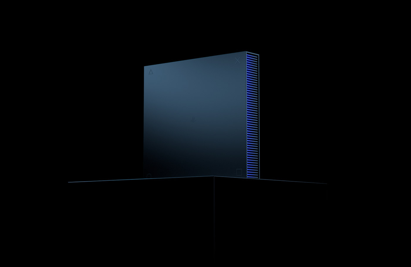
In short, I don't really like it, but I don't really care ultimately as its just a box anyway. I think it misses the mark on a number of levels. There's this school of thought that designers should be inspired by other works and I think there can be times where its overdone and thats why we're seeing all these memes of it being a router or a fridge because one can't really help make the comparison. When I look at the PS5, it looks like its the roof for a building or something that should be in an art gallery.
The two biggest issues I have is that it goes overboard with how all the elements clash or contrast with each other. The white and black clashes as both appear to be dominant. The way the white outer panel is thin at the top and thick at the bottom where the disc drive is, and how the black band does the reverse (goes from thick to narrow). There's symmetry but there isn't so it feels unusual and doesn't sit right.
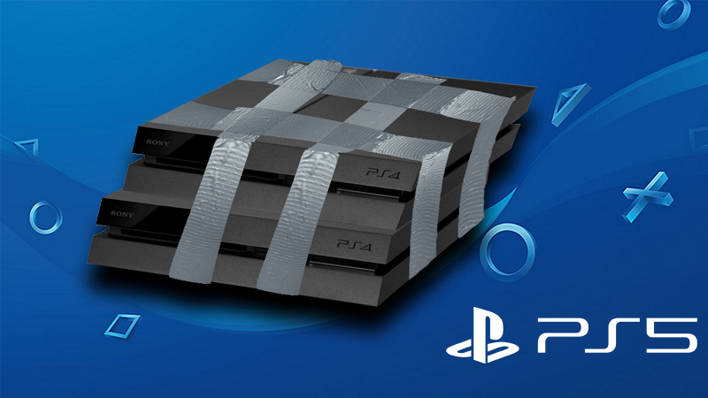
The other issue is that it appears big - this is mostly due to power and thermals now that its basically like a mid/high tier PC it needs the airflow and bigger fans, but consoles were always about efficiency in design. Whereas with a custom PC, it wasn't nearly as space efficient. I think if the PS5 was smaller - the reaction wouldn't nearly be as overblown.