-
Ever wanted an RSS feed of all your favorite gaming news sites? Go check out our new Gaming Headlines feed! Read more about it here.
-
We have made minor adjustments to how the search bar works on ResetEra. You can read about the changes here.
Fire Emblem Three Houses (Switch) JP Boxart + Music Samples. UPDATE: NA boxart added
- Thread starter Hero of Legend
- Start date
You are using an out of date browser. It may not display this or other websites correctly.
You should upgrade or use an alternative browser.
You should upgrade or use an alternative browser.
Fan edits always get the weirdest, most unearned praise.That flipped box looks fucking terrible, are you guys serious?
Neither the original or the fan edit are... great. I feel like the issue is that it kinda feels like three lords are too big and feel like they're slapped on there. Like, they're made to be the focus but are out of frame, unlike Byleth who feels like they should be the focus but they're farther back. The purple doesn't help it either.
I agree. Neither is very good, I just find the edit to be less jarring and more sensible. Having the larger, heavier element in the foreground be above and crowding the top of the image with the smaller background characters below feels out of place. Having the title more centered between the two groups, with the larger, foreground characters anchoring the bottom of the image with then the smaller character atop them feels better to me. But I would much prefer something else entirely as neither is all that interesting or inspiring.Neither the original or the fan edit are... great. I feel like the issue is that it kinda feels like three lords are too big and feel like they're slapped on there. Like, they're made to be the focus but are out of frame, unlike Byleth who feels like they should be the focus but they're farther back. The purple doesn't help it either.
Does being a fanboy require losing your ability to think? You keep going on and on about the frame as if you've found the magic argument to prove the nonbelievers wrong and even then the only thing you've proven is that there's a name to what people are distracted by.I didn't abandon anything? Your argument makes no sense, given that the three students are of roughly equivalent size, with perhaps the illusion that Claude is bigger due to being on the narrow end of the image as opposed to being positioned along one of the longer sides. Together, the three are positioned so that they frame the lower end of the art, of which the focus is on the two Byleths and the title.
In fact, you going on about frames highlights a major flaw in this box art's visual design; that the frame itself grabs the attention more than the content that the frame is supposed to display, for every reason that you've failed to address - or perhaps that you can't address because you don't know what you're talking about
Insults. Classy. Enjoy my ignore list.Does being a fanboy require losing your ability to think? You keep going on and on about the frame as if you've found the magic argument to prove the nonbelievers wrong and even then the only thing you've proven is that there's a name to what people are distracted by.
In fact, you going on about frames highlights a major flaw in this box art's visual design; that the frame itself grabs the attention more than the content that the frame is supposed to display, for every reason that you've failed to address - or perhaps that you can't address because you don't know what you're talking about
That's his bow and the shifted end curves from the rest of the shaft.
User Warned: Antagonizing Another User
I bet you do that a lot when youre backed into a corner with your own bullshit
Two other things I noticed are that the weapons clashing makes no sense (either the axe is ridiculously small or it's clashing at an extremely weird angle) and Edelgard's leggings look like they're made of rubber and are super uncomfortable.
Why can't we just get that instead of that strange color wheel
So much talent at Nintendo and this is what gets approved? :(
With months to go, I want to believe they'll get enough bad feedback to change this. It's pretty bad.
To be fair to Hailinel , framing and the use of lines to direct the eye are major factors in this sort of design. Looking at the official art and the edit side by side, I find that the original is, in fact, more clean and easier to follow.Does being a fanboy require losing your ability to think? You keep going on and on about the frame as if you've found the magic argument to prove the nonbelievers wrong and even then the only thing you've proven is that there's a name to what people are distracted by.
In fact, you going on about frames highlights a major flaw in this box art's visual design; that the frame itself grabs the attention more than the content that the frame is supposed to display, for every reason that you've failed to address - or perhaps that you can't address because you don't know what you're talking about
Here's how it works:
If you take a picture of someone through a doorway, while including the doorway in the shot, you are framing them. Unless the rest of the image is too busy, this should help focus the viewer on the subject of the picture.
If (as an example) you have prominent converging lines, such as rails on either side of a walkway (for whatever reason), the eye is apt to follow them.
In this case, the nobles of the three houses are the doorway, and their weapons are the rails.
I'm not saying it's the best box art one can find, and I'm not saying it's necessarily even good -though I do seem to take less offense than most here- but it seems clear to me that the composition of the official art is more effective than the edit. This is coming from my comparing the two before I read your conversation on this matter. Further, I do not believe you have provided a compelling case as to your point of view. Telling people they are incapable of reason is not an effective means of argumentation.
You've not only abandoned your original point to try to refute the only thing in my post that you can - you went from arguing about where the eye is drawn to arguing about positioning the frame, as if that supersedes the former - you also...don't seem to know the definition of "small."
Here's the thing: "positioning the frame" is very important to the idea of "where the eye is drawn." The frame helps draw the eye to where it should go. There is little point to framing something in a composition otherwise. This in mind, I do not believe the argument actually moved anywhere, instead being strengthened by introducing further elements of design and composition. This analysis may be affected by bias, as I had already come to the same conclusions. Again, while I believe the original to be more effective than the edit -and the edit did, in fact, provide a distinct lack of direction for where my eye should go- I will agree that the art could be better.
In general, though, while it may have some issues, the official art is still more effective than the edit.
It's definitely a little awkward looking. I'm no elite graphic designer (i.e. I took like two classes in college) but it seems like the kind of composition that would've worked a little better if there was more space than the narrow dimensions of Switch box art.
In any case, it's not like I'm going to be looking at this more than once before putting the case on a shelf and putting the cartridge in my carrying case... assuming I just don't get the whole thing digitally anyway.
In any case, it's not like I'm going to be looking at this more than once before putting the case on a shelf and putting the cartridge in my carrying case... assuming I just don't get the whole thing digitally anyway.
Thank you.To be fair to Hailinel , framing and the use of lines to direct the eye are major factors in this sort of design. Looking at the official art and the edit side by side, I find that the original is, in fact, more clean and easier to follow.
Here's how it works:
If you take a picture of someone through a doorway, while including the doorway in the shot, you are framing them. Unless the rest of the image is too busy, this should help focus the viewer on the subject of the picture.
If (as an example) you have prominent converging lines, such as rails on either side of a walkway (for whatever reason), the eye is apt to follow them.
In this case, the nobles of the three houses are the doorway, and their weapons are the rails.
I'm not saying it's the best box art one can find, and I'm not saying it's necessarily even good -though I do seem to take less offense than most here- but it seems clear to me that the composition of the official art is more effective than the edit. This is coming from my comparing the two before I read your conversation on this matter. Further, I do not believe you have provided a compelling case as to your point of view. Telling people they are incapable of reason is not an effective means of argumentation.
Here's the thing: "positioning the frame" is very important to the idea of "where the eye is drawn." The frame helps draw the eye to where it should go. There is little point to framing something in a composition otherwise. This in mind, I do not believe the argument actually moved anywhere, instead being strengthened by introducing further elements of design and composition. This analysis may be affected by bias, as I had already come to the same conclusions. Again, while I believe the original to be more effective than the edit -and the edit did, in fact, provide a distinct lack of direction for where my eye should go- I will agree that the art could be better.
In general, though, while it may have some issues, the official art is still more effective than the edit.
A big problem of this implementation, however, is that these lines don't converge into anything in particular. It takes you right to the center of the box, but what is there at the center? The weapons converge with the castle in the background, but why are foreground elements directing me to background elements when the subject is neither of these, and is in fact off center? The only other explanation is that the castle is then meant to lead me to the other characters, so the rails are mostly designed to send you to another set of rails whilst trying to be an important element of itself. It's a mess, and more of a backfire because people noticed more problems than intended (ie, "why is his bow bent weird")Looking at the official art and the edit side by side, I find that the original is, in fact, more clean and If you take a picture of someone through a doorway, while including the doorway in the shot, you are framing them. Unless the rest of the image is too busy, this should help focus the viewer on the subject of the picture.
If (as an example) you have prominent converging lines, such as rails on either side of a walkway (for whatever reason), the eye is apt to follow them.
In this case, the nobles of the three houses are the doorway, and their weapons are the rails.
Because you really haven't read this conversation. You've read the last few posts when this conversation extends to the previous page.This is coming from my comparing the two before I read your conversation on this matter. Further, I do not believe you have provided a compelling case as to your point of view.
Because the edit addresses the really glaring problems, but omitted other problems like the fact that the subjects are full body characters that have to share a portion of the image but another character's mere upper half takes up an entire quadrant. Or the fact that the color scheme of the subject makes them fade into the background. Probably because it was a quick photoshop, but the fact that a quick edit made such a difference says a lot about this.Again, while I believe the original to be more effective than the edit -and the edit did, in fact, provide a distinct lack of direction for where my eye should go- I will agree that the art could be better.
I absolutely disagree with this, because it forces elements of the art to work in counterintuitive ways to accomplish simple tasks, as well as just plain questionable mistakesIn general, though, while it may have some issues, the official art is still more effective than the edit.
That flipped box looks fucking terrible, are you guys serious?
Yeah idk what drugs the people in this thread are taking
yeah i guess they misread what people wanted. storywise fireemblem has been very formulaic so a change was nice but not a change to some cringeworthy shit like that... well that applies mainly to conquestI feel like it had the worst characters in the series, not the whole cast being the worst, but certain individual characters were the worst by far and that sucks.
I agree with the story, my dissapointment was so big because story seemed to be the big focus of the marketing to reach new heights for the series and it didn't deliver at all.
Did they misread it? I think Fates placed more emphasis on the characters which is smart and I think is what most people who play Fire Emblem wanted. Like you said, the story has always been fairly formulaic, but that's okay because it's been the characters and the players attachment to them that's always been more important.yeah i guess they misread what people wanted. storywise fireemblem has been very formulaic so a change was nice but not a change to some cringeworthy shit like that... well that applies mainly to conquest
Literally my first impression lmao.One of the worst cover arts for the series. What happened? Someone post the path of radiance cover.
This is the first bad cover of a Nintendo game after 2 years. How the new character designer did that? How that was approved? That won't impact the game for me but man, as someone who loves video game covers, it's disappointing to see it.
Unfortunately the Uta Prince designer is disappointing me in general when initially I was pretty hyped for her work in FE. Most of her designs are quite similar without them being unique with the exception of the three protagonists and then this cover came. :/
Unfortunately the Uta Prince designer is disappointing me in general when initially I was pretty hyped for her work in FE. Most of her designs are quite similar without them being unique with the exception of the three protagonists and then this cover came. :/
I don't think the lines need to bring you all the way to where they would have you go. They direct you, leading you toward the target, but it can, at times, be problematic for them to go the entire way. In this case, I do think they needed to have that added space.A big problem of this implementation, however, is that these lines don't converge into anything in particular. It takes you right to the center of the box, but what is there at the center? The weapons converge with the castle in the background, but why are foreground elements directing me to background elements when the subject is neither of these, and is in fact off center? The only other explanation is that the castle is then meant to lead me to the other characters, so the rails are mostly designed to send you to another set of rails whilst trying to be an important element of itself. It's a mess, and more of a backfire because people noticed more problems than intended (ie, "why is his bow bent weird")
The castle is a different matter: it doesn't actually lead you anywhere. The convergence of the weapons has already -in theory- lead you to a point directly above the heads of the two iterations of Byleth, and the lines extend slightly beyond that point. They may be diverging now, but you still follow them because they don't go too far and they, therefore, maintain their prior starting points. The question is, where have they led, truly? I would say that there is a reasonable enough amount of blank space around the Byleth duo that they -and the title- are the only reasonable focus for the lines to direct you toward. The castle blends too well into the back to be your next focus, though it does provide a weak secondary frame.
While the bow does look weird, I wouldn't say it's the composition's fault that was noticed, aside from the possibility the flash hides the visible curvature of the bow. If one were to remove the flash and still have issues with the bow, that's an issue specifically with the Claude art used here.
I'd say the edit attempts to fix problems, and in fixing the perceived biggest problems (e.g. Claude being upside down), it is seen to be doing a lot more than it actually does. The changes don't really take into account how the original composition works, and it really only moves a couple elements around. While Claude's bow does still try to lead to the previous focus, it has to contend with a pair of capes drawing the eye, once again, downward. In terms of composition, this seems more messy than it previously was.Because the edit addresses the really glaring problems, but omitted other problems like the fact that the subjects are full body characters that have to share a portion of the image but another character's mere upper half takes up an entire quadrant. Or the fact that the color scheme of the subject makes them fade into the background. Probably because it was a quick photoshop, but the fact that a quick edit made such a difference says a lot about this.
I do still agree that there are issues with the original; I just don't see how the edit is an improvement.
I think I followed the GoTo Post arrows far enough to say I read the whole thing. The alternative is that the relevant conversation began before the edit was even posted.Because you really haven't read this conversation. You've read the last few posts when this conversation extends to the previous page.
You did have a couple good points about size and color (and, really, yellow is known for catching the eye), but those don't actually beat the framing and directing lines, which are what you brought those up to argue against.
I didn't even care about the box art but this edit looks 1000 times betterReally great edit on SerenesForest by carefreejules looks a good deal better.
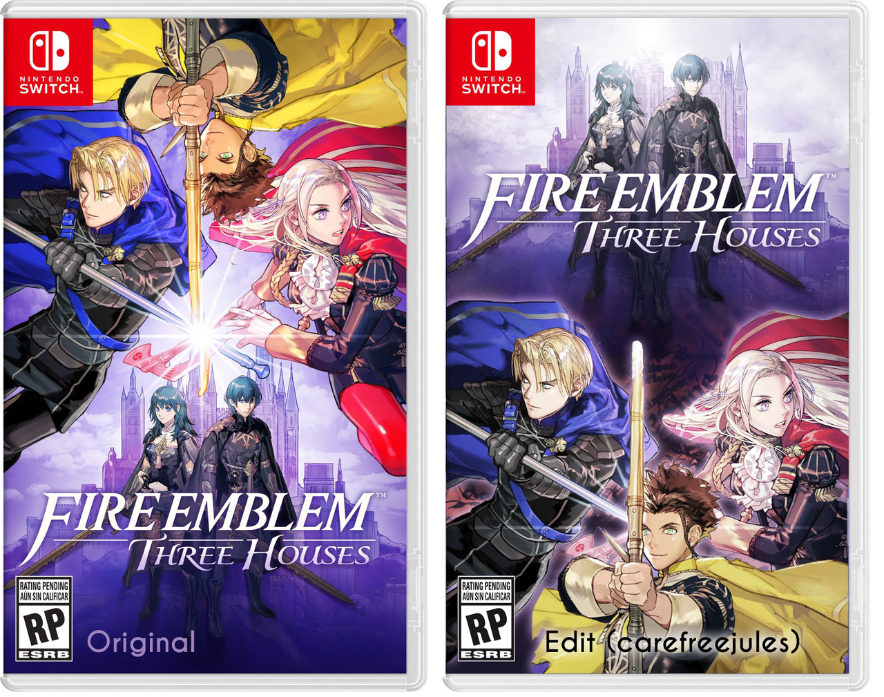
With slightly different positioning of Dimitri and Edelgard's arms & weapons they could still do the whole weapons meeting at point of light.
Wow this is really awful, jesus.
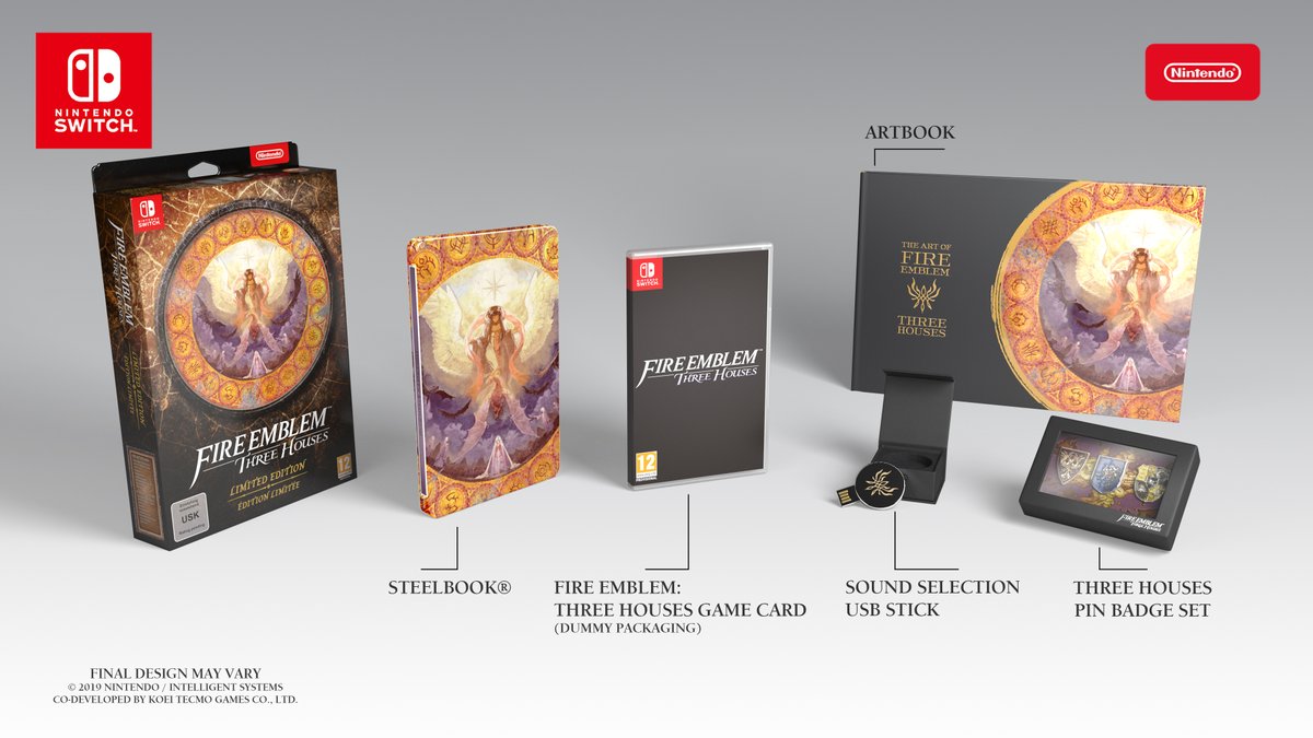
Glad I pre ordered the European Special Edition with that gorgeous steelbook.
Now I just hope the game is actually good, I don't know why I'm not getting great vibes from it.
Glad I pre ordered the European Special Edition with that gorgeous steelbook.
Now I just hope the game is actually good, I don't know why I'm not getting great vibes from it.
that KT feel. lol
Which EU retailer is taking orders? I'm struggling to see any UK ones so far.Wow this is really awful, jesus.
Glad I pre ordered the European Special Edition with that gorgeous steelbook.
Now I just hope the game is actually good, I don't know why I'm not getting great vibes from it.
I live in France so I ordered from Micromania.Which EU retailer is taking orders? I'm struggling to see any UK ones so far.
Lovely, thanks! I remember how hard the Fates one was to find.
Wow this is really awful, jesus.
Glad I pre ordered the European Special Edition with that gorgeous steelbook.
Now I just hope the game is actually good, I don't know why I'm not getting great vibes from it.
Thank God I went with the special edition
I think I would even prefer that black cover with just the logo at this point.Wow this is really awful, jesus.
Glad I pre ordered the European Special Edition with that gorgeous steelbook.
Now I just hope the game is actually good, I don't know why I'm not getting great vibes from it.