-
Ever wanted an RSS feed of all your favorite gaming news sites? Go check out our new Gaming Headlines feed! Read more about it here.
-
We have made minor adjustments to how the search bar works on ResetEra. You can read about the changes here.
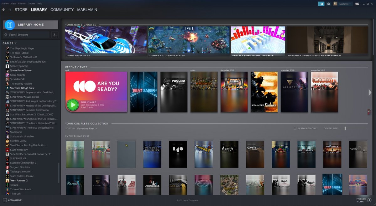
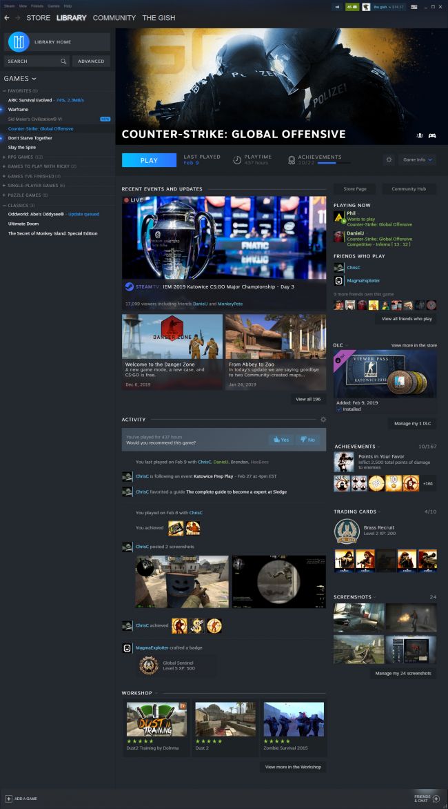
Exploring the New LEAKED Steam Library Update
- Thread starter anastiel
- Start date
You are using an out of date browser. It may not display this or other websites correctly.
You should upgrade or use an alternative browser.
You should upgrade or use an alternative browser.
lol it's not like Valve was gonna be at E3.when 👏 will 👏 these 👏 spoilers 👏 stop
thanks for ruining the new Steam story for me OP
PC Gaming Show is sponsored by Epic Games."Leaked".
Wonder if they will update this during the PC Gaming show then.
The one sponsored by their closest friend and partner, EGS? :3"Leaked".
Wonder if they will update this during the PC Gaming show then.
Would be closer to EGS 473.0
Feel like I've seen "New Steam UI coming soon!" every summer for the past five years
You probably have, but they've been iterating on it for quite a while in non-noticeable fashion
This is the first real big update in a bit though, especially visually
The one sponsored by their closest friend and partner, EGS? :3
EVEN BETTER!
None of these steam designs ever seem to truly refresh the look to a modern UI. It still looks like a mid 2000s PC app to me. Maybe that's what the audience wants, but I just think there's so much more you could do with it.
Tbh the issue I have mainly is that massive top and bottom border, why do they need to be there? The client itself is slow and clunky, adding yet another layer of web CSS or whatever isn't going to fix the problems. It looks slightly better I guess, but nothing to be excited over at all, especially considering how long this has taken to create.
The main thing I feel steam needs to deliver om for this UI I feel is customizability. The ability to tweak how icons and the like are shown, the colors used etc. If they can manage to do that, kudos to them.

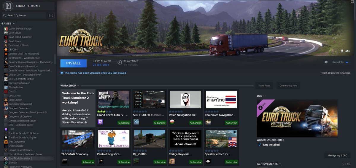
Because that is forcing the new Library UI to work on the current UI, so the top and bottom border stay there as they are not really integrated in that format.Tbh the issue I have mainly is that massive top and bottom border, why do they need to be there? The client itself is slow and clunky, adding yet another layer of web CSS or whatever isn't going to fix the problems. It looks slightly better I guess, but nothing to be excited over at all, especially considering how long this has taken to create.
The leak comes from using the files in the CSGO launcher to force the update of the library ui to work on the current UI as from the server side it is probably in late closed beta.
Bad news: web tech is confirmed.Pretty amazing if they keep the performance and if it's not done with web tech
I want freaking tabs. Why can't we have tabs on the Steam App so when you browse through games you can tab them vs having to jump back and forth?! Seriously, it's just annoying.
I'd honestly take this over the current (and future client). Back then Steam worked and was sufficiently snappy. Today with all of the cruft in the client I'm happy if a button press actually does something the first time I press it.
the steam client sucks a lot and given the option I'd rather use anything else. even the egs client is better, and that pos crashes at least once a week for me.
I always put Steam into "small mode" and it looks exactly like that still (the games selection window). and honestly I'd like Steam to stay functional as opposed to some front end try hard fancy crap where they focus on looks before use cases.I'd honestly take this over the current (and future client). Back then Steam worked and was sufficiently snappy. Today with all of the cruft in the client I'm happy if a button press actually does something the first time I press it.
the steam client sucks a lot and given the option I'd rather use anything else. even the egs client is better, and that pos crashes at least once a week for me.
I'd honestly take this over the current (and future client). Back then Steam worked and was sufficiently snappy. Today with all of the cruft in the client I'm happy if a button press actually does something the first time I press it.
the steam client sucks a lot and given the option I'd rather use anything else. even the egs client is better, and that pos crashes at least once a week for me.
https://playnite.link
oh neat. I forgot you were able to launch steam games via their url, I should probably build my own lightweigth ui
I'd honestly take this over the current (and future client). Back then Steam worked and was sufficiently snappy. Today with all of the cruft in the client I'm happy if a button press actually does something the first time I press it.
the steam client sucks a lot and given the option I'd rather use anything else. even the egs client is better, and that pos crashes at least once a week for me.
check your PC.
Steams HTML views are slow and always have been. Managing big wishlists is a pain in the client.
Is it full electron? Or just the web-view for the store?
holy shit I had forgotten lol, that's been a while
these leakers are LITERALLY destroying Gamer Christmas (a Gamer holiday that occurs on any day previously unannounced News for Gamers gets announced)!!!!when 👏 will 👏 these 👏 spoilers 👏 stop
thanks for ruining the new Steam story for me OP
You can literally run it on your own computer now. That's a leak if there ever was one.
And we still haven't gotten chat chess back!
holy shit this brings me back.
new update looks really good.

