Because the scope of each game is different, I think. DQ I is pretty short, DQ II is a bit longer, and DQ III is basically as long as I+II and maybe longer.
-
Ever wanted an RSS feed of all your favorite gaming news sites? Go check out our new Gaming Headlines feed! Read more about it here.
-
We have made minor adjustments to how the search bar works on ResetEra. You can read about the changes here.
Dragon Quest I-III Switch announced for NA/Europe Sept. 27 for $4.99, $6.49, and $12.49
- Thread starter KtotheRoc
- Start date
You are using an out of date browser. It may not display this or other websites correctly.
You should upgrade or use an alternative browser.
You should upgrade or use an alternative browser.
Do you guys think there's a chance of them fixing the graphics if we complain loud enough? It kinda worked for Chrono Trigger, so might as well try.
I know beggars can't be choosers, but I also don't want to support shoddy ports like this even if I'm very interested in those games.
None. The Steam release of Chrono Trigger was way more fucked than people disliking new sprites. It needed an overhaul.
This is like the 12th system that these games have been on, and the games are less popular, and in the case of 1&2, less good. There's less incentive to fix them, and they're not really broken. Other than the backgrounds scaling being fucked, there's not even anything that has a clear and unambiguous solution.
Last edited:
i don't think they'd care. they might do something if the japanese fans overwhelmingly hate it and complain, but i don't think that'll happen.Do you guys think there's a chance of them fixing the graphics if we complain loud enough? It kinda worked for Chrono Trigger, so might as well try.
I know beggars can't be choosers, but I also don't want to support shoddy ports like this even if I'm very interested in those games.
I originally played all three of these games on GBC and I wished they could find a way to remake or re-release those versions because they were great.
I don't think these games look as bad as people in the thread are saying but that's just me. Are there any gameplays vids out?
I don't think these games look as bad as people in the thread are saying but that's just me. Are there any gameplays vids out?
I originally played all three of these games on GBC and I wished they could find a way to remake or re-release those versions because they were great.
I don't think these games look as bad as people in the thread are saying but that's just me. Are there any gameplays vids out?
Look up videos of the PS4 version. These are just ports of those.

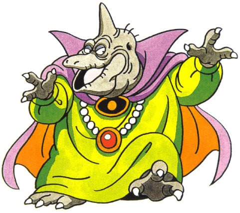
I like the drawn enemy portraits tbh. Toriyama's art is a big selling point of Dragon Quest and it was always kind of limited by the pixel art at the time. The sprites look fine and in III they look pretty good to me. What bothers me more than anything is actually the font being so basic. They could have picked something better for that.
For the price I'd say these are pretty solid versions if you only have modern consoles.
Ah, yes that would have been nice.I meant a physical release over here. Been debating importing it, but I'm not 100% committed.
But I'm at least glad someone is releasing a physical version.
I'll take what I can.
I was looking forward to this cause Ive never played the originals and yikes, no, those look HORRIBLE. I cant support that. Seems like the SNES remake of III is still the way to go
The thing that kills me is it actually takes extra effort to fuck these up this bad. Just porting the mobile versions would've been fine.
Ha, exactly. They expended resources to make things worse.
Do you guys think there's a chance of them fixing the graphics if we complain loud enough? It kinda worked for Chrono Trigger, so might as well try.
I know beggars can't be choosers, but I also don't want to support shoddy ports like this even if I'm very interested in those games.
Nope.
The mobile versions are $3, $5, and $10 respectively; I assume the upcharge is for the graphical, uh, makeover.
I like the drawn enemy portraits tbh. Toriyama's art is a big selling point of Dragon Quest and it was always kind of limited by the pixel art at the time. The sprites look fine and in III they look pretty good to me. What bothers me more than anything is actually the font being so basic. They could have picked something better for that.
For the price I'd say these are pretty solid versions if you only have modern consoles.
Hmm... Yeah, you're right, it IS the Toriyama concept art. Maybe it's just the coloring job that's bad?

Seeing that actually kinda makes it better for me in a way.
Excited for these games being available on something besides a phone. I think they look fine. Not sure why people are down on it.
Argh! I don't understand why they don't just release rom versions of the originals? What's wrong with pixelated fonts? If you're playing something like Dragon Quest 1 it's probably for some kind of historical or nostalgia reason, right? Why wouldn't you want to play it as it was released?
If you're going to remaster it, at least make it look better than the original :S These weird filtered versions and odd high-resolution fonts look disgusting!
If you're going to remaster it, at least make it look better than the original :S These weird filtered versions and odd high-resolution fonts look disgusting!
Argh! I don't understand why they don't just release rom versions of the originals? What's wrong with pixelated fonts? If you're playing something like Dragon Quest 1 it's probably for some kind of historical or nostalgia reason, right? Why wouldn't you want to play it as it was released?
If you're going to remaster it, at least make it look better than the original :S These weird filtered versions and odd high-resolution fonts look disgusting!
The QOL is still crap in the original versions, and they've also been widely available in Japan for years. Longtime fans that want those versions have no problem getting them.
The only thing filtered here is the map tiles, but even that is fairly light. The new map sprites are just much higher resolution that are more detailed and wildly closer to the concept art. I think the big issue is that they clash with the map tiles which are a totally different resolution, but updating the map is a load of work that has resulted in a bunch of notable tiling problems, which was the big complaint about the FF5 ports. Monster sprites are just using the original concept art, without pixelation. If resolutions were high enough back in the day, this is pretty much exactly what they would have looked like.
People hating on readable fonts is why we get issues like Three Houses font problems. Fonts become overused because they are widely agreed upon standards that work well in most circumstances.
I believe the SNES version of 3 has the added dungeon and boss which the mobile and Switch version are based onI think the aesthetic is much nicer on the GBC compared to these Switch ports, and 3 has added content (Dungeon and boss).
If you want a cheaper option thats on modern platforms then I guess the Switch is your only option atm.
I know the monster sprites are using the original concept art, but:The QOL is still crap in the original versions, and they've also been widely available in Japan for years. Longtime fans that want those versions have no problem getting them.
The only thing filtered here is the map tiles, but even that is fairly light. The new map sprites are just much higher resolution that are more detailed and wildly closer to the concept art. I think the big issue is that they clash with the map tiles which are a totally different resolution, but updating the map is a load of work that has resulted in a bunch of notable tiling problems, which was the big complaint about the FF5 ports. Monster sprites are just using the original concept art, without pixelation. If resolutions were high enough back in the day, this is pretty much exactly what they would have looked like.
People hating on readable fonts is why we get issues like Three Houses font problems. Fonts become overused because they are widely agreed upon standards that work well in most circumstances.
1. That's not how the game looked originally
2. It is undoing the work of the original pixel artists who worked on those games
3. Chucking high resolution sprites in a partially pixelated game is inconsistent as hell
4. The colouring on the high resolution assets is nasty!
I really love Toriyama's DQ character work, so much so that I bought the art book, but it doesn't mean I want to see poorly-implemented versions crammed in to what could have been a nice way to play the original games!
I can understand wanting to have higher-resolution fonts for legibility purposes, but at least make it an option... I'd much prefer consistent pixel sizes every time.
Plus, this is perfectly legible anyway:

Imagine if the SNES Classic console had random high-resolution Mario renders randomly interspersed throughout SMW? Almost nobody wants that, the point of the console was for nostalgia or a history lesson, you don't need to make it look "better" by making parts of it higher resolution!
The way Nintendo has re-released their old games via accurate emulation with nice save state and rewind features is essentially perfect, allows people to try out games from the past with added quality of life to make it easier to get through.
These Square Enix remasters are just George Lucas "improving" the original Star Wars films by shoving CG Jabba the Hutt into random scenes and pretending the originals don't exist!
Yeah the new 'sprites' have this weird shading that is very un-toriyama like in how he would go about it. I gotta imagine the newer additions are because of some weird licensing thing right? Why put in the 'effort' otherwise?
Still buying this collection to support more DQ releases. I hope DQ11 gets some love from the folks here.
Honestly, I sort of agree about it seeming less bad now. The coloring does most definitely feel off, though.Hmm... Yeah, you're right, it IS the Toriyama concept art. Maybe it's just the coloring job that's bad?
Seeing that actually kinda makes it better for me in a way.
Doesn't change the overworld sprites, but I think I am growing a tolerance for them after seeing so many screenshots... lmao
Yeah the new 'sprites' have this weird shading that is very un-toriyama like in how he would go about it. I gotta imagine the newer additions are because of some weird licensing thing right? Why put in the 'effort' otherwise?
This is almost certainly because it will sell better. The people that want original everything probably already have one (or more) versions that have all of that, and there's still the general public perception low-res pixel art = cheap, and worth less. Game companies actually have like 15 years of related sales data at this point on whether their raw/emulated ports sell better than more expensive "revised" ports.
On top of that, are people really forgetting how bad the reception to the mobile 1&2 were? People really think that was better than this? Those versions played fine, but the reception to the graphics wasn't that far off from this thread.
Honestly, I sort of agree about it seeming less bad now. The coloring does most definitely feel off, though.
Doesn't change the overworld sprites, but I think I am growing a tolerance for them after seeing so many screenshots... lmao
Looking at screenshots of mobile 1&2 will increase your tolerance for just having them redrawn at a resolution that works.
Last edited:
Bad news for Dragon Quest I, II and III. They are all mobile ports and the screen stutters
Check around 3:10 mark
Check around 3:10 mark
Bad news for Dragon Quest I, II and III. They are all mobile ports and the screen stutters
Check around 3:10 mark
Honestly, that.. strangely doesn't bug me, but I can see why it would for other people. I wonder if it's a mismatch of framerate of the sprite and background assets causing it. I wish I had the PS4 version on hand to check to see if it was doing that there as well...
Though, that reminds me, if you think that's bad, here's how ti is on the MSX version back in the day:
EDIT: I found a video of someone(s) PS4 playthrough. It's also there as well.
Seems it affects all three games from a quick glance of two videos from different players (possible spoilers, btw):
I still want them, but I dunno, they look a bit meh for the $70NZ I'd have to pay for a physical copy.
Though, that reminds me, if you think that's bad, here's how ti is on the MSX version back in the day:
That is really bad lol
How in the world do they not check their releases to prevent stuttering of games that came out in the NES era???
It really is, haha. Was a limitation with the MSX (as it didn't support proper scrolling, among other things), though there were ways around it. You kinda had to get creative in that aspect, but I imagine this was done on a limited budget, resources, and time restraints.
Same boat. Why I hope IV-VI get brought over to Switch to eventually.In for III. I have the iOS version, but really dislike playing long games on my phone
Please play a lot and post impressions
Welp, so for on the initial single screen before going up the mountain the player sprite shudders while moving.
Money well spent.
The art changes from mobile to ps4/switch are sooo bizarre to me.
On mobile the art style was cohesive, everything was using 16-bit era sprites still, the characters, backgrounds, battle backgrounds and enemy sprites. All except for the font/menus which is fine I think.
This one ups the character sprites to a higher pixel density like a 32-bit era game, still has 16 bit sprites for backgrounds but specifically only the battle backgrounds now have a gross smear filter and then the weirdest thing, they used hyper clean HD art for all the enemies to stand in front of the blurry mess battle backgrounds...

The FF5/FF6 mobile teams must've been in charge of these conversions, it seems in line with the bizarreness in those ports.
On mobile the art style was cohesive, everything was using 16-bit era sprites still, the characters, backgrounds, battle backgrounds and enemy sprites. All except for the font/menus which is fine I think.
This one ups the character sprites to a higher pixel density like a 32-bit era game, still has 16 bit sprites for backgrounds but specifically only the battle backgrounds now have a gross smear filter and then the weirdest thing, they used hyper clean HD art for all the enemies to stand in front of the blurry mess battle backgrounds...
The FF5/FF6 mobile teams must've been in charge of these conversions, it seems in line with the bizarreness in those ports.
This is wrong, backgrounds are in same style as the enemiesThe art changes from mobile to ps4/switch are sooo bizarre to me.
On mobile the art style was cohesive, everything was using 16-bit era sprites still, the characters, backgrounds, battle backgrounds and enemy sprites. All except for the font/menus which is fine I think.
This one ups the character sprites to a higher pixel density like a 32-bit era game, still has 16 bit sprites for backgrounds but specifically only the battle backgrounds now have a gross smear filter and then the weirdest thing, they used hyper clean HD art for all the enemies to stand in front of the blurry mess battle backgrounds...
The FF5/FF6 mobile teams must've been in charge of these conversions, it seems in line with the bizarreness in those ports.

Is this background not just the same as the mobile port but with a smear filter applied? Looks like it to me.
oh
Is this background not just the same as the mobile port but with a smear filter applied? Looks like it to me.
why would someone play anything other than Dragon Quest I? you bought one of the bad ones
Been playing DQ 1 for about 30 mins, and I've been enjoying it. It's just that without a proper D-Pad, handheld play is kinda awkward.
damn this is goty
AFAIK if there's ever anything on the ground you just press ADid they get rid of the search function in the first dragons quest?
Despite feeling disgusted by how these looked, being a huge DQ fan I of course bought them all anyway.
My first impression of DQIII is actually rather positive. The character sprites don't look as bad as they come off in images, and the backgrounds really look amazing in 16/9. I'd say it looks the worst on the world map, but the sprites blend better in towns and everything looks pretty good.
Still an overall disappointment considering the source material, but not quite the catastrophe I expected.
Seems the trilogy has a really choppy framerate. This is even worse than the new "art"-work to me. Hard Pass.
This makes me wonder why Link's Awakening and BotW are both the same price then :PBecause the scope of each game is different, I think. DQ I is pretty short, DQ II is a bit longer, and DQ III is basically as long as I+II and maybe longer.
Seems the trilogy has a really choppy framerate. This is even worse than the new "art"-work to me. Hard Pass.
Basically, it's a mix-matched frame rate from what I can tell and this seemed to have originated from the PS4 and 3DS port back when Dragon Quest XI came out in Japan. Looks like the sprites update at 60, but the backgrounds update at 30. At least just ball-parking it from eye.
The bigger question is did the mobile versions actually have this issue and no one noticed it till now?
EDIT:
Did a quick search and found a video of Dragon Quest III on iOS. Looks like it may have had the same issue, provided I'm seeing this correctly. Background movement definitely doesn't look smooth:
If that's the case, how the heck did this not get noticed after so long...
Yeah the choppiness of the screen scrolling isn't attractive - regardless I bought all three. I love this series so I want to support it in whatever way I can. I dont find the art and assets to be as off putting as I thought I might though - certainly looks nicer than those screens led me to believe but that's just me. I really hope they go ahead and bring over the rest of the series to Switch now.
Basically, it's a mix-matched frame rate from what I can tell and this seemed to have originated from the PS4 and 3DS port back when Dragon Quest XI came out in Japan. Looks like the sprites update at 60, but the backgrounds update at 30. At least just ball-parking it from eye.
The bigger question is did the mobile versions actually have this issue and no one noticed it till now?
EDIT:
Did a quick search and found a video of Dragon Quest III on iOS. Looks like it may have had the same issue, provided I'm seeing this correctly. Background movement definitely doesn't look smooth:
If that's the case, how the heck did this not get noticed after so long...
What's even worse is, the original releases of DQ1-3 already had a better (60fps?) framerate.
The video you linked doesn't support 60fps btw, so it's not really meaningful.