• Ever wanted an RSS feed of all your favorite gaming news sites? Go check out our new Gaming Headlines feed! Read more about it here.

The best looking SNES?

  • American SNES

    Votes: 441 21.8%
  • European SNES

    Votes: 1,583 78.2%

  • Total voters
    2,024

TigerPhin

Member
Oct 28, 2017
123
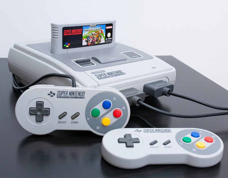
My feelings are complicated here. Living in the US, we had the purple machine - which is fine. Beyond the concave buttons (which are genius), I really lusted after the PAL/Japan version. I think it has so much charm and makes good on the four button colors in the SNES logo.

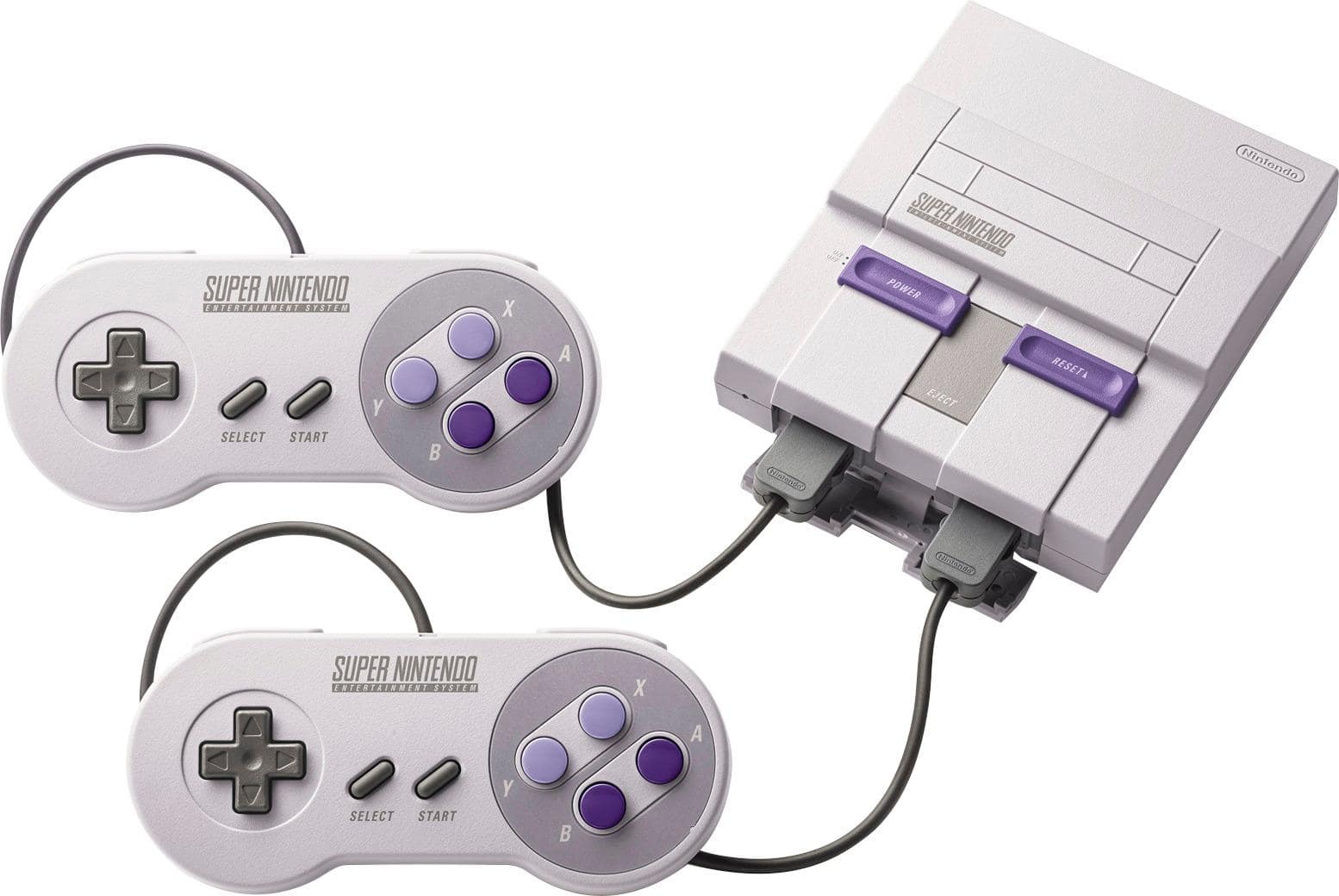
But I also just got the US mini in lieu of importing the PAL version. Side note, SNES mini plus hacking is the best retro machine ever for me with the same controller hardware.
 

Couleurs

Member
Oct 25, 2017
4,349
Denver, CO
As a preteen at the time, I felt like the US version was cooler, since it just felt 90s as hell with the purple and sharper corner design. But the Japan/Europe version held up better over time.
 

Sargerus

▲ Legend ▲
The Fallen
Oct 25, 2017
20,828
Come to think of it, the only good looking Nintendo console was probably the Wii.
 
Oct 27, 2017
999
Come to think of it, the only good looking Nintendo console was probably the Wii.
When it comes to Nintendo consoles the Wii and the Super Famicom are really the only good looking ones IMO. Now a lot of consoles in general are products of their time and looked nice back then but are very dated now. Handheld wise the DS Lite is a 10/10.
 

Pop-O-Matic

Avenger
Oct 25, 2017
12,861
Come to think of it, the only good looking Nintendo console was probably the Wii.
What the fuck is this take? The only good looking Nintendo console is a slate of white nothingness who's glossy finish turns to a smudgy, scratch-laden hellscape if you so much as look at it funny? How the hell is that better than the Famicom, NES top-loader, GB Pocket, N64, GameCube, GBA SP, DSi/XL, N3DS line, etc, etc. Hell, I'd put the Wii Mini over the original model.
 

flashman92

Member
Feb 15, 2018
4,558
I thought the US SNES looked like a fake toy and is probably the ugliest of the mainstream consoles (granted it has more "personanlity" than the generic gaming blocks we have now). Everything from the colors to the angular/boxy design is just so weird to me. Grey, purple, and lavendar (especially where grey is the primary color) is a bad color combination and I can't think of too many other things that use that color scheme. The JP/EU SNES looks like a fax machine. Not a fan of either.
 

ItsTheShoes

Attempting to circumvent ban with an alt
Banned
Oct 27, 2017
334
The euro SNES is ugly as shit. There isn't necessarily anything wrong with the rainbow controller, but that two tone looks dope. Also, the angularity gives it a slightly futuristic look. The euro one looks like a mid 90s Ford Taurus, nothing but jellybean ovals everywhere.
 

Jon Carter

Banned
Oct 27, 2017
5,746
Come to think of it, the only good looking Nintendo console was probably the Wii.
When it comes to Nintendo consoles the Wii and the Super Famicom are really the only good looking ones IMO. Now a lot of consoles in general are products of their time and looked nice back then but are very dated now. Handheld wise the DS Lite is a 10/10.

91Q4CEdO67L._SL1500_.jpg
 

Lindsay

Member
Nov 4, 2017
3,130
Also anyone saying light theme users voted for american SNES, no just no. I use light theme, I grew up with american SNES, I voted european SNES because that ones not atrocious looking!
 

Barn

Member
Oct 27, 2017
3,137
Los Angeles
I love the four-color logo and buttons of the Super Famicom, but I think the American Super Nintendo design has a stronger identity.
 

Fantastical

Member
Oct 27, 2017
5,361
I love the purple... But I also love the more colorful version. The two tone purple on the controllers looks especially nice imo
 

Buff Beefbroth

Chicken Chaser
Member
Apr 12, 2018
3,011
I think it looks amazing. Purple and gray look great together. I got no love for the candy colors of the other variant.
 

iKhameleon

Member
Oct 27, 2017
32
I've never understood the extreme reactions the American one gets on here. Assumed it was hyperbole. It doesn't seem THAT offensive lol. That said, I like them both, but prefer the American one. I could be biased since it's the one I grew up with. And I like purple.
 

wilyrook

Member
Oct 27, 2017
85
If I had the choice back then I'd pick the EU one, but I never really liked the look of any of the consoles, not just Nintendo's. The GBA SP and the DS Lite, though, are pretty awesome. No, I don't still use a flip-phone.
 

Alex3190

One Winged Slayer
Member
Oct 27, 2017
1,127
I grew up with a European controller but owned a NA console. I did end up buying a NA controller later on.

The NA controller buttons being concave feel a lot better than the EU/jp model. The colors on the European model are far superior than the American model purple colours.

For some reason my brain would always associate the American models colors with the Violet mint candy.
 
Last edited:

brambles13

Member
Oct 27, 2017
546
European model all the way. Our American model is butt ugly. I really think it's one of the many reasons Nintendo lost a ton of market share from 91-95ish in the us.
 

Zelda

Banned
Oct 25, 2017
2,079
I think I prefer the actual design of the EU SNES, but the American design holds a special place in my heart because that was my first gaming system as a kid.
 

balgajo

Self-requested ban
Banned
Oct 27, 2017
1,251
I think that the colored design is really bad. It doesn't fit well with the controller. About the consoles, I don't think that they are terrible but also not that great.
 

Smerdyakov

Member
Nov 13, 2017
380
It's maybe a little boxy, but the shades of purple they chose for the console and controller are really pleasant.
 

misterBee

Member
Aug 16, 2018
223
The bigger question is why did they feel the need to design two seperate consoles?

Catering to local markets.

The idea was that Americans needed consoles that were big and aggressive looking.

The small Famicom became the ugly grey NES.
The tiny PC Engine became the huge black (and largely empty) Turbografx.
The Super Famicom didn't change in size but needed to look 'futuristic' (well, what 1990s people thought looked futuristic) and became the ugly SNES.

Time has proven that most of these redesigns aged poorly.
 
May 15, 2019
2,448
I love the American SNES. The boxy geometric shape and use of purple instead of just the typical shades of black, white and gray make it really stand out. Shame the aging yellow plastic ruins so many.

Super Famicom looks nice too but it's a little bland.
 

Sheng Long

Moderator
Oct 27, 2017
7,590
Earth
It was a weird looking box then, it's a weird looking box now. I still don't get why they brought it to the US like that.
 

Cup O' Tea?

Member
Nov 2, 2017
3,603
Yeah it's fugly as shit. Why did they even re-design it in the first place? Would Americans really not have bought the Jap/Eur version if it had released there? I highly doubt it.

I don't understand why people always bring up the concave/convex buttons as being some kind of awesome feature. I'm not blind. I don't need braille in my videogame controllers thanks.
 
Last edited:

Irikan

Avenger
Oct 25, 2017
2,390
lmao imagine sincerely thinking that the american SNES is the better looking one, these people probably like pineapple on their pizza
 

Pyramid Head

Member
Oct 27, 2017
1,838
The original looks like someone actually spent a bit of time designing it, considering how all the various lines, curves and corners work as a whole.
The US version looks like someone quickly overlapped a few block shapes in a CAD program and called it a day.
 
Nov 8, 2017
3,532
I think the EU one looks slightly better.

The best thing about EU SNES is the coloured buttons. Like, growing up I don't know anyone who referred to the buttons by letter designation (A, B, X, Y); everyone I knew referred to them by colour ("Press yellow to jump, hold green to run, etc.). Couldn't do that with the US design.