Good thing I read through the thread. I was about to post this.
-
Ever wanted an RSS feed of all your favorite gaming news sites? Go check out our new Gaming Headlines feed! Read more about it here.
Characters that got Amazing re-designs.
- Thread starter Musubi
- Start date
You are using an out of date browser. It may not display this or other websites correctly.
You should upgrade or use an alternative browser.
You should upgrade or use an alternative browser.

Why does a computer have an increasingly large cleavage?Good thing I read through the thread. I was about to post this.
Sorry, but I can't take the Maria Renard redesign seriously.Castlevania Judgement the Thread
I unironically love all these designs

That poor owl.
Bigger SSD, duh!


Me too.Tbh I'd played the shit outta of an R-rated edgy Mario game with this design.
People love to criticise the suggestion of having a more edgy or adult version of games like Mario and while I understand why Nintendo would never do it, i would love to try different IPs in unconventional styles.
Alucard, from this in Castlevania III:

To this in Symphony of the Night:

Has there ever been a more fuckable vampire?

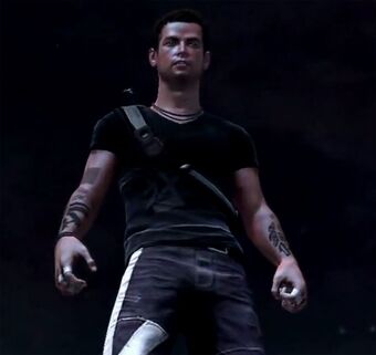
What could've been. Cole from Infamous 2 before fans got upset at how much less boring this design was compared to the first game.
As a huge inFAMOUS fan, I really liked this Cole redesign. Sometimes gamers are insufferable. Especially when their entitlement kicks in. I hope that Sucker Punch learned a valuable lesson from this, and sticks to their vision for their games, only addressing fan "input" when it comes to actually improving gameplay, like the QoL stuff they're adding to Ghost of Tsushima next week along with the new co-op mode content.
I mean, inFAMOUS 2 was still an awesome game to play, and the "updated Cole" for that one is fine enough, but this one I thought was a really cool redesign. I felt like it was simple and understated. Not overdesigned, and fit where Cole was at both character wise and the new settings (a warm, probably humid environment, as New Marais is a New Orleans analogue). If we ever get a remake of inFAMOUS 1 and 2, they should go with this design for both games (obviously, give him the jacket from inFAMOUS 1, then ditch it for 2, but with everything else from this design).
It's less bombastic, but that's the whole point. He's a father figure in that game instead of the protagonist.
He also doesn't actually look anything like the actual character he's supposed to be in a game that only takes place a few weeks after the original.As a huge inFAMOUS fan, I really liked this Cole redesign. Sometimes gamers are insufferable. Especially when their entitlement kicks in. I hope that Sucker Punch learned a valuable lesson from this, and sticks to their vision for their games, only addressing fan "input" when it comes to actually improving gameplay, like the QoL stuff they're adding to Ghost of Tsushima next week along with the new co-op mode content.
I mean, inFAMOUS 2 was still an awesome game to play, and the "updated Cole" for that one is fine enough, but this one I thought was a really cool redesign. I felt like it was simple and understated. Not overdesigned, and fit where Cole was at both character wise and the new settings (a warm, probably humid environment, as New Marais is a New Orleans analogue). If we ever get a remake of inFAMOUS 1 and 2, they should go with this design for both games (obviously, give him the jacket from inFAMOUS 1, then ditch it for 2, but with everything else from this design).
You're seriously going to pull out the "entitlement" card for this? Imagine if DmC wasn't a reboot and they just decided to make Dante look like that. That's what Nathan Cole was.
Both Nate and Elena got subtle changes to better "resemble" Nolan North and Emily Rose.
As a huge inFAMOUS fan, I really liked this Cole redesign. Sometimes gamers are insufferable. Especially when their entitlement kicks in. I hope that Sucker Punch learned a valuable lesson from this, and sticks to their vision for their games, only addressing fan "input" when it comes to actually improving gameplay, like the QoL stuff they're adding to Ghost of Tsushima next week along with the new co-op mode content.
I mean, inFAMOUS 2 was still an awesome game to play, and the "updated Cole" for that one is fine enough, but this one I thought was a really cool redesign. I felt like it was simple and understated. Not overdesigned, and fit where Cole was at both character wise and the new settings (a warm, probably humid environment, as New Marais is a New Orleans analogue). If we ever get a remake of inFAMOUS 1 and 2, they should go with this design for both games (obviously, give him the jacket from inFAMOUS 1, then ditch it for 2, but with everything else from this design).
Sometimes gamers are "insufferable" for a good reason. Neither character model was unique. The in-game version of the character looked equally as bland and basic as the one they used. The exception being: The final one actually resembled the original game's Cole.
Sometimes "being insufferable" isn't a bad thing (and I say that as someone who agrees that gamers are quite often very entitled dipshits.)
Honestly, I wanna watch the movie with that freak on the left now to see if it's still enjoyable.


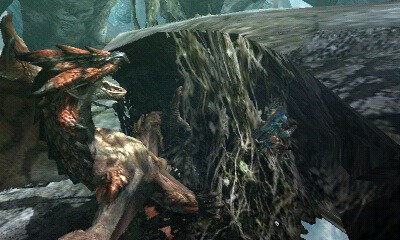
Rathalos from Monster Hunter. Both the 1st redesign (Middle row) and 2nd redesign (Bottom row) were massive improvements over the original look of the monster.

It's especially noticeable when you put the oldest model right next to the newest.
Looks like the exact same design to me...
KH1 Sora is the worst Sora and every time Square Enix brings him back I'm disappointed
Also Yoshi was vastly improved after World


OG Urianger always looked like a more generic NPC to me so I was very confused the more he started popping up in the plot. His redesign was much needed.
Also Yoshi was vastly improved after World
Urianger from FFXIV, I really disliked his first look

his new look:

OG Urianger always looked like a more generic NPC to me so I was very confused the more he started popping up in the plot. His redesign was much needed.


Then I suggest you look closer? Just because the changes are more subtle than some of the others in this thread doesn't mean they're not there. Longer nose, smaller and neater teeth that don't jut out of the mouth when closed, larger lips, completely different color patterns. Not to mention the much larger wings and shorter, more bird-like body proportions.
Next year, we're likely gonna have the 2nd version of Rathalos (Smash Ultimate, Monster Hunter Generations Ultimate) and the 3rd version of Rathalos (Monster Hunter Rise) on the same hardware.
But they weren't redesigned. Just had more polygons addedThen I suggest you look closer? Just because the changes are more subtle than some of the others in this thread doesn't mean they're not there. Longer nose, smaller and neater teeth that don't jut out of the mouth when closed, larger lips, completely different color patterns. Not to mention the much larger wings and shorter, more bird-like body proportions.
Next year, we're likely gonna have the 2nd version of Rathalos (Smash Ultimate, Monster Hunter Generations Ultimate) and the 3rd version of Rathalos (Monster Hunter Rise) on the same hardware.
DMC1-4 Dante to DmC Dante was an astronomical glowup.
Shame it was followed by his worst design with DMC5. Ah well.
Shame it was followed by his worst design with DMC5. Ah well.
Considering I actually thought 4's was Dante... yeah. Yeah, that was a good redesign lol. (Didn't play DMC til V, didn't follow it much at all either)Some might disagree but...
Nero DMC4
to DMC5

DMC5 is better imho, stands out more from Dante.

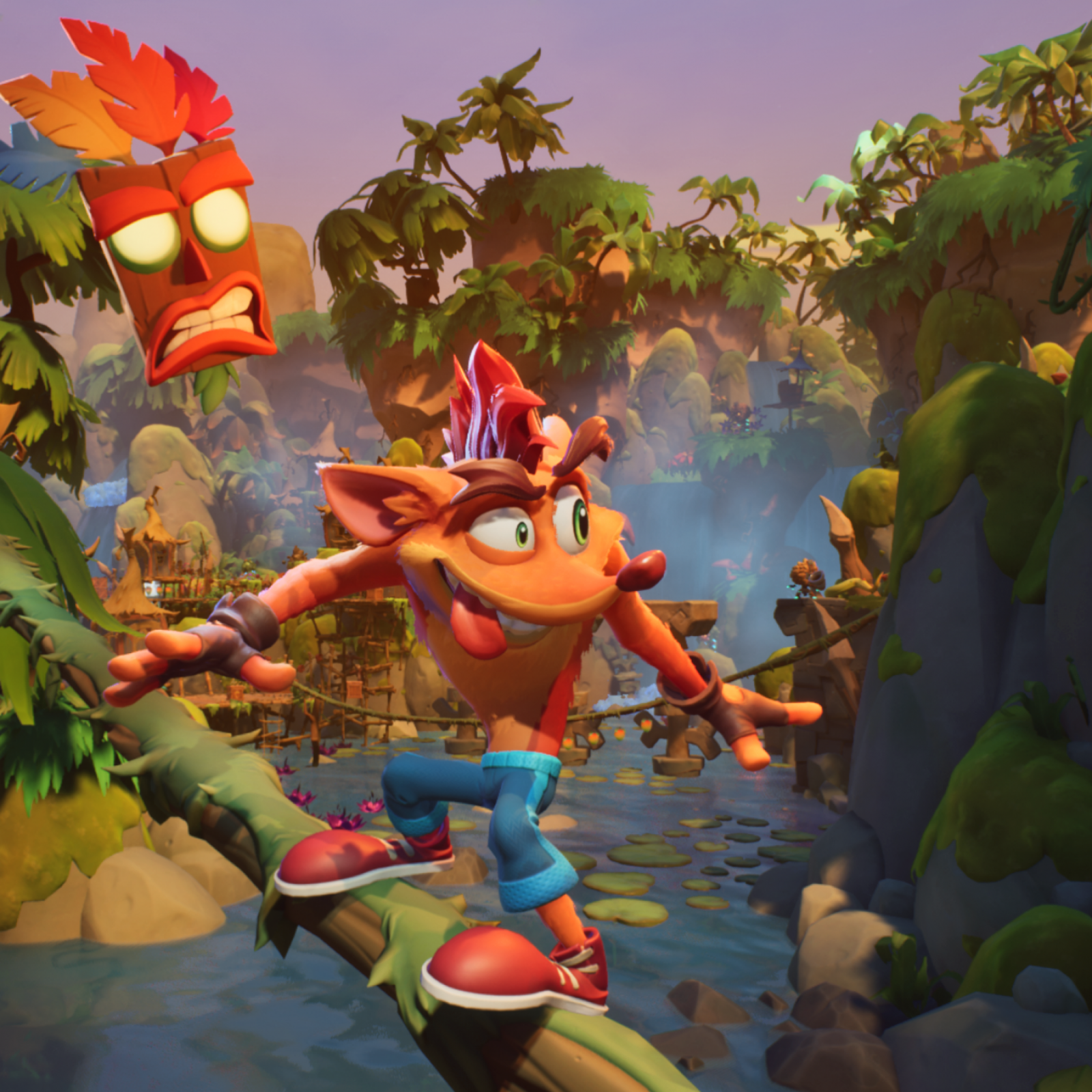
The original Crash was such an ugly miserable design. His new incarnation is cute and full of life, he no longer looks like a face with arms and legs sticking out of it.
Love Crash 4, but Alt-Tawna is pretty "meh" design wise (It's good that her gameplay is fun though because if it wasn't I legitimately think she'd be as contentious as Sonic's post-Sonic 3 & K pre-Colors friends). Honestly, this would've been so much better imoThat Tawna redesign is really bad. Not sure what they were thinking.
Even taking into account what I know about the story, I still don't understand why they didn't drop the AU character angle and just do something like this with classic Tawna. The remakes already showed her being tougher and more independent anyways.
Last edited:
As a huge inFAMOUS fan, I really liked this Cole redesign. Sometimes gamers are insufferable. Especially when their entitlement kicks in. I hope that Sucker Punch learned a valuable lesson from this, and sticks to their vision for their games, only addressing fan "input" when it comes to actually improving gameplay, like the QoL stuff they're adding to Ghost of Tsushima next week along with the new co-op mode content.
I mean, inFAMOUS 2 was still an awesome game to play, and the "updated Cole" for that one is fine enough, but this one I thought was a really cool redesign. I felt like it was simple and understated. Not overdesigned, and fit where Cole was at both character wise and the new settings (a warm, probably humid environment, as New Marais is a New Orleans analogue). If we ever get a remake of inFAMOUS 1 and 2, they should go with this design for both games (obviously, give him the jacket from inFAMOUS 1, then ditch it for 2, but with everything else from this design).
The concept art may look great but what they did show looked horrendous and nothing like Cole.
Honestly, I wanna watch the movie with that freak on the left now to see if it's still enjoyable.
There are unfinished bonus scenes on the bluray you can find on youtube. It's .... worse than you think.

It's just so horrible

Before I explain, I'm talking about the conceptual design and not so much the execution. I know it's become a meme and everyone has beaten the dead horse but I stand by this design being an amazing and simplistic, modern design that did a fantastic job speaking to Ken's personality in the design itself. I know his character select portrait and hair look stupid but in-game it looks fine although it definitely could have been translated better from art to game engine.
Nah, Team Ninja just couldn't do this badassery justiceI personally think Ryu Hayabusa is one of the best examples of this in gaming to the point it seems like the re-design completely overshadows and replaced the original in pop culture osmosis due to be more unique, striking and memorable (plus it being more promoted like being in Halo 3 helps):

I personally think Ryu Hayabusa is one of the best examples of this in gaming to the point it seems like the re-design completely overshadows and replaced the original in pop culture osmosis due to be more unique, striking and memorable (plus it being more promoted like being in Halo 3 helps):
Original Ryu Hayabusa just looked like a generic ninja. Literally nothing visually distinct about the original design. To put it succinctly, the original design was so by the numbers, would look like a NPC by today's standards.
Heels. Some weird-ass breast-plate or bra.
It's an amazing design, I'm not sure what you're going for here.
The concept art may look great but what they did show looked horrendous and nothing like Cole.
There are unfinished bonus scenes on the bluray you can find on youtube. It's .... worse than you think.
That was another version. I'm not talking about what they ultimately went with for that early reveal trailer, but the specific look from the concept art. Cole's redesign went through a lot of different iterations. I'm not a fan of the one from that screenshot, but I like the one from the concept art, and thought it would have been a better one to go with than the one they chose for the announcement/reveal trailer.
I've mentioned flaws.It's an amazing design, I'm not sure what you're going for here.
Wait until you see this feature: nsfwHadn't seen this design before, I like it about on par with the Xenoblade 2 design, nice!
Also wow the KOS-MOS hate is strong in this topic, dang
But they're not flaws. Just because a female character design has those things does not make it inherently bad. Sorry.
That was another version. I'm not talking about what they ultimately went with for that early reveal trailer, but the specific look from the concept art. Cole's redesign went through a lot of different iterations. I'm not a fan of the one from that screenshot, but I like the one from the concept art, and thought it would have been a better one to go with than the one they chose for the announcement/reveal trailer.
Yeah but I'm saying what people got upset about wasn't the cool concept art, it was the pathetic new redesign they debuted him as.
Eventually people mixed the two caused they were already angry at it but I don't think people would have been annoyed at the concept art.
He looks like Cole there, unlike what they debuted. It's kinda like Donte in DmC, the reveal Donte was unacceptable and final version was fine really.
wym Dylan Ryder is the best

JFC.
I'm sure there's someone about to post some long winded reasons why this exists and is in perfect lore and character reasoning.
...We literally have the devs describing the specific redesign processes (Structure of the feet, overall body proportions, longer nose) in writing for Tri.
I feel like people in this thread don't actually understand what "more polygons" means. Rathalos was redesigned. They did not just take the Monster Hunter 1 design and increase the number of polygons, they changed numerous aspects while creating newer versions to make a design that better reflected the intent and role of the monster.
Here's Rathalos on the oh-so-high-poly 3DS. He is still very obviously the Tri design instead of the PS2 design.
Last edited: