-
Ever wanted an RSS feed of all your favorite gaming news sites? Go check out our new Gaming Headlines feed! Read more about it here.
-
We have made minor adjustments to how the search bar works on ResetEra. You can read about the changes here.
Baskin Robbins rebrands with a new logo
- Thread starter tamago
- Start date
You are using an out of date browser. It may not display this or other websites correctly.
You should upgrade or use an alternative browser.
You should upgrade or use an alternative browser.
Don't hate it, but curious if they tried using the same colors from the previous logo... like blue instead of brown.
Will say haven't been to a BR in AGES so this shan't sway me.
Will say haven't been to a BR in AGES so this shan't sway me.
Like so many modern logos, just looks dull. Not really bad, though, since the original logo wasn't great to begin with. But boy are brands all about just sort of killing the personality of their logos nowadays
I legit can't believe this place still exists. I don't think I've seen one since they had Tiny Toons ice cream bars.
got a call from baskin robbins the other day, they said they're down to only five flavors.
Is there a reason to go to a baskin robbins tho? Unless you're under the very specific circumstance of giving a group of children a treat while your out, uhhh is there anything there I can't get at a super market
Is there a reason to go to a baskin robbins tho? Unless you're under the very specific circumstance of giving a group of children a treat while your out, uhhh is there anything there I can't get at a super market
*company unveils new logo*
Everyone, everywhere: "We literally *hate* this we can't believe you paid design consultants $11M for this lol what were ya'll thinking"
Everyone 3 years later, when the two are side-by-side: "The new logo is much cleaner and better"
Everyone, everywhere: "We literally *hate* this we can't believe you paid design consultants $11M for this lol what were ya'll thinking"
Everyone 3 years later, when the two are side-by-side: "The new logo is much cleaner and better"
Hate the logo just like I hate their ice cream which tastes like it's been sitting out since 1992.
Not that the one before was all that great but the new one is hard to read.
yea it's kind of clever but I don't think makes a good/readable logo.
I just searched and surprised there's 4 in my area. I thought they were long gone.
This. It's actually giving me a headache looking at it.
why does it look like they're trying to become "prestige"
the old one wasn't amazing but it looked like a logo for a cheery ice cream shop
the old one wasn't amazing but it looked like a logo for a cheery ice cream shop
they actually legit made it harder to read, impressive. too much contrast, makes them look way too distinct for my mind to blend them together nicely to make the BR, so it just looks like a 31 with some junk around it. no good
The incompetent rubes who run the transport network where I live just updated their logo to kind of look like the puckered anus logo from Community.
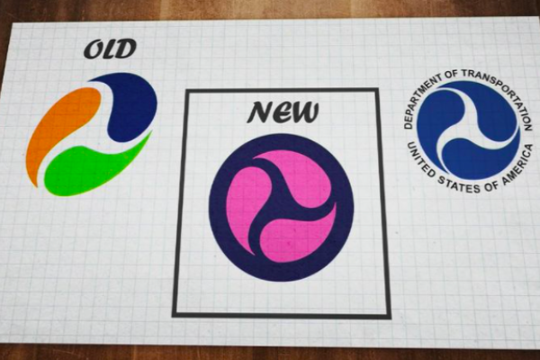
The BR logo looks ok I guess, keeping the "31" in it is a good move I think.
The BR logo looks ok I guess, keeping the "31" in it is a good move I think.
They should really drop the 31, because every BR around here is like "6 if you're lucky and never the ones any person might want."
They always find out.
It's definitely better. Reminds me of a modern 50s cafe. I like it! Old one was garbage and too childish
Better than what it's replacing but not great -- unoffensive is how I'd categorize it. For voting purposes though, I'm saying I like it because it's a vast improvement. The old one looks from another era in a bad way, so I get replacing it.
I think it's a good idea but there's not enough to make the 31 part connect well with the letter part.
It got the vibes of a the graphic design you put in the title sequence of a James Bond parody.
This is the Baskin Robbins of the Archer / NOLF / Kingsman universes.
This is the Baskin Robbins of the Archer / NOLF / Kingsman universes.

It's a brand that started in Columbus, Ohio. Personally, no other ice cream even comes close to how good Jeni's is. So good that the $8-9 per pint is completely worth it, and I bought her cookbook to learn how to make some of her flavors.
I think its the color honestly. The Pink/White goes good but its missing the blue from the older logo. It'd be like if McDonalds suddenly added a blue to their yellow and red logo.

EDIT: Ah, i took a look at the article. The branding examples look much better but by itself its pretty weird. I dont hate it but i don't really like it either.
EDIT: Ah, i took a look at the article. The branding examples look much better but by itself its pretty weird. I dont hate it but i don't really like it either.
Looked it up and it's in like 5 locations. I never understand why people put regional brands out there like everyone knows what they're talking about.It's a brand that started in Columbus, Ohio. Personally, no other ice cream even comes close to how good Jeni's is. So good that the $8-9 per pint is completely worth it, and I bought her cookbook to learn how to make some of her flavors.
Yeah, the white and blue is more pleasing... but I guess they thought having their logo look like Neapolitan was better.I think its the color honestly. The Pink/White goes good but its missing the blue from the older logo. It'd be like if McDonalds suddenly added a blue to their yellow and red logo.