So the whole point of ingame brightness settings is to compensate for your TV's settings being wrong. With a TV with a correct image you basically never have to change the default brightness setting in the game. Some cheaper TVs can't be calibrated into having a correct image so they will always need brightness adjustment in the game.
I always leave my games at the default setting because my TV settings are very close to perfect.
I would say that it used to be the case where you should probably ignore the settings if you have a calibrated display, but particularly with games that support HDR now -even if you are playing in SDR- you often have to follow the instructions for the image to look good. And you certainly have to if you are playing in HDR.
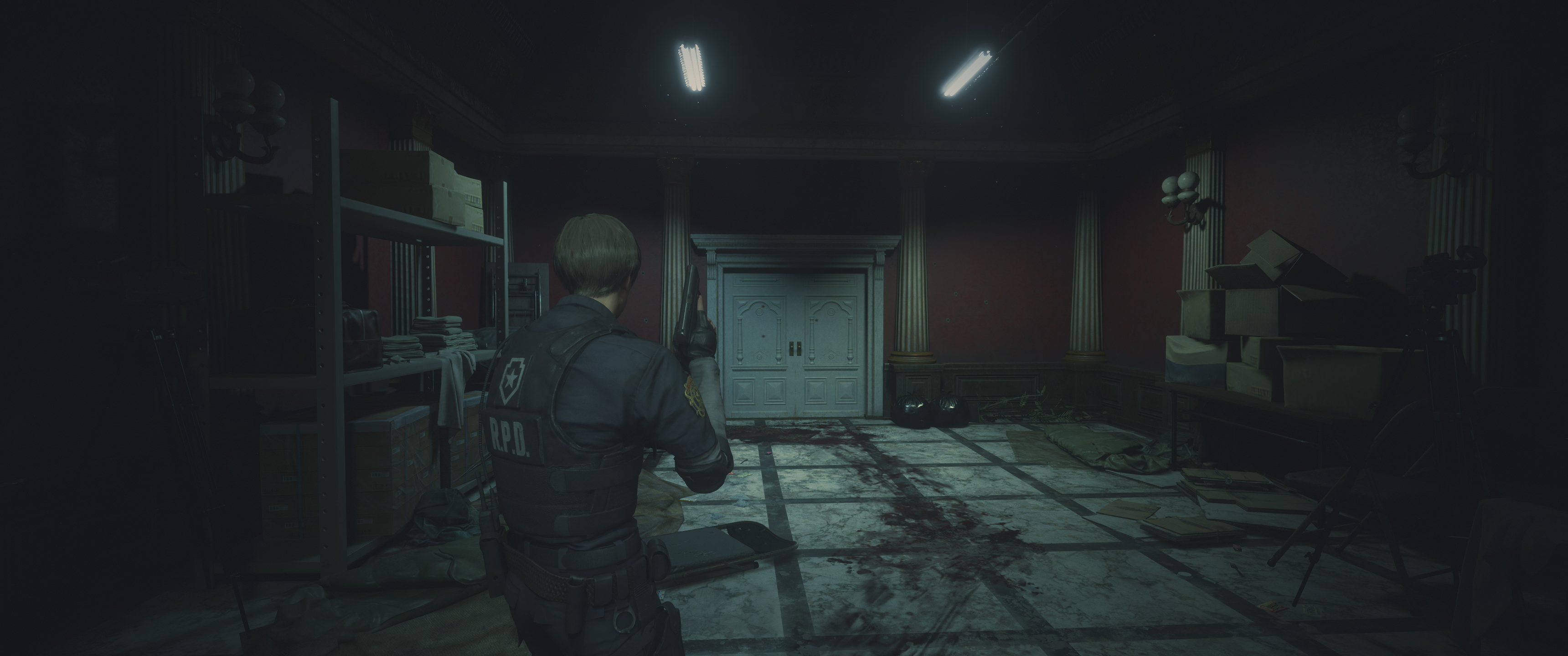
The default settings for
Resident Evil 2 in SDR look like this:
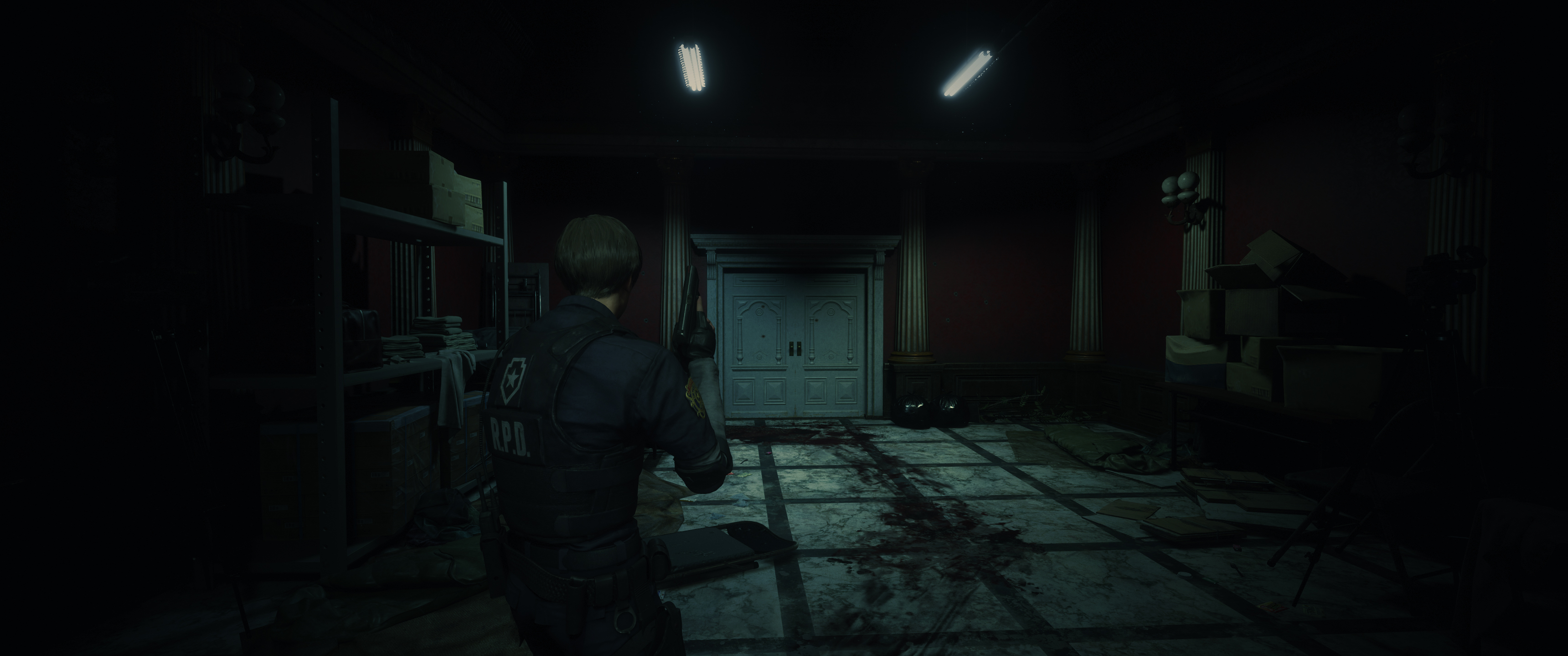
Compared to a calibrated sRGB image:
Or BT.709:
By following their instructions, these are the "objectively correct" settings for the game if your display is calibrated, because that's the only point at which the image in their instructions disappears.
But many people - even those with calibrated displays, such as
EvilBoris - thought this was too dark, and some of the later areas in the game are certainly darker than the station.
I believe if you're playing in HDR, there's no way to get an image that looks like the ones above, since a raised black level seems to be an aesthetic choice.
Based on its name, the BT.709 option is what should be used on calibrated televisions - and probably most displays, since few if any monitors are actually calibrated to the sRGB transfer curve even if they have an "sRGB" preset.
sRGB also specifies specific brightness and black level values, and those are never used. For example: my monitor's sRGB preset locks out the brightness control, but at a value which is significantly higher than the sRGB spec, and with a 2.2 gamma curve rather than the sRGB transfer function.
Based on the output shown above though, I question whether the game's sRGB and BT.709 nomenclature is accurate.
- The sRGB transfer function is linear near black, giving it a slight boost in brightness to the darkest shades - probably because it was intended for use with CRTs.
- BT.709 implies a 2.4 gamma on the display (if the display has sufficiently deep black levels) which is darker than sRGB.
And yet the output from the game is the opposite of what I would expect to see.
- Since sRGB lightens the image near black, I would expect the sRGB output to be darker to compensate for this; but it's lighter.
- Since a 2.4 gamma darkens the image, I would expect the game's BT.709 output to be lighter to compensate for this; but it's darker.
It's like they labelled them wrong, or just put arbitrary labels on the settings.
It's better than the mess they had in
Resident Evil 7, but which one is correct?
"Barely visible" isn't that hard to understand. What they mean is to turn the brightness setting down to the image being invisible. Then turn it up. The first step where it is no longer invisible but you can see there is something there which isn't the black background is "barely visible".
The problem with that, is that "invisible" can be arbitrary and subjective.
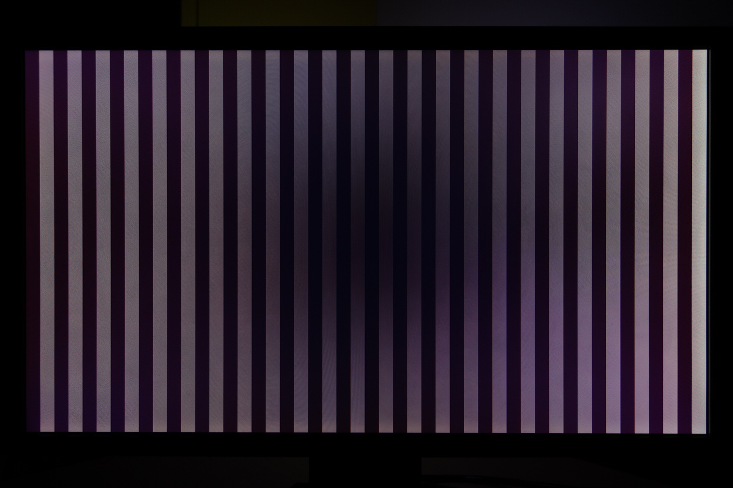
This test pattern alternates between #000000 and #010101 (I prefer creating animated test patterns rather than using static images for this).
If I display it on my television that uses a VA-type LCD panel -which most televisions do- it is effectively invisible.
It looks like a solid black screen due to the way that viewing angles work on high-contrast VA-type LCD panels. VA-type LCDs are very contrasted when viewed on-axis - to the point of "black crush" - and that tapers off quickly at an angle.
Here's an over-exposed photograph of a 5000:1 native VA-type LCD display, showing how only the very center of the image shows anything like the rated contrast of the panel - which gets narrower the closer you are to the display.
Why does that matter?
Well the test pattern looks like a solid black image when I view it on-axis. But if I get off-axis and view it from the side, the pattern is clearly visible. The signal
is being displayed on the panel. Even moving your head a bit off-center can make the pattern visible.
If I raise the brightness control even one more notch, the black level of the display is very noticeably raised; but it takes an increase of several notches before that test pattern is clearly distinct from the background when viewed on-axis.
So what is correct? The panel measures perfect gamma tracking using a meter, but subjectively shadow detail is crushed. And the only way to bring that shadow detail back is to either raise the black level or tweak near-black gamma subjectively.
This is one of the many reasons why I dislike VA-type LCD panels, despite how the contrast rating compares to IPS.
The subjective contrast is far less than the objective measurement, and all its other problems make it an easy choice to go with IPS rather than VA for me (or OLED if you're buying a large display).