After checking upon the beta I was hoping this would be one of those Valve things that would stay in perpetual beta, but not long after releasing the beta branch the new library UI is now out for everyone.
Oh no.
I was hoping for some top to bottom overhaul, but instead we got a rejiggered version of the old "detail view" that offers me a lot of what I don't want, and removed a lot of what I did want. I used the "list" view on Steam. It was nice, it had a nice amount of space for each entry, and allowed me to see at a glance the details that I wanted -- I don't need much, but checking if a game has cloud saves (and if I've had them enabled or disabled) and how much space is taken was what I needed, and I liked that.
But now we have some weird mutant hybrid of the old detail view mixed in with a new kind of grid view and it's all kinds of wack.
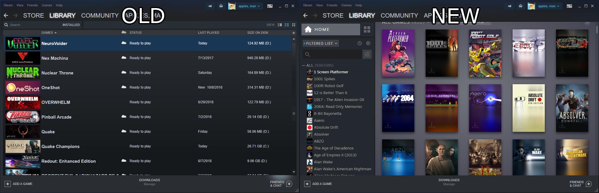
Why do my games need to be listed so small? I don't need my Steam library being some classic style Start Menu with tiny Start Menu icons for the games. The prior list view had nice tiles for all my games, and they're gone now in favour of this ugly mishmash.
They introduced new vertical style art for tiles, but why would I want to navigate this way? A significant chunk of my games are given a holdover appearance where the old tile graphic is sloppily inserted into the new vertical view with a blur to take up the rest of the space.
Now, I don't much care for using solely tiles for displaying my library, but when compared to the other launchers I use like EGS and Win 10 Game Pass, they actually have the sense to clearly label each entry instead of letting the variety of box art styles being the only identifier.

And what does all this culminate to? Well, a snazzy new front page for each game entry when clicked. This is neat, but I have absolutely no care for anything being shown and have no real customization options therein other than the "low bandwidth" and "low performance" checkboxes in settings that tone down some visual flair and autoloading of community content.

Worst of all for me, Steam still doesn't have the option to auto-minimize when launching a game, which has become a standard option in other launchers. Especially egregious on Steam as it's one where I would most likely have a game that I might launch running at a lower res which would then completely mess up the Steam window's size and position when brought back to the desktop.
So now I'm stuck with a library that forces a particular look, has less customization for my needs, and is overall just less useful.
And before anyone responds with that's what the feedback forum was for -- I did post there, but nothing ultimately came of it. I guess I'll just have to deal with it, but I've been feeling like venting about it because I quite liked how I previously had things, and this was a disappointing thing to see after years of teasing.
Oh no.
I was hoping for some top to bottom overhaul, but instead we got a rejiggered version of the old "detail view" that offers me a lot of what I don't want, and removed a lot of what I did want. I used the "list" view on Steam. It was nice, it had a nice amount of space for each entry, and allowed me to see at a glance the details that I wanted -- I don't need much, but checking if a game has cloud saves (and if I've had them enabled or disabled) and how much space is taken was what I needed, and I liked that.
But now we have some weird mutant hybrid of the old detail view mixed in with a new kind of grid view and it's all kinds of wack.
Why do my games need to be listed so small? I don't need my Steam library being some classic style Start Menu with tiny Start Menu icons for the games. The prior list view had nice tiles for all my games, and they're gone now in favour of this ugly mishmash.
They introduced new vertical style art for tiles, but why would I want to navigate this way? A significant chunk of my games are given a holdover appearance where the old tile graphic is sloppily inserted into the new vertical view with a blur to take up the rest of the space.
Now, I don't much care for using solely tiles for displaying my library, but when compared to the other launchers I use like EGS and Win 10 Game Pass, they actually have the sense to clearly label each entry instead of letting the variety of box art styles being the only identifier.
And what does all this culminate to? Well, a snazzy new front page for each game entry when clicked. This is neat, but I have absolutely no care for anything being shown and have no real customization options therein other than the "low bandwidth" and "low performance" checkboxes in settings that tone down some visual flair and autoloading of community content.
Worst of all for me, Steam still doesn't have the option to auto-minimize when launching a game, which has become a standard option in other launchers. Especially egregious on Steam as it's one where I would most likely have a game that I might launch running at a lower res which would then completely mess up the Steam window's size and position when brought back to the desktop.
So now I'm stuck with a library that forces a particular look, has less customization for my needs, and is overall just less useful.
And before anyone responds with that's what the feedback forum was for -- I did post there, but nothing ultimately came of it. I guess I'll just have to deal with it, but I've been feeling like venting about it because I quite liked how I previously had things, and this was a disappointing thing to see after years of teasing.

